Material Design Dropdown Menu Plugin For jQuery - menu.js
| File Size: | 12.1 KB |
|---|---|
| Views Total: | 9032 |
| Last Update: | |
| Publish Date: | |
| Official Website: | Go to website |
| License: | MIT |
menu.js is a very small jQuery plugin for creating a Material Design inspired dropdown / toggle menu that allows your users to select one of a number of options.
How to use it:
1. Load jQuery library together with the menu.min.css and menu.min.js in the html page.
<link rel="stylesheet" href="/path/to/menu.min.css">
<script src="/path/to/jquery.min.js"></script>
<script src="/path/to/menu.min.js"></script>
2. Create a menu toggle link like this:
<a href="javascript:;" class="toggle" id="menu-toggle1">
  <i class="material-icons">more_vert</i>
</a>
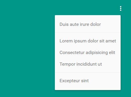
3. Create an HTML unordered list element that holds the options. Include a data-menu-toggle attribute whose value matches the id attribute of the trigger element.
<ul
  class="menu"
  data-menu
  data-menu-toggle="#menu-toggle1, #menu-toggle2"
>
  <li>
    <a href="#">Duis aute irure dolor</a>
  </li>
  <li class="menu-separator"></li>
  <li>
    <a href="#">Lorem ipsum dolor sit amet</a>
  </li>
  <li>
    <a href="#">Consectetur adipisicing elit</a>
  </li>
  <li>
    <a href="#">Tempor incididunt ut</a>
  </li>
  <li class="menu-separator"></li>
  <li>
    <a href="#">Excepteur sint</a>
  </li>
</ul>
4. Initialize the plugin and done.
$('[data-menu]').menu();
5. Customize the dropdown menu in the SCSS:
$menu-grid:       8px;
$menu-z-index:    96;

$menu-bg:         #fafafa;
$menu-color:      #757575;
$menu-separator:  #eee;
$menu-item-hover: #eee;

$menu-link:       $menu-color;
$menu-link-hover: #444;
Change log:
2017-03-04
- Added new settings variables
2016-11-24
- Fixed prevention of default behavior on toggle element
This awesome jQuery plugin is developed by eumatheusgomes. For more Advanced Usages, please check the demo page or visit the official website.