Material Design Inspired Reveal Navigation with jQuery and CSS3
| File Size: | 2.86 KB |
|---|---|
| Views Total: | 12871 |
| Last Update: | |
| Publish Date: | |
| Official Website: | Go to website |
| License: | MIT |
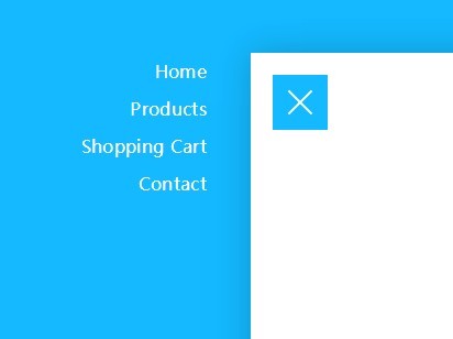
A Material Design inspired navigation that slides the main page to reveal a side menu when you click the toggle button. Based on CSS3 transitions & transforms and a little JavaScript (jQuery) magic.
Basic Usage:
1. Create a normal navigation menu using Html unordered list.
<nav>
  <ul>
    <li>Home</li>
    <li>Products</li>
    <li>Shopping Cart</li>
    <li>Contact</li>
  </ul>
</nav>
2. The CSS styles for the navigation menu.
nav {
  background-color: #14B9FF;
  width: 100%;
  height: 100%;
  position: fixed;
  left: 0;
  top: 0;
}
nav ul {
  width: 250px;
  margin-top: 50px;
}
nav ul:hover li {
  color: rgba(255, 255, 255, 0.5);
}
nav ul li {
  transition-duration: 0.25s;
  display: block;
  padding: 5px 40px;
  color: white;
  letter-spacing: 0.02em;
  text-align: right;
}
nav ul li:hover {
  cursor: pointer;
  color: white;
}
3. Create a toggle button to reveal the navigation menu.
<div class="openNav">
  <div class="icon"></div>
</div>
4. The CSS to style the toggle button and to give it a hamburger transition effect using CSS3 transitions.
.openNav {
  transition-duration: 0.5s;
  transition-timing-function: swing;
  width: 50px;
  height: 50px;
  background-color: #14B9FF;
  position: fixed;
  top: 20px;
  left: 20px;
  z-index: 9;
}
.openNav:hover {
  cursor: pointer;
}
.openNav .icon {
  transition-duration: 0.2s;
  position: absolute;
  width: 30px;
  height: 2px;
  background-color: white;
  top: 24px;
  left: 10px;
}
.openNav .icon:before,
.openNav .icon:after {
  transition-duration: 0.5s;
  background-color: white;
  position: absolute;
  content: "";
  width: 30px;
  height: 2px;
  left: 0px;
}
.openNav .icon:before {
  top: -7px;
}
.openNav .icon:after {
  top: 7px;
}
.openNav.open {
  transform: translateX(250px) translateY(50px);
  -webkit-transform: translateX(250px) translateY(50px);
}
.openNav.open .icon {
  background-color: transparent;
}
.openNav.open .icon:before,
.openNav.open .icon:after {
  top: 0;
}
.openNav.open .icon:before {
  transform: rotate(-45deg);
  -webkit-transform: rotate(-45deg);
}
.openNav.open .icon:after {
  transform: rotate(45deg);
  -webkit-transform: rotate(45deg);
}
5. Wrap your main content into a container with class of 'wrapper'.
<div class="wrapper">
  Main content goes here
</div>
6. The CSS to style the wrapper.
.navOpen {
  overflow: hidden;
}
.wrapper {
  transition-duration: 0.5s;
  transition-timing-function: swing;
  background-color: white;
  width: 100%;
  height: 100%;
  position: relative;
  padding: 100px 40px;
}
.wrapper.open {
  transform: translateX(250px) translateY(50px);
  -webkit-transform: translateX(250px) translateY(50px);
  box-shadow: 0 0 50px rgba(0, 0, 0, 0.2);
}
7. Include the latest version of jQuery JavaScript library at the bottom of your document.
<script src="//code.jquery.com/jquery-2.1.1.min.js"></script>
8. Bind the click function to the toggle button.
$(".openNav").click(function() {
  $("body").toggleClass("navOpen");
  $("nav").toggleClass("open");
  $(".wrapper").toggleClass("open");
  $(this).toggleClass("open");
});
This awesome jQuery plugin is developed by Lewi Hussey. For more Advanced Usages, please check the demo page or visit the official website.