Simple Off-canvas Navigation with jQuery and CSS3 - Material Menu
| File Size: | 22.8 KB |
|---|---|
| Views Total: | 6723 |
| Last Update: | |
| Publish Date: | |
| Official Website: | Go to website |
| License: | MIT |
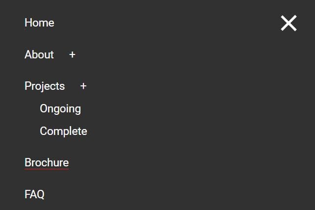
Material Menu is a jQuery responsive menu plugin that converts a normal navigation menu into a sticky top navigation bar on small screen devices.
When you click on the navigation bar, an off-canvas menu will slide out from the left hand side of the screen as you see in most mobile Apps.
See also:
Basic Usage:
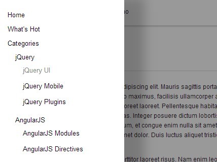
1. Create a normal multi-level navigation menu using nested unordered lists.
<div class="material-menu">
<nav class="top-bar">
<ul>
<li><a href="#">Home</a></li>
<li><a href="#">What's Hot</a> </li>
<li class="has-dropdown"><a href="#">Categories</a>
<ul class="dropdown">
<li class="has-dropdown"><a href="#">jQuery</a>
<ul class="dropdown">
<li><a href="#">jQuery UI</a></li>
<li><a href="#">jQuery Mobile</a></li>
<li><a href="#">jQuery Plugins</a></li>
</ul>
</li>
<li class="has-dropdown"><a href="#">AngularJS</a>
<ul class="dropdown">
<li><a href="#">AngularJS Modules</a></li>
<li><a href="#">AngularJS Directives</a></li>
</ul>
</li>
</ul>
</li>
<li><a href="#">About</a></li>
<li><a href="#">Contact</a></li>
</ul>
</nav>
</div>
2. Include jQuery Javascript library and the jQuery material menu plugin at the bottom of your document.
<script src="//code.jquery.com/jquery-1.11.1.min.js"></script>
<script src="materialmenu.jquery.js"></script>
3. Add the following CSS snippets to style the toggle button and the off-canvas menu in mobile view.
.material-menu-button {
  display: block;
  width: 50px;
  height: 45px;
  padding: 10px 10px 0px 10px;
  background-color: #000;
}

.material-menu-button span {
  display: block;
  width: 100%;
  height: 5px;
  margin-bottom: 4px;
  background-color: #fff;
}

@media only screen and (max-width: 767px) {

.material-menu-wrapper { padding: 20px; }

.material-menu-view-mobile {
  background-color: #fff;
  -webkit-box-shadow: 40px 0px 30px 0px rgba(0, 0, 0, 0.2);
  -moz-box-shadow: 40px 0px 30px 0px rgba(0, 0, 0, 0.2);
  box-shadow: 40px 0px 30px 0px rgba(0, 0, 0, 0.2);
}

.material-menu-titlebar {
  -webkit-box-shadow: 0px 2px 3px 0px rgba(0, 0, 0, 0.2);
  -moz-box-shadow: 0px 2px 3px 0px rgba(0, 0, 0, 0.2);
  box-shadow: 0px 2px 3px 0px rgba(0, 0, 0, 0.2);
}
}
4. Call the function to enable the off-canvas navigation.
$('.material-menu nav > ul').materialmenu();
5. Available options to customize your off-canvas navigation.
/**
 * Define width of the window (in pixels) where starts mobile devices.
 * @type integer
 */
mobileWidth: 767,

/**
 * Width of the wrapper of menu. Works only on mbile.
 * @type integer
 */
width: 250,

/**
 * Time of animation.
 * @type integer
 */
animationTime: 200,

/**
 * Overlay opacity.
 * @type integer
 */
overlayOpacity: 0.4,

/**
 * Class of menu button that fires showing of menu.
 * @type string
 */
buttonClass: 'material-menu-button',

/**
 * If you want, you can define Your own menu button,
 * that be appended to generated title.
 * @type string
 */
buttonHTML: '<div class="material-menu-button"><span></span><span></span><span></span></div>',

/**
 * Page title, showed on mobile devices.
 * @type string
 */
title: '',

/**
 * Tells if title can be showed on mobile devices (only).
 * @type boolean
 */
showTitle: false,

/**
 * Number of pixels to scroll top, when title is showed on mobile devices.
 * If is 0, title will always be visible on top.
 * @type integer
 */
titleShowOn: 40,

/**
 * If true, menu will hide when user click on some menu item.
 * @type boolean
 */
hideOnClick: true,

/**
 * Fires when menu is opened.
 * @param  jQuery object element Menu (ul) object.
 * @return void
 */
onOpen: function(element) {},

/**
 * Fires when menu is closed.
 * @param  jQuery object element Menu (ul) object.
 * @return void
 */
onClose: function(element) {},

/**
 * Fires when window width is chenged from desktop to mobile.
 * @param  jQuery object element Menu (ul) object.
 * @return void
 */
onChangeMobile: function(element) {
  element.parent().parent().addClass('vertical');
},

/**
 * Fires when window width is chenged from mobile to desktop.
 * @param  jQuery object element Menu (ul) object.
 * @return void
 */
onChangeDesktop: function(element) {
  element.parent().parent().removeClass('vertical');
},

/**
 * Fires when title-bar is opened.
 * @param  jQuery object element Title-bar object.
 * @return void
 */
onShowTitlebar: function(element) {},

/**
 * Fires when title-bar is closed.
 * @param  jQuery object element Title-bar object.
 * @return void
 */
onHideTitlebar: function(element) {}
Changelog:
v1.0.1 (2018-06-14)
- Fixed touch direction bug. Added passive flags to touchstart and touchmove events.
v0.1.2 (2015-11-24)
- update.
v0.1.1 (2015-08-10)
- update.
v0.1.0 (2015-05-02)
- New demo, Close on swipe
This awesome jQuery plugin is developed by requtize. For more Advanced Usages, please check the demo page or visit the official website.