Minimalist jQuery Responsive Dropdown Menu Plugin - Input Menu
| File Size: | 4.33 KB |
|---|---|
| Views Total: | 2595 |
| Last Update: | |
| Publish Date: | |
| Official Website: | Go to website |
| License: | MIT |
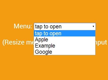
Input Menu is a super simple jQuery plugin which converts a horizontal desktop menu into a dropdown select list for easy access on mobile devices.
How to use it:
1. Insert the viewport meta tag into the head section.
<meta name="viewport" content="width=device-width, initial-scale=1">
2. Create a normal navigation menu.
<nav id="input-menu">
  <ul>
    <li>
      <a href="http://apple.com">Apple</a>
    </li>
    <li>
      <a href="http://example.com">Example</a>
    </li>
    <li>
      <a href="http://google.com">Google</a>
    </li>
  </ul>
</nav>
3. Load the inputmenu.js script after jQuery library.
<script src="//code.jquery.com/jquery-1.11.1.min.js"></script>
<script src="inputmenu.js"></script>
4. Initialize the responsive menu with default options.
$('#input-menu').inputMenu();
5. All the default settings.
$('#input-menu').inputMenu({
// also supports 'auto'
inputWidth: '150px',

menuText: 'Menu: ',
padding: '10px',

//in pixels
breakpoint: 850,

//you most likely need to change this to the ID that wraps your menu's <ul>
navID: '#input-menu'
});
Change logs:
2015-06-22
- added support for nested menu items and cleaned up
2015-03-06
- added support for nested menu items and cleaned up
2015-02-25
- added support for nested menu items and cleaned up
This awesome jQuery plugin is developed by jdabs. For more Advanced Usages, please check the demo page or visit the official website.


