Responsive One Page Navigation Plugin with jQuery - Nav Scroll
| File Size: | 10 KB |
|---|---|
| Views Total: | 13357 |
| Last Update: | |
| Publish Date: | |
| Official Website: | Go to website |
| License: | MIT |

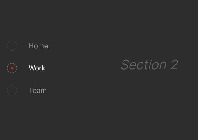
Nav Scroll is a lightweight jQuery plugin that create a responsive one page navigation for animated page scrolling to specific ID within the document. When the screen reaches a certain breakpoint (e.g. mobile or tablet devices), the plugin will automatically transform the navigation into a space-saving dropdown menu for easy access. You can customize the breakpoint via JS options object during initialization.
How to use it:
1. Create a navigation menu for your one page scroll website.
<nav class="nav">
  <div class="nav-mobile"> Mobile Dropdown Menu</div>
  <ul>
    <li><a href="#section1">Section 1</a></li>
    <li><a href="#section2">Section 2</a></li>
    <li><a href="#section3">Section 3</a></li>
  </ul>
</nav>
2. Create container sections with the corresponding IDs.
<section id="section1">
  ...
</section>
<section id="section2">
  ...
</section>
<section id="section3">
  ...
</section>
3. A little bit CSS to style the responsive one page navigation. The style below is made as an example, it's not part of the plugin but you can use it if you like.
section {
  width: 100%;
  height: 100%;
  padding-top: 15px;
  padding-left: 30px;
  color: #fff;
}

nav {
  width: 100%;
  height: 50px;
  position: fixed;
  top: 0;
  left: 0;
  box-shadow: 0 0 4px 0 rgba(0, 0, 0, 0.4);
  padding-left: 30px;
  background-color: white;
}

nav ul {
  padding: 0;
  margin: 0;
  list-style-type: none;
}

nav li {
  display: inline-block;
  text-align: left;
  margin-right: 40px;
  font-weight: bold;
  height: 50px;
  line-height: 50px;
}

nav li a { display: block; }

.nav-mobile {
  display: none;
  font-weight: bold;
  width: 100%;
}

#section1 { background-color: #F5624D; }

#section2 { background-color: #CC231E; }

#section3 { background-color: #34A65F; }

@media (max-width: 768px) {

nav ul {
  display: none;
  background-color: white;
  margin-left: -30px;
}

nav li {
  width: 100%;
  padding-left: 30px;
}

.nav-mobile {
  display: inline-block;
  height: 50px;
  line-height: 50px;
}
}

@media (min-width: 769px) {

nav ul { display: block !important; }

}
4. Load jQuery library and the jQuery nav scroll plugin at the end of your document.
<script src="//code.jquery.com/jquery-1.11.1.min.js"></script>
<script src="jquery.navScroll.js"></script>
5. Initialize the plugin to active the one page scroll navigation and the mobile dropdown menu.
$('.nav').navScroll({
  mobileDropdown: true,
  mobileBreakpoint: 768
});

$('.nav').on('click', '.nav-mobile', function (e) {
  e.preventDefault();
  $('.nav ul').slideToggle('fast');
});
6. Available options.
$('.nav').navScroll({
// The time it takes to scroll to the element.
// Set this to 0 so it obviously won't show an animation.
scrollTime: 500,

// The class of the items which invokes the scroll animation.
// All anchor tags inside the element are clickable when the value is empty.
navItemClassName: '',

// Set the height of the navigation (to use as offset).
// 'auto' let's the plugin determine the height automatically,
// a number determines the height in px.
navHeight: 'auto',

// If your navigation hides and is used as a dropdown on small
// screens setting this to true hides the dropdown after a click.
mobileDropdown: false,

// Additionaly you can insert the mobile nav's classname here,
// when left empty the plugin searches for a <ul> in the same parent element.
mobileDropdownClassName: '',

// The window width, which functions as a breakpoint between desktop and mobile.
mobileBreakpoint: 1024,

// Set to 'true' if you want to enable scrollspy.
scrollSpy: false,

// Set to true if you want the parent of the anchor to have an active class instead of the anchor itself (only if ScrollSpy is enabled).
activeParent: false,

// Set the name of the active class. When left blank the class name will be 'active'.
activeClassName: 'active',

// executed when the scrolling animation starts
onScrollStart: function() {},

// executed when the scrolling animations ends
onScrollEnd: function() {}

});
Change logs:
2017-06-27
- v1.4.1
2016-07-18
- Added the 'onScrollStart' and 'onScrollEnd' callbacks.
2016-01-19
- Added activeClassName option.
2015-06-30
- Added activeParent option and fixed non-anchor URLs with scrollSpy enabled.
2015-01-06
- Added a scrollSpy fix for IE.
2015-01-05
- Added ScrollSpy support.
2014-12-30
- Added a fix for href attributes without leading '#'
2014-12-19
- Added support for the scrollTime data attribute.
This awesome jQuery plugin is developed by jhammann. For more Advanced Usages, please check the demo page or visit the official website.