Mobile Off-screen Push Menu with jQuery and CSS3
| File Size: | 2.91 KB |
|---|---|
| Views Total: | 2578 |
| Last Update: | |
| Publish Date: | |
| Official Website: | Go to website |
| License: | MIT |
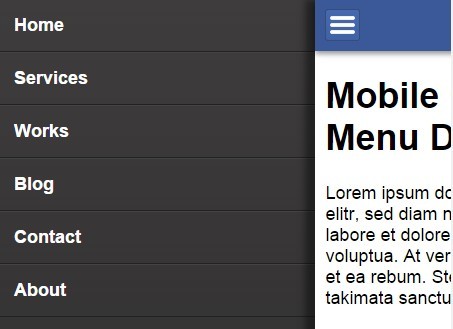
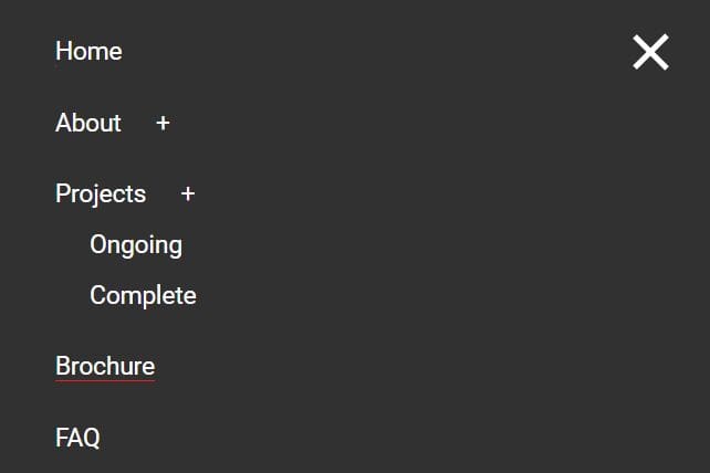
Yet another jQuery & CSS3 based mobile menu template that help you create a sliding off-canvas drawer menu for your mobile website & web application.
How to use it:
1. Create a hamburger button in the header to toggle the push menu.
<header>
  <div id="hamburger">
    <div></div>
    <div></div>
    <div></div>
  </div>
</header>
2. Create your mobile push menu from a nav list that is hidden on page load.
<nav>
  <ul>
    <li><a href="#">Home</a></li>
    <li><a href="#">Services</a></li>
    <li><a href="#">Works</a></li>
    <li><a href="#">Blog</a></li>
    <li><a href="#">Contact</a></li>
    <li><a href="#">About</a></li>
  </ul>
</nav>
3. Create a mask layer that will be layed over the content so that the content is unclickable while menu is shown.
<div id="contentLayer"></div>
4. Wrap the main content into #content container.
<div id="content">
  ...
</div>
5. Wrap everything noticed above into a wrapping container which is used to get the width of the whole content.
<div id="container">

  ...

</div>
6. Style the mobile push menu.
nav {
  opacity: 0;
  left: 0px;
  top: 0px;
  position: fixed;
  z-index: 0;
  width: 70%;
  height: 100%;
  -webkit-box-sizing: border-box;
  -moz-box-sizing: border-box;
  box-sizing: border-box;
  overflow-x: hidden;
  overflow-y: auto;
  background: #3e3c3d;
  background: -moz-linear-gradient(top, #3e3c3d 0%, #2d2c2d 100%);
  background: -webkit-gradient(linear, left top, left bottom, color-stop(0%, #3e3c3d), color-stop(100%, #2d2c2d));
  background: -webkit-linear-gradient(top, #3e3c3d 0%, #2d2c2d 100%);
  background: -o-linear-gradient(top, #3e3c3d 0%, #2d2c2d 100%);
  background: -ms-linear-gradient(top, #3e3c3d 0%, #2d2c2d 100%);
  background: linear-gradient(to bottom, #3e3c3d 0%, #2d2c2d 100%);
 filter: progid:DXImageTransform.Microsoft.gradient(startColorstr='#3e3c3d', endColorstr='#2d2c2d', GradientType=0);
}

nav ul {
  list-style: none;
  margin: 0;
  width: 100%;
  padding: 0;
}

nav li {
  position: relative;
  font-size: 1em;
  font-weight: bold;
  border-bottom: 1px solid #222222;
  border-top: 1px solid #444444;
  padding: 15px;
}

nav li a {
  color: #fff;
  text-decoration: none;
}
7. Style the hamburger button.
#hamburger {
  border: 1px solid #374C77;
  border-radius: 3px 3px 3px 3px;
  cursor: pointer;
  display: block;
  height: 24px;
  padding: 3px 4px 3px;
  position: relative;
  width: 25px;
  background: #4569b2;
  background: -moz-linear-gradient(top, #4569b2 0%, #4062a5 100%);
  background: -webkit-gradient(linear, left top, left bottom, color-stop(0%, #4569b2), color-stop(100%, #4062a5));
  background: -webkit-linear-gradient(top, #4569b2 0%, #4062a5 100%);
  background: -o-linear-gradient(top, #4569b2 0%, #4062a5 100%);
  background: -ms-linear-gradient(top, #4569b2 0%, #4062a5 100%);
  background: linear-gradient(to bottom, #4569b2 0%, #4062a5 100%);
 filter: progid:DXImageTransform.Microsoft.gradient(startColorstr='#4569b2', endColorstr='#4062a5', GradientType=0);
}

#hamburger div {
  background-color: #fff;
  border: 1px solid #eee;
  border-radius: 2px 2px 2px 2px;
  height: 2px;
  margin-top: 3px;
  width: 90%;
}
8. Style the mask layer.
#contentLayer {
  display: none;
  height: 100%;
  overflow-x: hidden;
  overflow-y: auto;
  position: absolute;
  right: 0;
  top: 0;
  width: 30%;
  z-index: 5;
}
9. The required CSS styles for the header & main content area.
header {
  background-color: #3b5998;
  padding: 10px;
  text-decoration: none;
  position: fixed;
  width: 100%;
  z-index: 1;
  -webkit-box-shadow: 0px 3px 7px 0px rgba(0, 0, 0, 0.4);
  box-shadow: 0px 3px 7px 0px rgba(0, 0, 0, 0.4);
}

#content {
  background-color: #FFFFFF;
  padding: 52px 10px 10px 10px;
  position: relative;
  width: auto;
  height: 100%;
  -webkit-box-shadow: -10px 0px 9px 0px rgba(0, 0, 0, 0.4);
  box-shadow: -10px 0px 9px 0px rgba(0, 0, 0, 0.4);
}
10. Using jQuery and jQuery UI for display effects.
<script src="//ajax.googleapis.com/ajax/libs/jquery/2.1.3/jquery.min.js"></script>
<script src="//ajax.googleapis.com/ajax/libs/jqueryui/1.11.2/jquery-ui.min.js"></script>
11. Enable the mobile push menu.
jQuery(document).ready(function () {

  //Open the menu
  jQuery("#hamburger").click(function () {

    jQuery('#content').css('min-height', jQuery(window).height());

    jQuery('nav').css('opacity', 1);

    //set the width of primary content container -> content should not scale while animating
    var contentWidth = jQuery('#content').width();

    //set the content with the width that it has originally
    jQuery('#content').css('width', contentWidth);

    //display a layer to disable clicking and scrolling on the content while menu is shown
    jQuery('#contentLayer').css('display', 'block');

    //disable all scrolling on mobile devices while menu is shown
    jQuery('#container').bind('touchmove', function (e) {
      e.preventDefault()
    });

    //set margin for the whole container with a jquery UI animation
    jQuery("#container").animate({"marginLeft": ["70%", 'easeOutExpo']}, {
      duration: 700
    });

  });

  //close the menu
  jQuery("#contentLayer").click(function () {

    //enable all scrolling on mobile devices when menu is closed
    jQuery('#container').unbind('touchmove');

    //set margin for the whole container back to original state with a jquery UI animation
    jQuery("#container").animate({"marginLeft": ["-1", 'easeOutExpo']}, {
      duration: 700,
      complete: function () {
        jQuery('#content').css('width', 'auto');
        jQuery('#contentLayer').css('display', 'none');
        jQuery('nav').css('opacity', 0);
        jQuery('#content').css('min-height', 'auto');

      }
    });
  });

});
This awesome jQuery plugin is developed by Gastdozent. For more Advanced Usages, please check the demo page or visit the official website.