Responsive Fixed Bottom Corner Navigation with jQuery and CSS3
| File Size: | 9.6 KB |
|---|---|
| Views Total: | 2354 |
| Last Update: | |
| Publish Date: | |
| Official Website: | Go to website |
| License: | MIT |
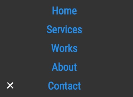
A mobile-friendly jQuery & CSS3 navigaion script to transform a regular horizontal nav bar into a fixed bottom corner navigation that morphs into a fullscreen menu panel on click/tap.
See also:
How to use it:
1. Create an empty container to place the navigation on mobile devices.
<div class="mobile-nav-container"></div>
2. Create close/open button for the mobile navigation.
<div class="mobile-nav-btn">
  <img class="nav-open" src="nav-open.png" alt="Nav Button Open">
  <img class="nav-close" src="nav-close.png" alt="Nav Button Close">
</div>
3. Create a regular Html list based navigation menu and then wrap it together with main content into the 'page-wrap' container.
<div class="page-wrap">
  <nav>
    <ul>
      <li><a href="#">Home</a></li>
      <li><a href="#">Services</a></li>
      <li><a href="#">Works</a></li>
      <li><a href="#">About</a></li>
      <li><a href="#">Contact</a></li>
    </ul>
  </nav>
  <div class="container">
    Main content goes here
  </div>
</div>
4. The core CSS/CSS3 rules for the regular menu & mobile morphing navigation.
*,
*:after,
*:before {
  -moz-box-sizing: border-box;
  -webkit-box-sizing: border-box;
  box-sizing: border-box;
}

html {
  height: 100%;
  margin: 0;
  padding: 0;
  width: 100%;
}

body {
  color: #333;
  font-family: 'roboto Condensed', sans-serif;
  font-size: 100%;
  height: 100%;
  margin: 0;
  padding: 0;
  width: 100%;
}

a {
  color: #238eec;
  text-decoration: none;
}

a:hover,
a:focus { text-decoration: underline; }

.page-wrap {
  margin: 0;
  height: 100%;
  position: relative;
  width: 100%;
}

.container {
  margin: 0;
  padding: 10px;
  width: 100%;
}

.container p {
  margin: 0 0 10px;
  width: 100%;
}

nav {
  background: #333;
  margin: 0;
  z-index: 15;
}

@media (max-width: 700px) {

nav { display: none; }

}

nav ul {
  margin: 0;
  overflow: hidden;
  padding: 10px 10px;
}

nav li {
  color: #fefefe;
  float: left;
  list-style: none;
  margin-right: 25px;
}

nav li:hover,
nav li:focus { color: #fdb32b; }

@media (max-width: 700px) {

nav li { display: none; }

}

nav.active-nav {
  background: none;
  display: block;
  padding-top: 50px;
  position: absolute;
  width: 100%;
}

nav.active-nav li {
  display: block;
  float: none;
  font-size: 35px;
  font-weight: bold;
  margin-bottom: 20px;
  opacity: 0;
  text-align: center;
}

.mobile-nav-container {
  background: #333;
  border-radius: 50%;
  bottom: 25px;
  color: #333;
  display: none;
  height: 50px;
  left: 25px;
  position: fixed;
  -moz-transition: all 0.25s ease-out;
  -o-transition: all 0.25s ease-out;
  -webkit-transition: all 0.25s ease-out;
  transition: all 0.25s ease-out;
  width: 50px;
  z-index: 10;
}

@media (max-width: 700px) {

.mobile-nav-container { display: block; }
}

.mobile-nav-container.active-nav {
  bottom: -1000px;
  height: 2000px;
  left: -1000px;
  width: 2000px;
}

.mobile-nav-btn .nav-open { display: block; }

.mobile-nav-btn .nav-close { display: none; }

.mobile-nav-btn.active-nav .nav-open { display: none; }

.mobile-nav-btn.active-nav .nav-close { display: block; }

.mobile-nav-btn {
  bottom: 38px;
  display: none;
  left: 38px;
  position: fixed;
  -moz-transition: none;
  -o-transition: none;
  -webkit-transition: none;
  transition: none;
  width: 50px;
  z-index: 100;
}

@media (max-width: 700px) {

.mobile-nav-btn { display: block; }
}

nav.active-nav li.show-nav {
  opacity: 1;
  -moz-transition: all 0.25s ease-out;
  -o-transition: all 0.25s ease-out;
  -webkit-transition: all 0.25s ease-out;
  transition: all 0.25s ease-out;
}

.nav-open,
.nav-close { width: 50%; }

.crop { overflow: hidden; }
5. Load the necessary JQuery library at the bottom of your html.
<script src="//ajax.googleapis.com/ajax/libs/jquery/2.1.3/jquery.min.js"></script>
6. The core JavaScript to trigger the morphing navigation on mobile devices according to the CSS3 media queries.
(function($) {
  jQuery(document).ready(function() {

    $('.mobile-nav-btn').click(function() {
      if( $('nav').hasClass('active-nav') ) {
        $('.mobile-nav-container').toggleClass('active-nav');
        $('.mobile-nav-btn').toggleClass('active-nav');
        $('nav').toggleClass('active-nav');
      	$('nav li').removeClass('show-nav');

        setTimeout(function(){
        $('.page-wrap').removeClass('crop');
        $('.page-wrap').height('auto'); // resets height for scolling
        }, 300);

      } else {
      	$('.page-wrap').addClass('crop');
        $('.mobile-nav-btn').toggleClass('active-nav');
        $('.mobile-nav-container').toggleClass('active-nav');
        $('nav').toggleClass('active-nav');

        var timer = 0;
        $.each($('nav li'), function (i, s) {
          timer = 300 * i;
          setTimeout(function () {
            $(s).addClass('show-nav');
          }, timer); // show menu items on timer
        });

      }
    });

  });

}(jQuery));
This awesome jQuery plugin is developed by davidleininger. For more Advanced Usages, please check the demo page or visit the official website.