Creative Morphing Menu with jQuery and CSS3
| File Size: | 1.9 KB |
|---|---|
| Views Total: | 16421 |
| Last Update: | |
| Publish Date: | |
| Official Website: | Go to website |
| License: | MIT |
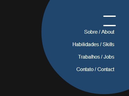
A jQuery, sass/CSS3 based creative menu that pops up a corner navigation with a subtle button morphing effect based on CSS3 transitions & transforms.
How to use it:
1. Create the Html for a navigation menu with a hamburger toggle icon.
<div class="open">
  <span class="cls"></span>
  <span>
    <ul class="sub-menu ">
      <li> <a href="#">Home</a> </li>
      <li> <a href="#">Contact</a> </li>
      <li> <a href="#">About</a> </li>
      <li> <a href="#">Blog</a> </li>
    </ul>
  </span>
  <span class="cls"></span>
</div>
2. The core CSS/CSS3 rules to style the navigation menu and to create the morphing effect.
.open {
  position: fixed;
  top: 40px;
  right: 40px;
  width: 50px;
  height: 50px;
  display: block;
  cursor: pointer;
  transition: opacity 0.2s linear;
}

.open:hover { opacity: 0.8; }

.open span {
  display: block;
  float: left;
  clear: both;
  height: 4px;
  width: 40px;
  border-radius: 40px;
  background-color: #fff;
  position: absolute;
  right: 3px;
  top: 3px;
  overflow: hidden;
  transition: all 0.4s ease;
}

.open span:nth-child(1) {
  margin-top: 10px;
  z-index: 9;
}

.open span:nth-child(2) { margin-top: 25px; }

.open span:nth-child(3) { margin-top: 40px; }

.sub-menu {
  transition: all 0.8s cubic-bezier(0.68, -0.55, 0.265, 1.55);
  height: 0;
  width: 0;
  right: 0;
  top: 0;
  position: absolute;
  background-color: rgba(38, 84, 133, 0.54);
  border-radius: 50%;
  z-index: 18;
  overflow: hidden;
}

.sub-menu li {
  display: block;
  float: right;
  clear: both;
  height: auto;
  margin-right: -160px;
  transition: all 0.5s cubic-bezier(0.68, -0.55, 0.265, 1.55);
}

.sub-menu li:first-child { margin-top: 180px; }

.sub-menu li:nth-child(1) { -webkit-transition-delay: 0.05s; }

.sub-menu li:nth-child(2) { -webkit-transition-delay: 0.10s; }

.sub-menu li:nth-child(3) { -webkit-transition-delay: 0.15s; }

.sub-menu li:nth-child(4) { -webkit-transition-delay: 0.20s; }

.sub-menu li:nth-child(5) { -webkit-transition-delay: 0.25s; }

.sub-menu li a {
  color: #fff;
  font-family: 'Lato', Arial, Helvetica, sans-serif;
  font-size: 16px;
  width: 100%;
  display: block;
  float: left;
  line-height: 40px;
}

.oppenned .sub-menu {
  opacity: 1;
  height: 400px;
  width: 400px;
}

.oppenned span:nth-child(2) { overflow: visible; }

.oppenned span:nth-child(1),
.oppenned span:nth-child(3) {
  z-index: 100;
  transform: rotate(45deg);
}

.oppenned span:nth-child(1) { transform: rotate(45deg) translateY(12px) translateX(12px); }

.oppenned span:nth-child(2) {
  height: 400px;
  width: 400px;
  right: -160px;
  top: -160px;
  border-radius: 50%;
  background-color: rgba(38, 84, 133, 0.54);
}

.oppenned span:nth-child(3) { transform: rotate(-45deg) translateY(-10px) translateX(10px); }

.oppenned li { margin-right: 168px; }
3. Include the latest version of jQuery library at the bottom of the document.
<script src="http://code.jquery.com/jquery-1.11.1.min.js"></script>
4. The jQuery script to enable the morphing menu.
$(document).ready(function() {
  $(document).delegate('.open', 'click', function(event){
    $(this).addClass('oppenned');
    event.stopPropagation();
  })
  $(document).delegate('body', 'click', function(event) {
    $('.open').removeClass('oppenned');
  })
  $(document).delegate('.cls', 'click', function(event){
    $('.open').removeClass('oppenned');
    event.stopPropagation();
  });
});
This awesome jQuery plugin is developed by Sergioandrade. For more Advanced Usages, please check the demo page or visit the official website.