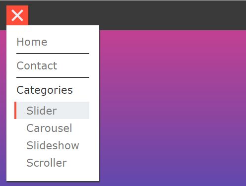
Sliding Hamburger Navbar With jQuery And CSS
| File Size: | 1.79 KB |
|---|---|
| Views Total: | 1541 |
| Last Update: | |
| Publish Date: | |
| Official Website: | Go to website |
| License: | MIT |

An animated hamburger navigation for the web.
This project makes use of jQuery and CSS/CSS3 to create an animated hamburger toggle that slides out a horizontal navbar when getting clicked.
How to use it:
1. Add the hamburger toggle and your menu list to the navbar.
<div class="menu">
  <span class="toggle">
    <i></i>
    <i></i>
    <i></i>
  </span>
  <div class="menuContent">
    <ul>
      <li>Home</li>
      <li>About</li>
      <li>Contact</li>
      <li>Blog</li>
      <li>About us</li>
    </ul>
  </div>
</div>
2. The core CSS styles for the navbar.
.menu {
  height: 70px;
  width: 70px;
  right: 70px;
  top: 20px;
  text-align: center;
  position: absolute;
  background: #fafafa;
  overflow: hidden;
  transition: all 0.2s ease;
  z-index: 999;
}

.menu.active {
  width: calc(100% - 140px);
}

.menu.active .menuContent * {
  opacity: 1;
}

.menu .menuContent {
  position: absolute;
  width: 100%;
  height: 100%;
  line-height: 40px;
  right: 0px;
  text-align: center;
}

.menu .menuContent * {
  opacity: 0;
}

.menu .menuContent ul li {
  display: inline-block;
  margin-left: 50px;
  margin-right: 50px;
  color: #2d3235;
  transition: opacity 0.3s ease 0.3s;
  cursor: pointer;
  position: relative;
}

.menu .menuContent ul li:hover:before {
  opacity: 0.8;
  top: 13px;
  left: 20px;
}

.menu .menuContent ul li:hover:after {
  opacity: 0.8;
  bottom: 13px;
  left: -20px;
}

.menu .menuContent ul li:before, .menu .menuContent ul li:after {
  content: "";
  position: absolute;
  width: 20px;
  height: 2px;
  background: #ccc;
  transition: all 0.3s ease;
}

.menu .menuContent ul li:before {
  transform: rotate(-55deg);
  left: 60px;
  top: -30px;
  opacity: 0;
  right: 0;
  margin: auto;
}

.menu .menuContent ul li:after {
  transform: rotate(-55deg);
  left: -60px;
  bottom: -30px;
  opacity: 0;
  right: 0;
  margin: auto;
}
3. Style the hamburger menu toggle.
.menu.active span i:nth-child(1) {
  transform: rotate(-45deg) translate(-50%, -50%);
  top: 50%;
}

.menu.active span i:nth-child(2) {
  transform: translateX(-100px);
  opacity: 0;
}

.menu.active span i:nth-child(3) {
  transform: rotate(45deg) translate(-50%, -50%);
  top: 50%;
}

.menu span {
  width: 70px;
  height: 70px;
  position: absolute;
  right: 0;
  cursor: pointer;
  background: #fafafa;
  z-index: 1;
}

.menu span i {
  position: absolute;
  transform-origin: 50% 50%;
  width: 45%;
  height: 2px;
  left: 0;
  right: 0;
  margin: auto;
  background-color: #ccc;
  transition: transform 0.3s ease, opacity 0.1s ease 0.1s;
}

.menu span i:nth-child(1) {
  top: 40%;
}

.menu span i:nth-child(2) {
  top: 50%;
}

.menu span i:nth-child(3) {
  top: 60%;
}
4. The core JavaScript to enable the hamburger navbar. Copy and paste the following JS snippets after jQuery library and done.
<script src="/path/to/cdn/jquery.slim.min.js"></script>
$('.toggle').on('click', function() {
  $('.menu').toggleClass('active');
});
This awesome jQuery plugin is developed by mrakhmadjon. For more Advanced Usages, please check the demo page or visit the official website.