Responsive Multilevel Dropdown Menu Plugin With jQuery
| File Size: | 4.4 KB |
|---|---|
| Views Total: | 7729 |
| Last Update: | |
| Publish Date: | |
| Official Website: | Go to website |
| License: | MIT |
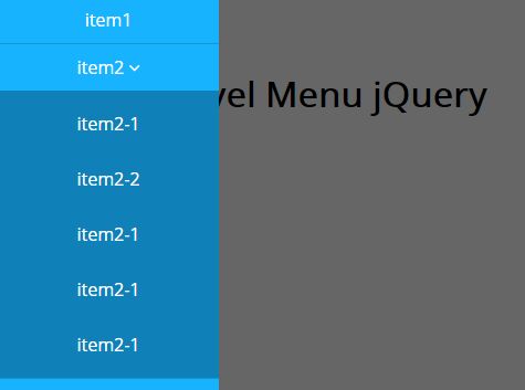
RWD Multilevel Menu makes use of jQuery and CSS3 to converts the normal horizontal dropdown menu into a sliding side menu on mobile devices.
How to use it:
1. Create the html for the multi-level menu.
<div id="pageslide" class="navBox">
  <ul>
    <li> <a href="h#">item1</a> </li>
    <li> <a href="#">item2<i class="fa fa-angle-down"></i></a>
      <ul class="dropNav">
        <li><a href="#">item2-1</a></li>
        <li><a href="#">item2-2</a></li>
        <li><a href="#">item2-1</a></li>
        <li><a href="#">item2-1</a></li>
        <li><a href="#">item2-1</a></li>
      </ul>
    </li>
    <li> <a href="#">item3<i class="fa fa-angle-down"></i></a>
      <ul class="dropNav">
        <li><a href="#">item3-1</a></li>
        <li><a href="#">item3-2</a></li>
        <li><a href="#">item3-1</a></li>
        <li><a href="#">item3-1</a></li>
        <li><a href="#">item3-1</a></li>
      </ul>
    </li>
    <li> <a href="#">item4</a> </li>
    <li> <a href="#">item5</a> </li>
  </ul>
</div>
2. Create a link to toggle the side menu.
<a id="openPageslide" href="#pageslide"><span></span></a>
3. The primary CSS/CSS3 styles for the multi-level menu.
.navBox {
  overflow: hidden;
  background: #18B3FF;
}

.navBox a {
  display: block;
  padding: 14px 10px;
  color: #fff;
  text-align: center;
  text-decoration: none;
}

.navBox .active { background: #474747; }

.navBox ul {
  max-width: 990px;
  margin: 0 auto;
  overflow: hidden;
}

.navBox ul li {
  float: left;
  list-style: none;
}

.navBox ul li .fa { padding-left: 4px; }

.navBox .dropNav {
  display: none;
  width: 100%;
  padding: 5px 0;
  position: absolute;
  left: 0;
  right: 0;
  top: inherit;
  background: #474747;
  z-index: 7;
  overflow: hidden;
}

.navBox>ul>li.active { background-color: #474747; }

@media only screen and (min-width: 991px) {

#openPageslide { display: none; }

#pageslide { display: block !important; }

.pageslideBg { display: none !important; }
}
4. Style the multi-level menu on small screens (screen size < 990px.)
@media screen and (max-width: 990px) {

.navBox ul li { float: none; }

.navBox>ul>li { border-bottom: 1px solid #1C93CE; }

.navBox>ul>li>a { padding: 10px; }

.navBox .dropNav {
  position: static;
  background: #0F80B8;
}

#openPageslide {
  display: block;
  padding: 14px 10px;
  width: 28px;
  border-radius: 6px;
}

#openPageslide span {
  height: 7px;
  display: block;
  border: 1px solid #0F80B8;
  border-width: 5px 0;
}

#pageslide {
  display: none;
  width: 200px;
  position: fixed;
  top: 0;
  left: -200px;
  height: 100%;
  z-index: 999999;
  overflow-y: auto;
}

.pageslideBg {
  display: none;
  position: fixed;
  width: 100%;
  height: 100%;
  top: 0;
  left: 0;
  background: rgba(0,0,0,0.6);
  z-index: 9998;
}
}
5. Style the multi-level menu on small screens (screen size < 990px.)
@media screen and (max-width: 990px) {

.navBox ul li { float: none; }

.navBox>ul>li { border-bottom: 1px solid #1C93CE; }

.navBox>ul>li>a { padding: 10px; }

.navBox .dropNav {
  position: static;
  background: #0F80B8;
}

#openPageslide {
  display: block;
  padding: 14px 10px;
  width: 28px;
  border-radius: 6px;
}

#openPageslide span {
  height: 7px;
  display: block;
  border: 1px solid #0F80B8;
  border-width: 5px 0;
}

#pageslide {
  display: none;
  width: 200px;
  position: fixed;
  top: 0;
  left: -200px;
  height: 100%;
  z-index: 999999;
  overflow-y: auto;
}

.pageslideBg {
  display: none;
  position: fixed;
  width: 100%;
  height: 100%;
  top: 0;
  left: 0;
  background: rgba(0,0,0,0.6);
  z-index: 9998;
}
}
6. Include the latest version of jQuery library at the bottom of the webpage.
<script src="//code.jquery.com/jquery-3.0.0.min.js"></script>
7. The core JavaScript for the dropdown menu.
var responsiveWidth = 990;
var _widthResize;

$(window).resize(function() {
    _widthResize = $(this).width() > responsiveWidth;
}).resize();

$('.navBox >ul >li').hover(function(){
  if(_widthResize){
    var _this = $(this);
    _this.addClass('active').children('.dropNav').stop(true, true).slideDown(300);
  }
} , function(){
  if(_widthResize){
    $(this).removeClass('active').children('.dropNav').stop(true, true).hide();
  }
});

$('.dropNav').parent('li').click(function(e) {
  if(!_widthResize){
    $(this).children('.dropNav').stop(true, true).slideToggle(300);
    e.preventDefault();
  }
});
8. The core JavaScript for the side menu.
(function($){
  $.fn.extend({

    sideNav : function(){
      if( $('.pageslideBg').length == 0 ) {
            $('<div />').attr( 'class', 'pageslideBg' ).appendTo( $('body') );
        }
        var $btn = $(this),
          $pageslide = $($btn.attr("href")),
        $pageslideBg = $('.pageslideBg'),
        _width = $pageslide.width();
      $btn.click(function(){
        $pageslideBg.show();
        $pageslide.css({ 'display':'block'}).animate({'left':0 });
        return false;
      });
      $pageslideBg.click(function() {
        $(this).hide();
        $pageslide.animate({'left': _width*-1 + 'px' },function(){
          $(this).hide();
        });
        return false;
      });

      return this;
    }

  });
})(jQuery);

$("#openPageslide").sideNav();
This awesome jQuery plugin is developed by github693626. For more Advanced Usages, please check the demo page or visit the official website.


