Sticky Morphing Side Navigation With jQuery And CSS3
| File Size: | 2.78 KB |
|---|---|
| Views Total: | 2544 |
| Last Update: | |
| Publish Date: | |
| Official Website: | Go to website |
| License: | MIT |
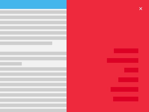
This is a cool Material Design inspired page navigation that will morph into a fixed side menu when the users click on the toggle button. Built with HTML list, CSS3 trasnsitions/transforms/animations and a little JQuery script.
How to use it:
1. Create the side navigation menu together with its toggle button on the webpage.
<div class="menu-expanded">
  <div id="menu" class="menu"></div>
  <span class="linee linea1"></span>
  <span class="linee linea2"></span>
  <span class="linee linea3"></span>
  <div class="main-menu">
    <ul>
      <li><a href="#">Home</a></li>
      <li><a href="#">Categories</a></li>
      <li><a href="#">Works</a></li>
      <li><a href="#">Portfolio</a></li>
      <li><a href="#">Contact Us</a></li>
      <li><a href="#">About Us</a></li>
    </ul>
  </div>
</div>
2. The primary CSS styles for the side navigation.
.menu-expanded {
  background-color: transparent;
  position: fixed;
  width: 340px;
  height:100%;
  top: 0px;
  right: 0px;
  overflow: hidden !important;
  z-index: 5;
}

.menu {
  float: right;
  margin: 15px 15px 0 0;
  height: 49px;
  width: 49px;
  border-radius: 50%;
  background-color: #EE283D;
  border: none;
  transition: all 0.40s ease-out;
}

.main-menu {
  visibility: hidden;
  position: absolute;
  right: 50px;
  top: 160px;
  opacity: 0;
  transition: all 0.300s;
  transition-delay: 0s;
}

.main-menu ul {
  list-style-type: none;
}

.main-menu ul li {
  margin: 20px 0px;
}

.main-menu ul li a {
  float: right;
  text-decoration: none;
  color: transparent;
  background-color: #DB0024;
  margin-top: 20px;
}

.main-menu ul li a:hover {
  opacity: 0.7;
}
3. The primary CSS styles for menu toggle button (hamburger toggle).
.menu,
.linee {
  cursor: pointer;
}

.over {
  transform: scale(100);
  transition: all 0.350s ease-in;
  cursor: default;
}

.linea1 {
  background: #fff;
  height: 2px;
  width: 15px;
  position: absolute;
  right: 33px;
  top: 33px;
  transition: all 0.3s;
}

.linea2 {
  background: #fff;
  height: 2px;
  width: 15px;
  position: absolute;
  right: 33px;
  top: 38px;
  opacity: 1;
  transition: opacity 0.5s;
}

.linea3 {
  background: #fff;
  height: 2px;
  width: 15px;
  position: absolute;
  right: 33px;
  top: 43px;
}

.overL1 {
  animation: closetop 1s forwards;
  animation-direction: alternate;
  cursor: pointer;
}

.overL2 {
  opacity: 0;
  transition: opacity 0.5s;
  cursor: pointer;
}

.overL3 {
  animation: closebottom 1s forwards;
  animation-direction: alternate;
  cursor: pointer;
}
4. The required CSS/CSS3 styles for the morphing effect.
@keyframes closetop {
  0% {
    transform: translateY(5px) rotate(0deg);
  }
  25% {
    transform: translateY(5px) rotate(0deg);
  }
  75% {
    transform: translateY(5px) rotate(-45deg);
  }
  100% {
    transform: translateY(5px) rotate(-45deg);
  }
}

@keyframes closebottom {
  0% {
    transform: translateY(0px) rotate(0deg);
  }
  25% {
    transform: translateY(-5px) rotate(0deg);
  }
  75% {
    transform: translateY(-5px) rotate(45deg);
  }
  100% {
    transform: translateY(-5px) rotate(45deg);
  }
}

.overmain {
  visibility: visible;
  opacity: 1;
  transition: all 0.400s;
  transition-delay: 0.370s;
}
5. Load the latest version of jQuery JavaScript library in the webpage.
<script src="//code.jquery.com/jquery-3.1.0.slim.min.js"></script>
6. The jQuery script to toggle the CSS classes based on the menu state.
$('.menu , .linee').on('click', function() {
  $('.menu').toggleClass('over')
  $('.linea1').toggleClass('overL1')
  $('.linea2').toggleClass('overL2')
  $('.linea3').toggleClass('overL3')
  $('.main-menu').toggleClass('overmain')
});
This awesome jQuery plugin is developed by tomma5o. For more Advanced Usages, please check the demo page or visit the official website.