Simplest Responsive Nav Menu With jQuery And CSS3 - nav-mobile.js
| File Size: | 3.14 KB |
|---|---|
| Views Total: | 9253 |
| Last Update: | |
| Publish Date: | |
| Official Website: | Go to website |
| License: | MIT |
Just another jQuery & CSS based mobile-friendly navigation system that automatically converts the regular horizontal site menu into a sliding dropdown menu with a toggle link.
How to use it:
1. Create the site navigation with a mobile menu toggle link on your webpage.
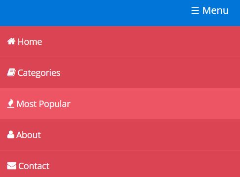
<nav class="nav">
<a class="toggle-nav" href="#">☰</a>
<div class="nav-mobile">
<ul class="left">
<li><a href="#">Home</a></li>
<li><a href="#">Categories</a></li>
<li><a href="#">Most Popular</a></li>
</ul>
<ul class="right">
<li>
<a href="#">About</a>
</li>
<li>
<a href="#">Contact</a>
</li>
</ul>
</div>
</nav>
2. The CSS to style the site navigation.
a {
  color: #fff;
  text-decoration: none;
}

ul { list-style: none; }

.nav {
  background: #0275d8;
  min-height: 50px;
}

.nav .left {
  float: left;
  margin-left: 1em;
}

.nav .left li {
  border-bottom: 1px solid #ED5565;
  font-size: 14px;
  float: left;
}

.nav .left li a {
  display: block;
  padding: 10px 15px;
  line-height: 30px;
}

.nav .left li a:hover { background: #ED5565; }

.nav .right {
  float: right;
  margin-right: 1em;
}

.nav .right li {
  border-bottom: 1px solid #ED5565;
  font-size: 14px;
  float: left;
}

.nav .right li a {
  display: block;
  padding: 10px 15px;
  line-height: 30px;
}

.nav .right li a:hover { background: #ED5565; }

.toggle-nav { display: none; }

.nav-mobile style { display: block; }
3. Style the dropdown menu on small screens like mobile & tablet using CSS3 media queries.
@media only screen and (max-width: 768px) {

.nav { border-bottom: 1px solid rgba(0,0,0,0.1); }

.toggle-nav {
  display: block;
  padding: 10px;
  position: absolute;
  right: 10px;
  line-height: 30px;
}

.toggle-nav:after { content: ' Menu'; }

.nav-mobile { display: none; }

.style-mobile {
  background: #DA4453;
  top : 51px;
  position : absolute;
  width : 100%;
}

.style-mobile li {
  display: block;
  width: 100%;
}

.nav .right {
  display: block;
  float: none;
  margin: 0em;
}

.nav .left {
  display: block;
  float: none;
  margin: 0em;
}

}
4. Include the necessary jQuery library at the bottom of your webpage.
<script src="//code.jquery.com/jquery-2.2.1.min.js"></script>
5. Active the responsive nav menu with a little jQuery script.
$(function(){

  // Returns width of browser viewport
  var browser = $(window).width();
  // Returns width of HTML document
  var document = $(document).width();

  var nav = $('.nav .toggle-nav');

  nav.click(function(e){
      $('.nav .nav-mobile').addClass('style-mobile').slideToggle('slow');
      e.preventDefault();
  });

});
This awesome jQuery plugin is developed by JhonatanC. For more Advanced Usages, please check the demo page or visit the official website.


