Smooth Sidebar Navigation with jQuery and CSS3
| File Size: | 2.24 KB |
|---|---|
| Views Total: | 18188 |
| Last Update: | |
| Publish Date: | |
| Official Website: | Go to website |
| License: | MIT |
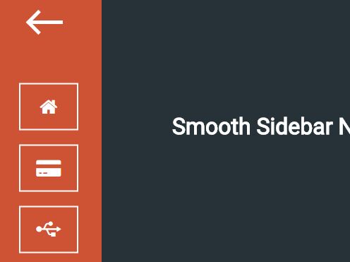
A jQuery based sidebar navigation helps you create an off-canvas sidebar navigation menu with smooth transitions based on CSS3 animations.
How to use it:
1. Create a list of menu items for the sidebar navigation.
<nav class="nav-container hidden hideNav">
  <ul class="nav-list">
    <li class="list-item">Menu Item 1</li>
    <li class="list-item">Menu Item 2</li>
    <li class="list-item">Menu Item 3</li>
    <li class="list-item">Menu Item 4</li>
    <li class="list-item">Menu Item 5</li>
  </ul>
</nav>
2. Create a hamburger menu toggle button that will morph into an arrow when clicked on.
<button class="btn-nav">
  <div class="bar arrow-top-r"></div>
  <div class="bar arrow-middle-r"></div>
  <div class="bar arrow-bottom-r"></div>
</button>
3. The core CSS / CSS3 styles for the sidebar navigation.
.nav-container {
  position: absolute;
  left: -50%;
  top: 0;
  background: #CD5334;
  height: 100%;
  width: 150px;
}

.nav-list {
  cursor: pointer;
  list-style-type: none;
  top: 50%;
  text-align: center;
  position: relative;
  margin: 0;
  padding: 0;
  -webkit-transform: translateY(-50%);
  -moz-transform: translateY(-50%);
  -ms-transform: translateY(-50%);
  -o-transform: translateY(-50%);
  transform: translateY(-50%);
}

.list-item {
  margin: 20px auto;
  border: 2px solid #fff;
  width: 50px;
  padding: 15px;
  -webkit-transition: all 1s ease;
  -moz-transition: all 1s ease;
  -ms-transition: all 1s ease;
  -o-transition: all 1s ease;
  transition: all 1s ease;
}

.list-item:hover {
  border: 2px solid #17BEBB;
  -webkit-transition: all 1s ease;
  -moz-transition: all 1s ease;
  -ms-transition: all 1s ease;
  -o-transition: all 1s ease;
  transition: all 1s ease;
}

@keyframes
showNav { from {
 left: -100%;
}

to { left: 0; }
}

@-webkit-keyframes
showNav { from {
 left: -100%;
}

to { left: 0; }
}

@-moz-keyframes
showNav { from {
 left: -100%;
}

to { left: 0; }
}

@-o-keyframes
showNav { from {
 left: -100%;
}

to { left: 0; }
}

.showNav {
  -webkit-animation: showNav .5s ease forwards;
  -moz-animation: showNav 1s ease forwards;
  -o-animation: showNav 1s ease forwards;
  animation: showNav .5s ease forwards;
}

@keyframes
hideNav { from {
 left: 0;
}

to { left: -100%; }
}

@-webkit-keyframes
hideNav { from {
 left: 0;
}

to { left: -100%; }
}

@-moz-keyframes
hideNav { from {
 left: 0;
}

to { left: -100%; }
}

@-o-keyframes
hideNav { from {
 left: 0;
}

to { left: -100%; }
}

.hideNav {
  -webkit-animation: hideNav 1s ease forwards;
  -moz-animation: hideNav 1s ease forwards;
  -o-animation: hideNav 1s ease forwards;
  animation: hideNav 1s ease forwards;
}
4. Style & animate the hamburger toggle button.
button {
  background: none;
  border: none;
}

.btn-nav:hover { cursor: pointer; }

.btn-nav:hover .bar { background: #17BEBB; }

.bar {
  display: block;
  height: 5px;
  width: 50px;
  background: #fff;
  margin: 10px auto;
}

.btn-nav {
  display: block;
  padding: 15px 0;
  width: 50px;
  position: fixed;
  left: 20px;
  margin: 0 auto;
  -webkit-transition: all 1s ease;
  -moz-transition: all 1s ease;
  -ms-transition: all 1s ease;
  -o-transition: all 1s ease;
  transition: all 1s ease;
}

.btn-nav:focus { outline: none; }

.middle { margin: 0 auto; }

.bar {
  -webkit-transition: all .7s ease;
  -moz-transition: all .7s ease;
  -ms-transition: all .7s ease;
  -o-transition: all .7s ease;
  transition: all .7s ease;
}

.animated { z-index: 999; }

.animated .arrow-top-r {
  -webkit-transform: rotateZ(-45deg) translateY(11px);
  -moz-transform: rotateZ(-45deg) translateY(11px);
  -ms-transform: rotateZ(-45deg) translateY(11px);
  -o-transform: rotateZ(-45deg) translateY(11px);
  transform: rotateZ(-45deg) translateY(11px);
  width: 25px;
}

.animated .arrow-middle-r {
  -webkit-transform: translateX(25px);
  -moz-transform: translateX(25px);
  -ms-transform: translateX(25px);
  -o-transform: translateX(25px);
  transform: translateX(25px);
}

.animated .arrow-bottom-r {
  -webkit-transform: rotateZ(45deg) translateY(-11px);
  -moz-transform: rotateZ(45deg) translateY(-11px);
  -ms-transform: rotateZ(45deg) translateY(-11px);
  -o-transform: rotateZ(45deg) translateY(-11px);
  transform: rotateZ(45deg) translateY(-11px);
  width: 25px;
}
5. Put the latest version of jQuery library at the end of the document.
<script src="//code.jquery.com/jquery-2.1.4.min.js"></script>
6. Use jQuery methods to toggle CSS classes as you open / close the sidebar navigation.
$(window).load(function() {
   $(".btn-nav").on("click tap", function() {
     $(".nav-container").toggleClass("showNav hideNav").removeClass("hidden");
     $(this).toggleClass("animated");
   });
 });
This awesome jQuery plugin is developed by tonkec. For more Advanced Usages, please check the demo page or visit the official website.