jQuery Dynamic & Sticky Website Header Plugin - HeadShrinker
| File Size: | 19.8KB |
|---|---|
| Views Total: | 4909 |
| Last Update: | |
| Publish Date: | |
| Official Website: | Go to website |
| License: | MIT |
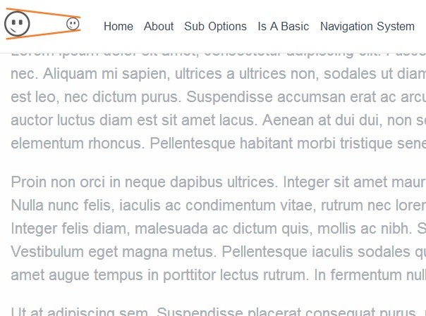
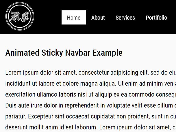
Head Shrinker is jQuery plugin that shrinks your website header section and makes it sticky at the top of your web page when scrolling down. Ideal for creating a fixed position top navigation menu for your website.
How it works:
The body class of "headshrinker" is added when the plugin is active.Head Shrinker also adds a class of "headshrunk" onto the cloned header in case you want to overwrite CSS specifically.
See also:
- jQuery Plugin For Sticky Header Elements - clingify
- jQuery Plugin For iOS List-Style Sticky Headers - Stacks
- Fixed Position Top Menu Bar with jQuery and CSS3 - nagging-menu
- Sticky Top Menu Bar with CSS3
How to use it:
1. Include the required Head Shrinker stylesheet in the head section.
<link rel="stylesheet" href="headshrinker.css" media="all" />
2. Create a header section that will be cloned as a sticky top menu bar when scrolling down the page.
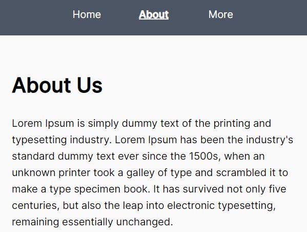
<header>
<nav>
<ul>
<li><a href="#">Home</a></li>
<li><a href="#">About</a></li>
<li><a href="#">Contact</a></li>
</ul>
</nav>
</header>
3. Include necessary javascript library files at the bottom of your page.
<script src="http://code.jquery.com/jquery-latest.min.js"></script>
<script src="jquery.headshrinker.js"></script>
4. Call the plugin with options.
<script>
jQuery(document).ready(function () {
jQuery('header').headshrinker({
fontSize: "17px",
mobileMenu: true
});
});
</script>
5. All the options.
<script>
jQuery(document).ready(function () {
jQuery('header').headshrinker({
zindex: 99999, // set CSS z-index
shrinkBy: 2, // shrink by this multiple
fontSize: "", // add font size in here
shrinkMenu: false, // convert menu to hamburger in all instances
revealAlign: "right", // left or right hamburger menu
revealTop: "12px", // adjust top positioning of hamburger menu
shrinkMenuTop: "69px", // adjust top positioning of the flyout menu
menuSwitch: 768, // aimed at the mobile experience, when menu is this width, convert to hamburger
navTarget: 'nav', // this is the element WITHIN the cloned headshrinker bar
mobileMenu: false // set to true if you want to remove the desktop menu and replace with headshrinker when in mobile view (menuSwitch)
});
});
</script>
This awesome jQuery plugin is developed by weare2ndfloor. For more Advanced Usages, please check the demo page or visit the official website.