jQuery Plugin For Fixed Bootstrap 4 Nav With Smooth Scroll - navbar-fixed.js
| File Size: | 4.94 KB |
|---|---|
| Views Total: | 30592 |
| Last Update: | |
| Publish Date: | |
| Official Website: | Go to website |
| License: | MIT |
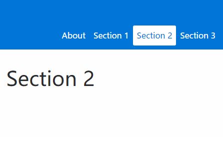
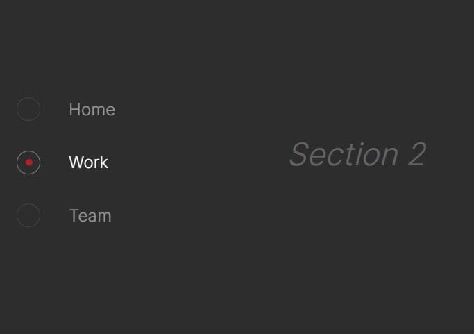
navbar-fixed.js is a very small jQuery plugin used to extend the default fixed Bootstrap navbar component with scrollspy and smooth scroll support.
How to use it:
1. Add Bootstrap to your web project using the Bootstrap CDN:
<link rel="stylesheet" href="/path/to/bootstrap.min.css">
<script src="/path/to/jquery.slim.min.js"></script>
<script src="/path/to//tether.min.js"></script>
<script src="/path/to/bootstrap.min.js"></script>
2. Add the following JavaScript and CSS files to your Bootstrap project.
<link rel="stylesheet" href="navbar-fixed.css">
<script src="navbar-fixed.js"></script>
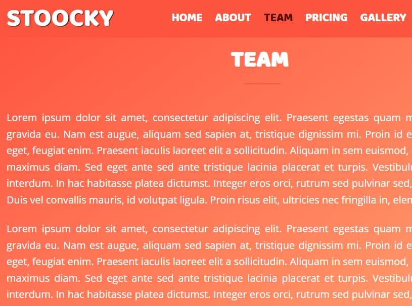
3. Create a fixed top navbar containing anchor links:
<nav class="navbar navbar-toggleable-sm fixed-top bg-primary navbar-light">
  <button class="navbar-toggler navbar-toggler-right" type="button" data-toggle="collapse" data-target="#navbarSupportedContent" aria-controls="navbarSupportedContent" aria-expanded="false" aria-label="Toggle navigation">
     <span class="navbar-toggler-icon"></span>
   </button>
  <div class="collapse navbar-collapse justify-content-end" id="navbarSupportedContent">
    <ul class="navbar-nav">
      <li class="nav-item">
        <a class="nav-link active" href="#about">About</a>
      </li>
      <li class="nav-item">
        <a class="nav-link" href="#section1">Section 1</a>
      </li>
      <li class="nav-item">
        <a class="nav-link" href="#section2">Section 2</a>
      </li>
      <li class="nav-item">
        <a class="nav-link" href="#section3">Section 3</a>
      </li>
    </ul>
  </div>
</nav>
3. Create your own sectioned content:
<div class="container-fluid section bg-primary" style="height: 50%;" id="about">
  <div class="container text-center">
    <div class="row align-items-center">
      <div class="col">
        <h1 class="text-light">Navbar-Scroller</h1>
        <p>For Fixed Nav with Bootstrap 4 Alpha 6</p>
      </div>
    </div>
  </div>
</div>
<div class="container-fluid section" style="height: 50%;" id="section1">
  <div class="container text-center">
    <div class="row align-items-center">
      <div class="col">
        <h1 class="text-light">Example Section 1</h1>
      </div>
    </div>
  </div>
</div>
<div class="container-fluid section" style="height: 50%; background-color: #fefefe" id="section2">
  <div class="container text-center">
    <div class="row align-items-center">
      <div class="col">
        <h1 class="text-light">Example Section 2</h1>
      </div>
    </div>
  </div>
</div>
<div class="container-fluid section" style="height: 100%;" id="section3">
  <div class="container text-center">
    <div class="row align-items-center">
      <div class="col">
        <h1 class="text-light">Example Section 3</h1>
      </div>
    </div>
  </div>
</div>
Change log:
2017-04-18
- added exception to trigger last section if it is <100% of window size
This awesome jQuery plugin is developed by ts-de. For more Advanced Usages, please check the demo page or visit the official website.