jQuery Responsive Sticky Mobile Menu Plugin - mobilize
| File Size: | 184 KB |
|---|---|
| Views Total: | 1219 |
| Last Update: | |
| Publish Date: | |
| Official Website: | Go to website |
| License: | MIT |
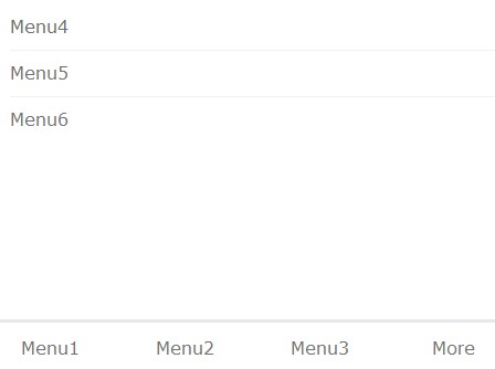
mobilize is a jQuery navigation menu plugin optimized for mobile that automatically hides overflowing menu items and shows them under "more" button on small screen devices. Resize and refresh the demo page to see it in action. By default, the menu is sticky at the bottom of the page and you can change it however you like in the mobilize.css.
How to use it:
1. Include the jQuery javascript library and other resources in your Html document.
<link rel="stylesheet" href="http://cdnjs.cloudflare.com/ajax/libs/normalize/3.0.1/normalize.min.css">
<script src="http://ajax.googleapis.com/ajax/libs/jquery/1.11.1/jquery.min.js"></script>
<script src="js/mobilize.js"></script>
2. Create the Html for a navigation menu. Add the CSS class 'main-item' to the list items you want to in the sticky menu.
<div class="demo">
<ul>
<li class="main-item"><a href="">Menu1</a></li>
<li class="main-item"><a href="">Menu2</a></li>
<li class="main-item"><a href="">Menu3</a></li>
<li><a href="">Menu4</a></li>
<li><a href="">Menu5</a></li>
<li><a href="">Menu6</a></li>
</ul>
</div>
3. Call the plugin on the parent element and set the responsive breakpoint, menu item name and CSS name for the navigation menu.
<script>
$('.demo').mobilize(729, "More", "mobilize.css");
</script>
This awesome jQuery plugin is developed by mathiasrando. For more Advanced Usages, please check the demo page or visit the official website.


