Mobile App-style Bootstrap 4 Navbar In JavaScript - BMN
| File Size: | 10.7 KB |
|---|---|
| Views Total: | 4932 |
| Last Update: | |
| Publish Date: | |
| Official Website: | Go to website |
| License: | MIT |
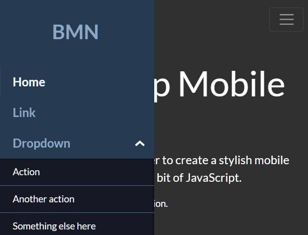
BMN.js (Bootstrap Mobile Nav) is a JavaScript plugin to extend the Bootstrap 4 navbar that converts the regular collapse menu (responsive behavior) into a mobile-friendly sidebar menu on mobile devices.
Built with vanilla JavaScript and without the need of Bootstrap 4's JavaScript.
How to use it:
1. Load the necessary Bootstrap 4's stylesheet in the document's head section.
<link rel="stylesheet" href="/path/to/bootstrap.min.css" />
2. Load the Bootstrap Mobile Nav plugin's JavaScript and CSS files.
<!-- BMN CSS-->
<link rel="stylesheet" href="./bmn/bmn.css" />
<!-- BMN JS -->
<script src="./bmn/bmn.min.js"></script>
3. Initialize the BMN plugin on the regular Bootstrap 4 navbar and done.
<nav class="navbar navbar-expand-lg navbar-light bg-light">
  <a class="navbar-brand" href="#">Navbar</a>
  <button class="navbar-toggler" type="button" data-toggle="collapse" data-target="#navbarSupportedContent" aria-controls="navbarSupportedContent" aria-expanded="false" aria-label="Toggle navigation">
    <span class="navbar-toggler-icon"></span>
  </button>

  <div class="collapse navbar-collapse" id="navbarSupportedContent">
    <ul class="navbar-nav mr-auto">
      <li class="nav-item active">
        <a class="nav-link" href="#">Home <span class="sr-only">(current)</span></a>
      </li>
      <li class="nav-item">
        <a class="nav-link" href="#">Link</a>
      </li>
      <li class="nav-item dropdown">
        <a class="nav-link dropdown-toggle" href="#" id="navbarDropdown" role="button" data-toggle="dropdown" aria-haspopup="true" aria-expanded="false">
          Dropdown
        </a>
        <div class="dropdown-menu" aria-labelledby="navbarDropdown">
          <a class="dropdown-item" href="#">Action</a>
          <a class="dropdown-item" href="#">Another action</a>
          <div class="dropdown-divider"></div>
          <a class="dropdown-item" href="#">Something else here</a>
        </div>
      </li>
      <li class="nav-item">
        <a class="nav-link disabled" href="#" tabindex="-1" aria-disabled="true">Disabled</a>
      </li>
    </ul>
    <form class="form-inline my-2 my-lg-0">
      <input class="form-control mr-sm-2" type="search" placeholder="Search" aria-label="Search">
      <button class="btn btn-outline-success my-2 my-sm-0" type="submit">Search</button>
    </form>
  </div>
</nav>
var bmn = new BMN();
bmn.init({
  // options here
});
4. The Bootstrap mobile nav is left-aligned by default and you can change the placement to right using the slideFrom options.
bmn.init({
  slideFrom: "right"
});
5. Create an off-canvas push menu. It means that the Bootstrap mobile nav will push the main content to the other side when toggled.
bmn.init({
  offCanvas: true
});
6. Specify the CSS selector of the menu toggler.
bmn.init({
  toggler: ".navbar-toggler"
});
7. Customize the icon of the dropdown menu.
bmn.init({
  dropdown: {
    icon: "chevron"
  }
});
8. Add a custom footer to the Bootstrap mobile nav.
const socialLinks = `
<ul class="bmn__social">
<li><a href="#">Facebook</a></li>
<li><a href="#">Twitter</a></li>
<li><a href="#">Github</a></li>
</ul>
`;

bmn.init({
  footer: {
    show: true,
    content: socialLinks
  }
});
This awesome jQuery plugin is developed by seekwhence. For more Advanced Usages, please check the demo page or visit the official website.