Responsive Navbar Active Animation For Bootstrap 4
| File Size: | 7.36 KB |
|---|---|
| Views Total: | 6659 |
| Last Update: | |
| Publish Date: | |
| Official Website: | Go to website |
| License: | MIT |
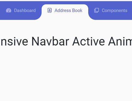
Make use of jQuery and CSS3 to apply a fancy menu active animation to Bootstrap 4 navbar.
Well suited for one page scrolling website that allows you to switch between nav items just like a tabs component.
How to use it:
1. Load the necessary resources in the document.
<link rel="stylesheet" href="/path/to/cdn/bootstrap.min.css" />
<link rel="stylesheet" href="/path/to/cdn/font-awesome/all.min.css" />
<script src="/path/to/cdn/jquery.slim.min.js"></script>
<script src="/path/to/cdn/bootstrap.bundle.min.js"></script>
2. Create a navbar in the document.
<nav class="navbar navbar-expand-lg navbar-mainbg">
  <a class="navbar-brand navbar-logo" href="#">Navbar</a>
  <button class="navbar-toggler" type="button" data-toggle="collapse" data-target="#navbarSupportedContent" aria-controls="navbarSupportedContent" aria-expanded="false" aria-label="Toggle navigation">
  <i class="fas fa-bars text-white"></i>
  </button>
  <div class="collapse navbar-collapse" id="navbarSupportedContent">
    <ul class="navbar-nav ml-auto">
      <div class="hori-selector"><div class="left"></div><div class="right"></div></div>
      <li class="nav-item">
        <a class="nav-link" href="javascript:void(0);"><i class="fas fa-tachometer-alt"></i>Dashboard</a>
      </li>
      <li class="nav-item active">
        <a class="nav-link" href="javascript:void(0);"><i class="far fa-address-book"></i>Address Book</a>
      </li>
      <li class="nav-item">
        <a class="nav-link" href="javascript:void(0);"><i class="far fa-clone"></i>Components</a>
      </li>
      <li class="nav-item">
        <a class="nav-link" href="javascript:void(0);"><i class="far fa-calendar-alt"></i>Calendar</a>
      </li>
      <li class="nav-item">
        <a class="nav-link" href="javascript:void(0);"><i class="far fa-chart-bar"></i>Charts</a>
      </li>
      <li class="nav-item">
        <a class="nav-link" href="javascript:void(0);"><i class="far fa-copy"></i>Documents</a>
      </li>
    </ul>
  </div>
</nav>
3. The required CSS styles.
.navbar-logo {
  padding: 15px;
  color: #fff;
}

.navbar-mainbg {
  background-color: #5161ce;
  padding: 0px;
}

#navbarSupportedContent {
  overflow: hidden;
  position: relative;
}

#navbarSupportedContent ul {
  padding: 0px;
  margin: 0px;
}

#navbarSupportedContent ul li a i {
  margin-right: 10px;
}

#navbarSupportedContent li {
  list-style-type: none;
  float: left;
}

#navbarSupportedContent ul li a {
  color: rgba(255, 255, 255, 0.5);
  text-decoration: none;
  font-size: 15px;
  display: block;
  padding: 20px 20px;
  transition-duration: 0.6s;
  transition-timing-function: cubic-bezier(0.68, -0.55, 0.265, 1.55);
  position: relative;
}

#navbarSupportedContent>ul>li.active>a {
  color: #5161ce;
  background-color: transparent;
  transition: all 0.7s;
}

#navbarSupportedContent a:not(:only-child):after {
  content: "\f105";
  position: absolute;
  right: 20px;
  top: 10px;
  font-size: 14px;
  font-family: "Font Awesome 5 Free";
  display: inline-block;
  padding-right: 3px;
  vertical-align: middle;
  font-weight: 900;
  transition: 0.5s;
}

#navbarSupportedContent .active>a:not(:only-child):after {
  transform: rotate(90deg);
}

.hori-selector {
  display: inline-block;
  position: absolute;
  height: 100%;
  top: 0px;
  left: 0px;
  transition-duration: 0.6s;
  transition-timing-function: cubic-bezier(0.68, -0.55, 0.265, 1.55);
  background-color: #fff;
  border-top-left-radius: 15px;
  border-top-right-radius: 15px;
  margin-top: 10px;
}

.hori-selector .right,
.hori-selector .left {
  position: absolute;
  width: 25px;
  height: 25px;
  background-color: #fff;
  bottom: 10px;
}

.hori-selector .right {
  right: -25px;
}

.hori-selector .left {
  left: -25px;
}

.hori-selector .right:before,
.hori-selector .left:before {
  content: '';
  position: absolute;
  width: 50px;
  height: 50px;
  border-radius: 50%;
  background-color: #5161ce;
}

.hori-selector .right:before {
  bottom: 0;
  right: -25px;
}

.hori-selector .left:before {
  bottom: 0;
  left: -25px;
}

@media (max-width: 991px) {
  #navbarSupportedContent ul li a {
    padding: 12px 30px;
  }
  .hori-selector {
    margin-top: 0px;
    margin-left: 10px;
    border-radius: 0;
    border-top-left-radius: 25px;
    border-bottom-left-radius: 25px;
  }
  .hori-selector .left,
  .hori-selector .right {
    right: 10px;
  }
  .hori-selector .left {
    top: -25px;
    left: auto;
  }
  .hori-selector .right {
    bottom: -25px;
  }
  .hori-selector .left:before {
    left: -25px;
    top: -25px;
  }
  .hori-selector .right:before {
    bottom: -25px;
    left: -25px;
  }
}
4. The main JavaScript to activate the Responsive Navbar Active Animation.
function test(){
  var tabsNewAnim = $('#navbarSupportedContent');
  var selectorNewAnim = $('#navbarSupportedContent').find('li').length;
  var activeItemNewAnim = tabsNewAnim.find('.active');
  var activeWidthNewAnimHeight = activeItemNewAnim.innerHeight();
  var activeWidthNewAnimWidth = activeItemNewAnim.innerWidth();
  var itemPosNewAnimTop = activeItemNewAnim.position();
  var itemPosNewAnimLeft = activeItemNewAnim.position();
  $(".hori-selector").css({
    "top":itemPosNewAnimTop.top + "px",
    "left":itemPosNewAnimLeft.left + "px",
    "height": activeWidthNewAnimHeight + "px",
    "width": activeWidthNewAnimWidth + "px"
  });
  $("#navbarSupportedContent").on("click","li",function(e){
    $('#navbarSupportedContent ul li').removeClass("active");
    $(this).addClass('active');
    var activeWidthNewAnimHeight = $(this).innerHeight();
    var activeWidthNewAnimWidth = $(this).innerWidth();
    var itemPosNewAnimTop = $(this).position();
    var itemPosNewAnimLeft = $(this).position();
    $(".hori-selector").css({
      "top":itemPosNewAnimTop.top + "px",
      "left":itemPosNewAnimLeft.left + "px",
      "height": activeWidthNewAnimHeight + "px",
      "width": activeWidthNewAnimWidth + "px"
    });
  });
}
$(document).ready(function(){
  setTimeout(function(){ test(); });
});
$(window).on('resize', function(){
  setTimeout(function(){ test(); }, 500);
});
$(".navbar-toggler").click(function(){
  setTimeout(function(){ test(); });
});
This awesome jQuery plugin is developed by piyushpd. For more Advanced Usages, please check the demo page or visit the official website.