Custom Confirm Dialogs With Bootstrap 5 - PowerButtons
| File Size: | 244 KB |
|---|---|
| Views Total: | 14208 |
| Last Update: | |
| Publish Date: | |
| Official Website: | Go to website |
| License: | MIT |
PowerButtons (formerly confirmbutton.js) is a JavaScript/Bootstrap plugin that supercharges web buttons with extra functionality like adding confirmation dialogs, verifying conditions, and showing alert messages.
It offers smooth integration with jQuery but doesn't necessitate it. In the absence of Bootstrap, the plugin smartly falls back to the native JavaScript popup function.
How to use it:
1. Load the OPTIONAL jQuery library and Bootstrap 5 framework in the document.
<link rel="stylesheet" href="/path/to/cdn/bootstrap.min.css" />
<script src="/path/to/cdn/jquery.min.js"></script>
<script src="/path/to/cdn/bootstrap.min.js"></script>
2. Load the confirmbutton.js plugin.
<script src="dist/powerbuttons.js"></script>
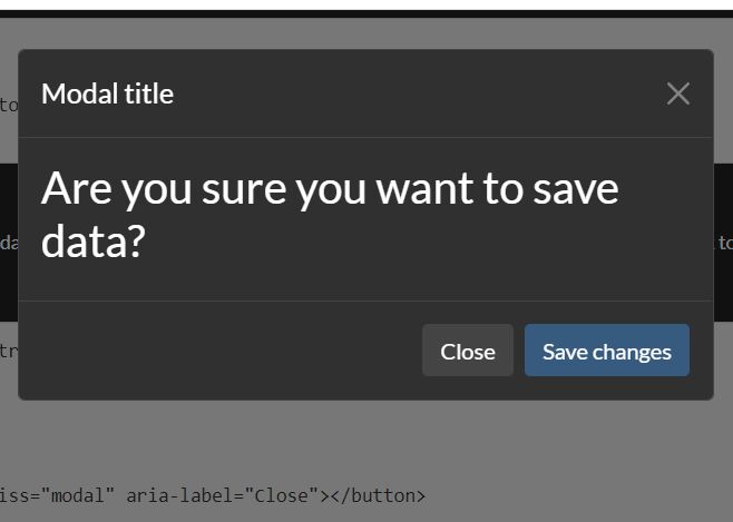
3. Enable a button to toggle a confirmation modal and define the confirmation message in the data-confirm attribute. All possible data attributes:
- data-confirm-custom-content: Custom content displayed under the confirm message. Defaults to null.
- data-confirm-title: Custom title of the confirm modal. The action requires confirmation.
- data-confirm-button-cancel: Text to show in the cancel button. Defaults to "Cancel".
- data-confirm-button-confirm: Text to show in the confirm button. Defaults to "Confirm".
- data-confirm-button-close: Shows a close button. Defaults to true.
- data-confirm-escape-key: Cancel the confirm using the escape key or pressing outside the dialog.
<button
  data-confirm="Are you sure?">
  Confirm Button
</button>
4. Create a verify button to ensure a condition is met before executing the intended function. If the condition fails, it presents a modal dialog to inform the user. Available data attributes for verify buttons:
- data-verify: Javascript code to evaluate. If it returns true, the verification will succeed.
- data-verify-form: The selector for the form to verify (or any HTML5 object). If it is set, the function will be evaluated in the context of the form.
- data-verify-verified: Message to show in the modal dialog if the verification succeeds. Defaults to null.
- data-verify-not-verified: Message to show if the verification fails. Defaults to "The condition for this action is not met".
- data-verify-custom-content-verified: Custom content displayed under the verify message when verified. Defaults to null.
- data-verify-custom-content-not-verified: Custom content displayed under the verify message when not verified. Defaults to null.
- data-verify-title-verified: Title of the modal dialog if the verification succeeds. Defaults to null.
- data-verify-title-not-verified: Title of the modal dialog if the verification fails. Defaults to "The action requires verification".
- data-verify-button-accept: Text to show in the confirmation button. Defaults to "Accept".
- data-verify-button-close: Shows a close button. Defaults to false.
- data-verify-escape-key: Cancel the verify using the escape key or pressing outside the dialog. Defaults to true.
- data-verify-header: Shows verify header. Defaults to true.
- data-verify-footer: Shows verify footer. Defaults to true.
<button
  data-verify="window.prompt('Type something') == ''"
  data-verify-not-verified="Text to show when not verified"
  onclick="alert('continue because you left the text blank')">
  Verify Button
</button>
5. Enable a button to toggle an alert message. Available data attributes:
- data-showmessage-title: Title of the alert message. Defaults to null.
- data-showmessage-custom-content: Custom content displayed under the alert message. Defaults to null.
- data-showmessage-button-accept: Text to show in the Accept button. Defaults to "Accept".
- data-showmessage-button-close: Shows a close button. Defaults to false.
- data-showmessage-escape-key: Cancel the alert message using the escape key or pressing outside the dialog. Defaults to true.
- data-showmessage-header: Shows alert header. Defaults to true.
- data-showmessage-footer: Shows alert footer. Defaults to true.
<button
  data-showmessage="Alert Message"
  onclick="alert('More Message')">
  Alert Message
</button>
6. Enable a button to alter the values of form fields before executing its action, allowing for setting hidden fields or pre-filling forms efficiently.
<form name="example">
    <input type="text" name="input1">
    <input type="text" name="input2">
</form>
<button
  data-formset="example"
  data-formset-input1="value for field 1"
  data-formset-input2="javascript:'value for field 2 taken from field 1 using javascript expression: ' + this.input1.value">
  Formset Buttong
</button>
7. Replace the button with a form containing the button and add hidden fields to be submitted with the button, eliminating the need for creating extraneous forms. Available data attributes:
- data-formbutton: The URL the form will be submitted to. Defaults to the current page URL.
- data-formbutton-method: Submit method. Defaults to "post".
- data-formbutton-form-class: Form class. Defaults to "formbutton".
- data-formbutton-form-id: Unique form ID. Defaults to null.
- data-formbutton-field-*: Additional form fields.
- data-formbutton-convert-case: Converts the case of the field names that are being created to kebab-case, snake_case, camelCase or PascalCase. The possible values are kebab, snake, camel or pascal. Defaults to "snake".
<button
  data-formbutton
  data-formbutton-field-id="hiddenvalue"
  name="form-button"
  value="1">
  Form Button
</button>
8. Enable a button to execute an asynchronous task before performing its actual action, displaying a modal dialog during execution. It's perfect for running lengthy tasks before form submissions. Available data attributes:
- data-asynctask: Javascript code to evaluate
- data-asynctask-title: Title of the modal. Defaults to "Please wait".
- data-asynctask-message: Message to show in the modal. Defaults to "Please wait while the task is being executed".
- data-asynctask-custom-content: Custom content displayed under the message. Defaults to null.
- data-asynctask-button-cancel: Text to show in the Cancel button. Defaults to "Cancel".
- data-asynctask-cancel: Code to execute if the task is cancelled. Defaults to null.
- data-asynctask-header: Shows header. Defaults to true.
- data-asynctask-footer: Shows footer. Defaults to true.
<button
  data-asynctask="task here', {mode:'no-cors'})">
  Async Task
</button>
9. You can also activate the plugin via JavaScript or jQuery.
let options = {
    confirm: "Are you sure?"
};
let mybutton = document.getElementById('button-id');
window.powerButtons('confirm', mybutton, options);
// OR jQuery
let options = {
    confirm: "Are you sure?"
};
$('#button-id').powerButtons('confirm', options);
// Multiple actions in the same button
$('#button-id').powerButtons('confirm', options).powerButtons('showmessage', {showmessage: "The confirmation has been done"});
10. All possible plugin options.
// confirm
confirm: "Please confirm this action",
customContent: null,
title: "The action requires confirmation",
buttonConfirm: "Confirm",
buttonCancel: "Cancel",
buttonClose: true,
escapeKey: true

// verify
verify: null,
form: null,
verified: null,
notVerified: "The condition for this action is not met",
customContentVerified: null,
customContentNotVerified: null,
titleNotVerified: "The action requires verification",
titleVerified: null,
buttonAccept: "Accept",
buttonClose: false,
escapeKey: true,
header: true,
footer: true

// alert message
showmessage: "This is a message",
customContent: null,
title: null,
buttonAccept: "Accept",
escapeKey: true,
buttonClose: true,
header: true,
footer: true

// formset
form: null,
fields: {}

// form button
formbutton: null,
method: 'post',
formClass: 'formbutton',
convertCase: 'none',
formId: null,
fields: {}
task: null,
message: "Please wait...",
customContent: null,
title: null,
buttonCancel: "Cancel",
cancel: null,
header: true,
footer: true,

// async task
task: null,
message: "Please wait...",
customContent: null,
title: null,
buttonCancel: "Cancel",
cancel: null,
header: true,
footer: true

// Callback
onDialogCreated: function (dlg) {
  dlg.addEventListener('show.bs.modal', function () {
     console.log("dialog shown");
  });
}
11. Localize the plugin.
window.powerButtons.defaults['config'] = {
  confirm: "Please confirm your action",
  title: "This action requires confirmation",
  buttonConfirm: "Confirm",
  buttonCancel: "Cancel",
};
Changelog:
2025-03-08
- Enhance dialogs
v2.2.2 (2025-02-27)
- enable a callback when the dialogs are created (onDialogCreated)
- do not force the fade class to the dialogs, and set it in the dialogClass as default. But it enables to remove it, to disable the animation.
v2.2.1 (2025-02-14)
- fix a message in the console about retaining focus when hiding the dialogs
v2.2.0 (2024-11-08)
- Add classes for dialog, focus element
v2.1.2 (2024-10-17)
- Add the override actions that may enable to stop the execution of the actions chain if a condition is met. E.g. a button that checks that a file does not exists and if exists... it will prompt the user to overwrite the file.
v2.1.0 (2023-12-05)
- remove dependency from window
- add the discover method and enhance the default function
v2.0.1 (2023-10-16)
- correct bug in devel and add the plugin list
- add support for using the form in which the button is, and inputs wit...
- remove messages in console
v2.0.0 (2023-09-26)
- Renamed to PowerButtons
- Add more functionalities
- Update doc
- Update demo
2021-12-02
- add verification buttons
2021-11-18
- correct one bug with previous onclick and add title configuration
This awesome jQuery plugin is developed by dealfonso. For more Advanced Usages, please check the demo page or visit the official website.