Extended Date and Time Picker jQuery Plugin for Bootstrap 5
| File Size: | 111 KB |
|---|---|
| Views Total: | 102 |
| Last Update: | |
| Publish Date: | |
| Official Website: | Go to website |
| License: | MIT |
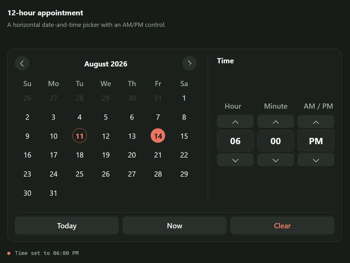
Extended DateTimePicker is a jQuery plugin that adds a full-featured date and time picker to your Bootstrap 5 projects.
It supports single dates, date ranges, multiple dates, birthday entry, blocked dates, and 12-hour or 24-hour time input. Ideal for booking forms, appointment screens, profile forms, and admin schedules.
Features:
- Single dates, ranges, multiple dates, and birthday entry.
- Combines calendar and clock controls in one picker.
- Displays one or two months for different date selection workflows.
- Blocks weekends, individual dates, and dates outside defined limits.
- Switches between 24-hour time and 12-hour time with AM/PM.
- Vertical and horizontal picker layouts.
- Formats selected dates for direct form submission.
- Supports English, Spanish, and custom translations.
- Adapts popup placement to narrow screens and nearby viewport edges.
- Closes input-based pickers after an outside click.
How to use it:
1. Load Bootstrap 5 CSS, jQuery library, and the plugin's files in the document.
<!-- Bootstrap 5 CSS -->
<link
  rel="stylesheet"
  href="/path/to/cdn/bootstrap.min.css"
>

<!-- Extended DateTimePicker CSS -->
<link
  rel="stylesheet"
  href="/path/to//dist/jquery.extended.datetimepicker.min.css"
>

<!-- jQuery -->
<script src="/path/to/cdn/jquery.min.js"></script>

<!-- Extended DateTimePicker -->
<script src="/path/to/dist/jquery.extended.datetimepicker.min.js"></script>
2. Create a text input for the selected date and time:
<div class="mb-3">
  <label for="meetingDate" class="form-label">Meeting date</label>
  <input
    type="text"
    id="meetingDate"
    class="form-control"
    placeholder="Choose a date and time"
  >
</div>
3. Initialize the jQuery date and time picker.
$(function () {
  $("#meetingDate").extendedDateTimePicker({
    mode: "single",
    lang: "en",
    showCalendar: true,
    showClock: true,
    format24h: false
  });
});
4. All configuration options and callback functions to customize the plugin:
-
mode(String): Sets date selection to'single','range','multiple', or'birthday'. Default:'single'. -
layout(String): Sets the picker panel to'vertical'or'horizontal'. Default:'vertical'. -
showCalendar(Boolean): Controls calendar visibility. Default:true. -
showClock(Boolean): Controls clock visibility. Default:true. -
themeColor(String): Sets the Bootstrap color suffix used for selected dates and related states. Default:'success'. -
format24h(Boolean): Uses 0 through 23 hours whentrueand 12-hour time with AM/PM whenfalse. Default:true. -
defaultTime(String | Array): Dynamic footer action buttons. Default:null. -
actions(Array): Uses 0 through 23 hours whentrueand 12-hour time with AM/PM whenfalse. Default:['close', 'today', 'now', 'clear']. -
selectedDates(Array): Supplies initial selections as ISO date strings. Default:[]. -
minDate(String | null): Sets the earliest selectable calendar date inYYYY-MM-DDformat. Default:null. -
maxDate(String | null): Sets the latest selectable calendar date inYYYY-MM-DDformat. Default:null. -
disableWeekends(Boolean): Blocks Saturday and Sunday in calendar mode. Default:false. -
disabledDates(Array): Blocks specific calendar dates supplied asYYYY-MM-DDstrings. Default:[]. -
doubleMonth(Boolean): Displays the active month and the following month together. Default:false. -
dateFormat(String): Sets the date string written to the input. The formatter recognizesYYYY,YY,MM,M,DD, andD. Default:'YYYY-MM-DD'. -
lang(String | Object): Uses'es','en', or a custom translation object for calendar, clock, birthday, and action labels. Default:'es'. -
onOpen(Function): Runs after an input-based picker opens. The callback context points to the target input. Default: empty function. -
onClose(Function): Runs after an input-based picker closes. The callback context points to the target input. Default: empty function. -
onSelectDate(Function | null): Runs after a date selection changes. Single and birthday modes pass oneDateobject. Range and multiple modes pass an array ofDateobjects. The second argument contains formatted date strings. Default:null. -
onSelectTime(Function | null): Runs after the time state changes. The callback receiveshourandminute, plusampmin 12-hour mode. Default:null.
$("#meetingDate").extendedDateTimePicker({
  mode: 'single',
  layout: 'vertical',
  showClock: true,
  showCalendar: true,
  themeColor: 'success',
  format24h: true,
  defaultTime: null,
  actions: ['close', 'today', 'now', 'clear'],
  selectedDates: [],
  minDate: null,
  maxDate: null,
  disableWeekends: false,
  disabledDates: [],
  doubleMonth: false,
  dateFormat: 'YYYY-MM-DD',
  lang: 'es',
  onOpen: function () { },
  onClose: function () { },
  onSelectDate: null,
  onSelectTime: null
});
5. API methods:
// Open the picker attached to an input.
$("#meetingDate").extendedDateTimePicker("open");

// Close the picker attached to an input.
$("#meetingDate").extendedDateTimePicker("close");

// Remove the picker, event handlers, wrapper, and stored instance.
$("#meetingDate").extendedDateTimePicker("destroy");
Advanced Examples
Appointment Form with Date and Time
<form id="appointmentForm">
  <div class="mb-3">
    <label for="appointmentDate" class="form-label">
      Appointment
    </label>

    <input
      type="text"
      id="appointmentDate"
      name="appointment"
      class="form-control"
      placeholder="Select appointment date"
    >
  </div>

  <button type="submit" class="btn btn-primary">
    Save Appointment
  </button>
</form>

<script>
$(function () {
  $("#appointmentDate").extendedDateTimePicker({
    mode: "single",
    lang: "en",
    showCalendar: true,
    showClock: true,
    format24h: true,
    dateFormat: "MM/DD/YYYY",
    disableWeekends: true,

    onSelectDate: function (date, formattedDates) {
      console.log("Selected date:", formattedDates[0]);
    },

    onSelectTime: function (time) {
      console.log("Selected time:", time.hour + ":" + time.minute);
    }
  });
});
</script>
Booking Date Range with Two Months
<div class="mb-3">
  <label for="stayDates" class="form-label">Stay dates</label>

  <input
    type="text"
    id="stayDates"
    class="form-control"
    placeholder="Select check-in and check-out"
  >

  <input type="hidden" id="checkIn" name="check_in">
  <input type="hidden" id="checkOut" name="check_out">
</div>

<script>
$(function () {
  $("#stayDates").extendedDateTimePicker({
    mode: "range",
    lang: "en",
    layout: "horizontal",
    showClock: false,
    doubleMonth: true,
    minDate: "2026-09-01",
    maxDate: "2026-12-20",
    disabledDates: [
      "2026-10-12",
      "2026-11-05",
      "2026-11-06"
    ],

    onSelectDate: function (dates, formattedDates) {
      if (formattedDates.length === 2) {
        $("#checkIn").val(formattedDates[0]);
        $("#checkOut").val(formattedDates[1]);
      }
    }
  });
});
</script>
Load Disabled Dates from an AJAX Endpoint
Assume the endpoint returns this JSON structure:
{
  "dates": [
    "2026-08-19",
    "2026-08-22",
    "2026-08-28"
  ]
}
Add the target input:
<input
  type="text"
  id="serviceDate"
  class="form-control"
  placeholder="Choose an available service date"
>
Load the dates and initialize the picker after the request succeeds:
$(function () {
  $.getJSON("/api/blocked-dates", function (response) {
    var blockedDates = Array.isArray(response.dates)
      ? response.dates
- [];

    $("#serviceDate").extendedDateTimePicker({
      mode: "single",
      lang: "en",
      showClock: false,
      minDate: "2026-08-12",
      disabledDates: blockedDates
    });
  });
});
Birthday Picker
<div class="mb-3">
  <label for="birthDate" class="form-label">Date of birth</label>

  <input
    type="text"
    id="birthDate"
    name="birth_date"
    class="form-control"
    placeholder="Choose your date of birth"
  >
</div>

<script>
$(function () {
  $("#birthDate").extendedDateTimePicker({
    mode: "birthday",
    lang: "en",
    showClock: false,
    dateFormat: "MM/DD/YYYY"
  });
});
</script>
Alternatives and Related Resources:
-
Bootstrap Date Picker with Range Support - jQuery bs-datepicker
-
10 Best Date Time Picker JavaScript Plugins with Examples (2026)
-
Advanced Date, Time & Date Range Picker Components for shadcn/ui
Changelog:
v1.3.0 (09/04/2026)
- Introduced configurable action buttons in the footer of the date-time picker, allowing developers to specify which buttons to display (e.g., close, today, now, clear).
- Enhanced internationalization support by adding translations for new action buttons and clock labels in both English and Spanish.
- Improved the clock module to support dynamic titles for start and end times based on language settings.
v1.2.1 (09/01/2026)
- Enhance datetime picker with range mode and CSS improvements
This awesome jQuery plugin is developed by PinedaMB. For more Advanced Usages, please check the demo page or visit the official website.
- Prev: Clock Dial Time Picker for Bootstrap - jQuery bsTimepicker
- Next: None