Responsive jQuery Message Box & Notification Plugin - lobibox
| File Size: | 1.21 MB |
|---|---|
| Views Total: | 39880 |
| Last Update: | |
| Publish Date: | |
| Official Website: | Go to website |
| License: | MIT |
Lobibox is responsive jQuery dialog box & notification plugin that is divided into two parts: Messageboxes and Notifications. Works well with Bootstrap.
Messageboxes:
- Lobibox messages boxes can be modal and not modal as well.
- You can show multiple messages at the same time.
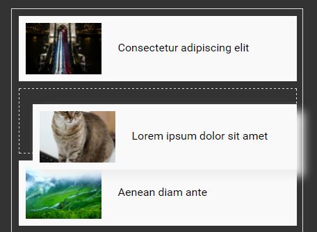
- Every message can be draggable (On small screens dragging is disabled)
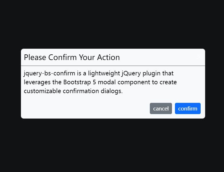
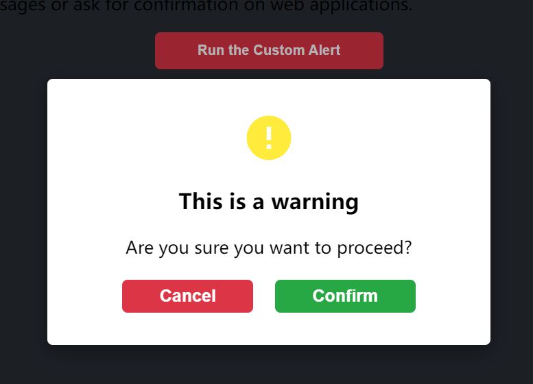
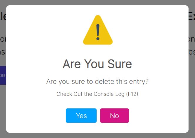
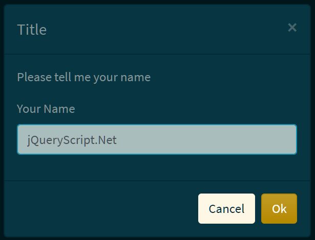
- You can show: messages in different colors and icons; confirm message; one line prompt; multiline prompt; Any HTML5 input type can be used in prompt window. Such as: text, color, date, datetime, email, number range; Progress messagebox. Lobibox comes with default progress style but you can use bootstrap style progress bar; custom content window with ajax support with custom action buttons
- Every message is an instance of "class". You can easily grab the instance and attach events or call methods directly by the instance.
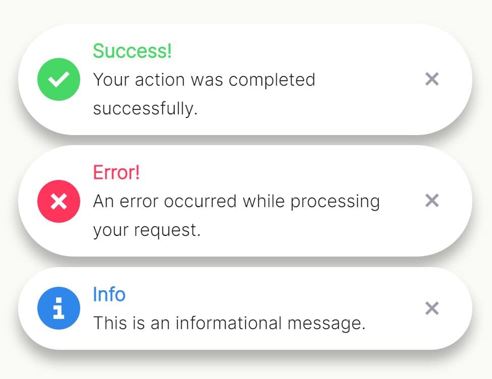
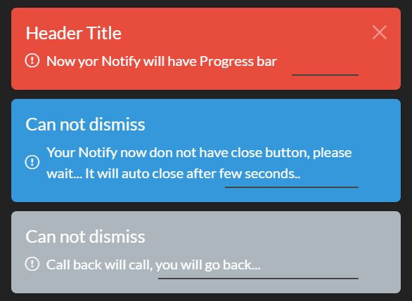
Notification:
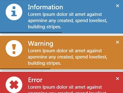
- Different color support
- Possibility to show in any corners of the screen
- Delay after which it disappears
- Show delay indicator
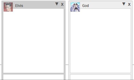
- Show with image
- Sound support
- Size support. You can show notifications of different size
Basic usage:
1. Download and include the jQuery lobibox plugin after jQuery library.
<script src="http://code.jquery.com/jquery-1.11.2.min.js"></script>
<link rel="stylesheet" href="dist/css/LobiBox.min.css">
<script src="dist/js/lobibox.min.js"></script>
2. Create messageboxes:
// Confirm
Lobibox.confirm({
  ... //Options
});

// Alert
Lobibox.alert(
  'error|success|warning|info', // Any of the following
  {
  ... //Options
  }
);

// Prompt
Lobibox.prompt(
  '', // Any HTML5 input type is valid
  {
  //Options
  }
);

// Progress
Lobibox.progress({
  //Options
});

// Window
Lobibox.window({
  //Options
});
3. Default options for all messageboxes.
// If the messagebox is larger (in width) than window's width.
// The messagebox's width is reduced to window width - 2 * horizontalOffset
horizontalOffset: 5,

width           : 600,

// Height is automatically given calculated by width
height          : 'auto',

// Show close button or not
closeButton     : true,

// Make messagebox draggable
draggable       : false,

// Class for custom buttons
customBtnClass  : 'lobibox-btn-default',

modal           : true,
debug           : false,

// Position where buttons should be aligned
buttonsAlign    : 'center',

// Close messagebox on Esc press
closeOnEsc      : true,

//Overriding default options
Lobibox.base.DEFAULTS = $.extend({}, Lobibox.base.DEFAULTS, {
  //override any options from default options
});
4. Available options for all messageboxes.
Lobibox.base.OPTIONS = {

// DO NOT change this value.
// Some functionality is depended on it
bodyClass       : 'lobibox-open',

// DO NOT change this object.
// Some functionality is depended on it
modalClasses : {
    'error'     : 'lobibox-error',
    'success'   : 'lobibox-success',
    'info'      : 'lobibox-info',
    'warning'   : 'lobibox-warning',
    'confirm'   : 'lobibox-confirm',
    'progress'  : 'lobibox-progress',
    'prompt'    : 'lobibox-prompt',
    'default'   : 'lobibox-default',
    'window'    : 'lobibox-window'
},

// This is option how buttons can be shown.
// What are buttonsAlign option available values
buttonsAlign: ['left', 'center', 'right'],

// You can change the title or class of buttons from here or use the same structure object for button when creating messagebox
// closeOnClick : true will close the messagebox when clicking this type of button.
// Set it to false not to close messagebox when clicking on it
buttons: {
  ok: {
    'class': 'lobibox-btn lobibox-btn-default',
    text: 'OK',
    closeOnClick: true
  },
cancel: {
    'class': 'lobibox-btn lobibox-btn-cancel',
    text: 'Cancel',
    closeOnClick: true
  },
  yes: {
    'class': 'lobibox-btn lobibox-btn-yes',
    text: 'Yes',
    closeOnClick: true
  },
  no: {
    'class': 'lobibox-btn lobibox-btn-no',
    text: 'No',
    closeOnClick: true
  }
}
};


//Overriding default options
Lobibox.base.OPTIONS = $.extend({}, Lobibox.base.OPTIONS, {
... //override any options except those above which is written "DO NOT change"
});
5. Create notifications:
Lobibox.notify(

  // 'warning', 'info', 'success', 'error'
  'warning',
  {
      ...
  }

);
6. Default options for lobibox notifications:
// Title of notification.
// Do not include it for default title or set custom string.
// Set this false to disable title
title: true,

// normal, mini, large
size: 'normal',

// Show animation class. (Uses animate.css)
showClass: 'flipInX',

// Hide animation class (Uses animate.css)
hideClass: 'zoomOutDown',

// Icon of notification.
// Leave as is for default icon or set custom string
icon: true,

// Message of notification
msg: '',

// Image source string
img: null,

// Make notifications closable
closable: true,

// Hide notification after this time (in miliseconds)
delay: 5000,

// Show timer indicator
delayIndicator: true,

// Close notifications by clicking on them
closeOnClick: true,

// Width of notification box
width: 400,

// Sound of notification. Set this false to disable sound.
// Leave as is for default sound or set custom soud path
sound: true,

// Place to show notification.
// Available options: "top left", "top right", "bottom left", "bottom right"
position: "bottom right"

// Overriding default options
Lobibox.notify.DEFAULTS = $.extend({}, Lobibox.notify.DEFAULTS, {
    ... //override any options from default options
});
7. Available options for lobibox notifications
Lobibox.notify.OPTIONS = {
'class': 'animated-fast',
soundPath: 'src/sounds/',

// You can override options for large notifications from here
large: {
    width: 500
},

// You can override options for small notifications from here
mini: {
    'class': 'notify-mini'
},

// Default options of different style notifications
success: {
    'class': 'lobibox-notify-success',
    'title': 'Success',
    'icon': 'glyphicon glyphicon-ok-sign',
    sound: 'sound2.mp3'
},
error: {
    'class': 'lobibox-notify-error',
    'title': 'Error',
    'icon': 'glyphicon glyphicon-remove-sign',
    sound: 'sound4.mp3'
},
warning: {
    'class': 'lobibox-notify-warning',
    'title': 'Warning',
    'icon': 'glyphicon glyphicon-exclamation-sign',
    sound: 'sound5.mp3'
},
info: {
    'class': 'lobibox-notify-info',
    'title': 'Information',
    'icon': 'glyphicon glyphicon-info-sign',
    sound: 'sound6.mp3'
}
};

//Overriding default options
Lobibox.notify.OPTIONS = $.extend({}, Lobibox.notify.OPTIONS, {
... //override any options from default options
});
Change logs:
2016-07-17
- Fixed close button click
2016-03-05
- bug fixing
2015-11-17
- Fixed bug of progress bar when trying to focus on first button
This awesome jQuery plugin is developed by arboshiki. For more Advanced Usages, please check the demo page or visit the official website.