10 Best Toggle Switches in HTML, CSS & JavaScript (2026)
Toggle switches are familiar UI controls for turning settings and options on or off. You will find them in forms, dashboards, preference panels, and interfaces where a state needs to change immediately.
Switch controls are built into iOS, Android, and other operating systems, but web projects often need custom HTML, CSS, or JavaScript to match the design and behavior of the rest of the interface. A basic checkbox can become a switch with CSS, while JavaScript adds more control over states, interactions, and reusable components.
The 10 picks here cover jQuery plugins, vanilla JavaScript components, and pure CSS approaches. They range from lightweight checkbox styling and iOS-style switches to three-state controls and switches with JavaScript APIs.
Originally published Jan 03 2018, updated Aug 10 2026
Table of contents:
- Toggle Switch Comparison
- Native HTML/CSS Toggle Switch
- jQuery Toggle Switch Plugins
- Vanilla JavaScript Toggle Switch Plugins
- CSS Only Toggle Switches
- How to Choose a Toggle Switch
- Toggle Switch vs Toggle Button
- Toggle Switch Accessibility
- Related Resources
Toggle Switch Comparison
| Library | Type | Best Use |
|---|---|---|
| LC Switch | jQuery / Vanilla JS | Two-state checkbox and radio switches with methods and status events. |
| Switcher | jQuery | Two-state iOS-style checkbox and radio switches. |
| jToggler | jQuery | Two-state or three-state checkbox switches with an indeterminate state. |
| switchify | jQuery | Compact two-state checkbox-to-switch conversion. |
| Candlestick | jQuery | Three-state checkbox controls with optional swipe gestures. |
| SlideOn | Vanilla JS | Two-state checkbox switches with preset sizes, shapes, and themes. |
| Toggle Switch | Web Component | Reusable two-state custom elements with attribute-based styling. |
| el-checkbox | Pure CSS | Checkbox, radio, and switch styling from one stylesheet. |
| vc-toggle-switch | Pure CSS | Two-state switches with visible ON/OFF labels and CSS variables. |
| slider.css | Pure CSS | Two-state and three-state controls built from radio inputs. |
Native HTML/CSS Toggle Switch
A two-state setting does not require a JavaScript library. A checkbox stores the value, participates in forms, and pairs with a label. CSS can turn the visual control into a sliding switch.
<label class="toggle-control">
  <input type="checkbox" name="notifications">
  <span class="toggle-track" aria-hidden="true"></span>
  <span>Email notifications</span>
</label>
.toggle-control {
  display: inline-flex;
  align-items: center;
  gap: 0.65rem;
  cursor: pointer;
}

.toggle-control input {
  position: absolute;
  width: 1px;
  height: 1px;
  opacity: 0;
}

.toggle-track {
  position: relative;
  width: 44px;
  height: 24px;
  border-radius: 999px;
  background: #b7bcc4;
  transition: background 0.2s ease;
}

.toggle-track::after {
  content: "";
  position: absolute;
  top: 3px;
  left: 3px;
  width: 18px;
  height: 18px;
  border-radius: 50%;
  background: #fff;
  transition: transform 0.2s ease;
}

.toggle-control input:checked + .toggle-track {
  background: #2463eb;
}

.toggle-control input:checked + .toggle-track::after {
  transform: translateX(20px);
}

.toggle-control input:focus-visible + .toggle-track {
  outline: 2px solid currentColor;
  outline-offset: 3px;
}
The experimental HTML switch attribute applies to checkbox inputs and identifies the control as an on/off switch:
<label for="dark-mode">Dark mode</label> <input type="checkbox" id="dark-mode" name="dark-mode" switch>
Supporting browsers can render the checkbox with switch styling. Browsers that do not recognize the attribute ignore it and keep normal checkbox behavior. Use CSS when the control needs a consistent appearance across browsers.
Best jQuery Toggle Switch Plugins:
JavaScript Plugin For Sliding Toggle Switches - LC Switch
LC Switch converts native checkbox and radio inputs into sliding switches and exposes both jQuery and vanilla JavaScript APIs. Public methods toggle, enable, disable, update, and destroy instances, and the plugin emits events when a field changes state.
Basic ON/OFF Toggle Switches In jQuery - Switcher
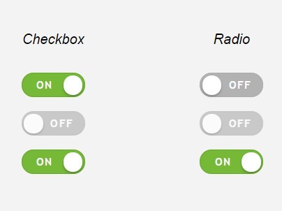
Switcher transforms native checkbox and radio inputs into iOS-style on/off controls through one jQuery initializer. CSS handles the visual transition and can be overridden to match the surrounding form.
Three States Toggle Switch With jQuery - jQuery jToggler
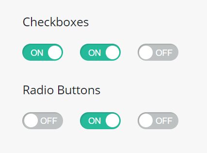
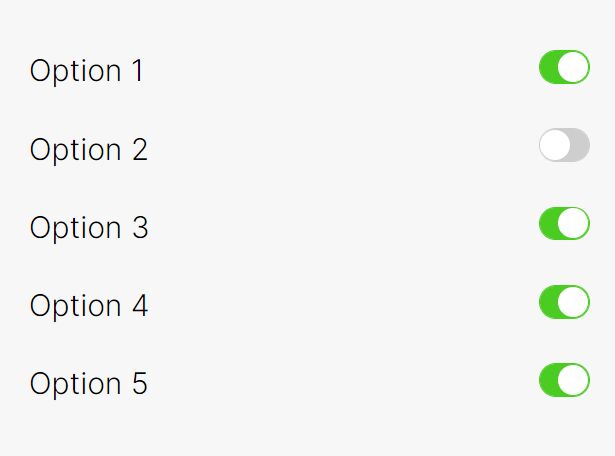
jToggler turns a checkbox into an iOS-style switch with checked, unchecked, and optional indeterminate states. Data attributes add a custom label and enable the multi-state mode, and the plugin emits events after normal or multi-state changes.
Transform Checkbox Into Toggle Switch - jQuery switchify
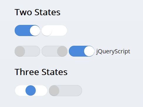
switchify converts checkbox inputs into iOS-style switches through a single jQuery call. Its stylesheet controls the track, handle, checked state, and transition, so you can adjust the switch appearance through CSS.
jQuery Plugin For Tri-state Toggle Switches - Candlestick
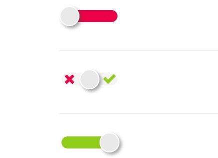
Candlestick converts a checkbox into a three-state control with checked, unchecked, and default values. It exposes size and value options, callbacks, and a reset command. Swipe gestures require Hammer.js and the jQuery Hammer adapter.
Best Vanilla JavaScript Toggle Switch Plugins:
Smooth iOS Style Slide Switch Component – SlideOn
SlideOn converts checkbox inputs into sliding switches with JavaScript and CSS. Its classes cover square styling, five size presets, theme variants, and padding adjustments.

Customizable Rounded & Square Toggle Switch Web Component
This Web Component adds a <toggle-switch> custom element with rounded and square variants. A hidden input stores its boolean state, and attributes control dimensions, colors, padding, shape, and transition duration.

Best CSS Only Toggle Switches:
CSS/CSS3 Only Custom Checkboxes, Radios And Switches – el-checkbox
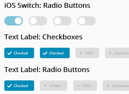
el-checkbox is a CSS-only package for custom checkboxes, radio buttons, and iOS-style switches. It ships with four color themes and three preset sizes and does not require JavaScript initialization.

Smooth iOS Style Switch In Pure CSS – vc-toggle-switch.css
vc-toggle-switch.css styles a standard checkbox as an iOS-style switch with an animated handle. data-on and data-off set the visible labels, and CSS custom properties control colors, dimensions, typography, and animation timing.

Radio Button Based 3-state Toggle/Switch Control – slider.css
slider.css styles radio groups as two-state or three-state switch controls. The three-position pattern assigns one radio input to each value. CSS variables control the main colors and text styling.

How to Choose a Toggle Switch
- Basic binary settings: Start with a native checkbox and CSS when no extra API is required.
- Existing jQuery forms: LC Switch, Switcher, jToggler, switchify, and Candlestick fit pages that already load jQuery.
- Three-state data: jToggler and Candlestick handle an indeterminate checkbox state. slider.css uses three radio values for the same visual pattern.
- Framework-free JavaScript: SlideOn keeps native checkbox markup. The Web Component packages the control as a custom element.
- CSS-only styling: el-checkbox covers several form controls, vc-toggle-switch.css adds labeled switches, and slider.css handles radio-based multi-state choices.
Toggle Switch vs Toggle Button
A toggle switch changes a persistent setting between on and off and commonly maps to a checkbox. A toggle button represents a pressed or selected action state and may appear inside button groups or segmented controls.
For button-style state controls, compare the 10 Best Toggle Button Plugins In JavaScript & CSS.
Toggle Switch Accessibility
For binary form settings, a native checkbox with an associated label supplies built-in keyboard and form behavior. Custom styling should preserve keyboard focus and keep the underlying input interactive.
A non-native binary widget with role="switch" must keep aria-checked synchronized to true or false. The switch role has no mixed state. Use checkbox semantics for an indeterminate state, or radio inputs when the interface represents three distinct choices.
Related Resources
- 10 Best Toggle Button Plugins In JavaScript & CSS
- 10 Best Custom Checkbox And Radio Input Replacements
- 10 Best Toggle Switch JavaScript And CSS Libraries
- More jQuery Switch Plugins
- More JavaScript & CSS Toggle Switch Libraries