Basic ON/OFF Toggle Switches In jQuery - Switcher
| File Size: | 5.53 KB |
|---|---|
| Views Total: | 20039 |
| Last Update: | |
| Publish Date: | |
| Official Website: | Go to website |
| License: | MIT |
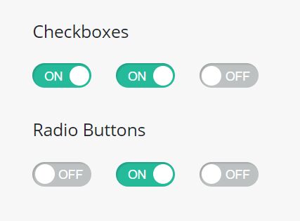
Switcher is an ultra-light jQuery plugin that transforms the native Checkbox and Radio Button elements into iOS inspired on/off toggle switches just with a JS call.
Click on the switches to toggle between ON and OFF states with a smooth transition effect based on CSS3.
How to use it:
1. Load the stylesheet switcher.css in the head, and the JavaScript file switcher.js after jQuery library.
<link href="css/switcher.css" rel="stylesheet">
<script src="https://code.jquery.com/jquery-3.3.1.min.js"
        integrity="sha384-tsQFqpEReu7ZLhBV2VZlAu7zcOV+rXbYlF2cqB8txI/8aZajjp4Bqd+V6D5IgvKT"
        crossorigin="anonymous">
</script>
<script src="js/jquery.switcher.js"></script>
2. Initialize the plugin to apply the plugin to all the checkboxes and radio buttons in the document.
<h2>Checkboxes</h2>
<div class="form-check form-check-inline">
  <input class="form-check-input" type="checkbox" id="inlineCheckbox1" value="option1">
</div>
<div class="form-check form-check-inline">
  <input class="form-check-input" type="checkbox" id="inlineCheckbox2" value="option2">
</div>
<div class="form-check form-check-inline">
  <input class="form-check-input" type="checkbox" id="inlineCheckbox3" value="option3" disabled>
</div>

<h2>Radio Buttons</h2>
<div class="form-check form-check-inline">
  <input class="form-check-input" type="radio" name="inlineRadioOptions" id="inlineRadio1" value="option1">
</div>
<div class="form-check form-check-inline">
  <input class="form-check-input" type="radio" name="inlineRadioOptions" id="inlineRadio2" value="option2">
</div>
<div class="form-check form-check-inline">
  <input class="form-check-input" type="radio" name="inlineRadioOptions" id="inlineRadio3" value="option3" disabled>
</div>
$(function(){

   $.switcher();

});
3. You can also initialize the plugin on specific checboxes or radio buttons.
$.switcher('input[type=checkbox]');

$.switcher('input[type=radio]');
4. Override the default CSS to create your own styles.
.ui-switcher {
  background-color: #bdc1c2;
  display: inline-block;
  height: 20px;
  width: 48px;
  border-radius: 10px;
  box-sizing: border-box;
  vertical-align: middle;
  position: relative;
  cursor: pointer;
  transition: border-color 0.25s;
  margin: -2px 4px 0 0;
  box-shadow: inset 1px 1px 1px rgba(0, 0, 0, 0.15);
}

.ui-switcher:before {
  font-family: sans-serif;
  font-size: 10px;
  font-weight: 400;
  color: #ffffff;
  line-height: 1;
  display: inline-block;
  position: absolute;
  top: 6px;
  height: 12px;
  width: 20px;
  text-align: center;
}

.ui-switcher:after {
  background-color: #ffffff;
  content: '\0020';
  display: inline-block;
  position: absolute;
  top: 2px;
  height: 16px;
  width: 16px;
  border-radius: 50%;
  transition: left 0.25s;
}
This awesome jQuery plugin is developed by zellien. For more Advanced Usages, please check the demo page or visit the official website.