Checkbox Toggle Switch Plugin For Tailwind CSS Framework
| File Size: | 6.57 KB |
|---|---|
| Views Total: | 5946 |
| Last Update: | |
| Publish Date: | |
| Official Website: | Go to website |
| License: | MIT |
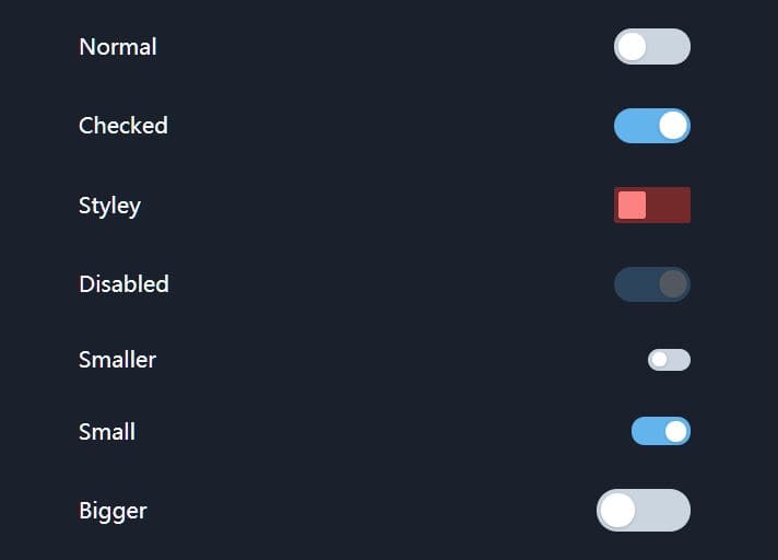
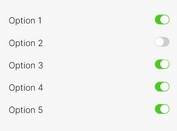
A tiny and fast jQuery plugin that helps developers create checkbox based on/off switches in the latest Tailwind CSS framework.
Easy to implement without any JS call. And highly customizable via HTML data attribute.
How to use it:
1. Load the latest jQuery library and Tailwind framework or Twind (Tailwind-in-JS) in the document.
<!-- Tailwind CSS -->
<script src="https://cdn.tailwindcss.com"></script>
<!-- jQuery Is Required  -->
<script src="/path/to/cdn/jquery.slim.min.js"></script>
2. Download the package and load the jquery-tailwind-toggle.js after jQuery but before the closing body tag.
<script src="jquery-tailwind-toggle.js"></script>
3. To Cceate a default toggle switch, simply wrap your checkbox element in a label element with the data-toggle="checkbox-toggle" attribute and done.
<label data-toggle="checkbox-toggle">
  <input type="checkbox" />
</label>
4. Customize the toggle switch with the following HTML data attributes:
- data-rounded: rounded[-none|-sm|-lg|-full]
- data-handle-size: Handle size. Default: 20
- data-handle-color: Background color of the handle. Default: 'bg-white'
- data-off-color: Background color when Off. Default: 'bg-gray-400'
- data-on-color: Background color when On. Default: 'bg-blue-400'
<label
  data-toggle="checkbox-toggle"
  data-rounded="rounded"
  data-handle-size="20"
  data-handle-color="bg-white"
  data-off-color="bg-gray-400"
  data-on-color="bg-blue-600">
  <input type="checkbox" />
</label>
Changelog:
2024-05-09
- Supports TailwindCSS 3.0+
2021-05-13
- Supports Twind (Tailwind-in-JS)
This awesome jQuery plugin is developed by craigerskine. For more Advanced Usages, please check the demo page or visit the official website.
