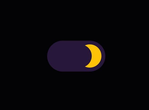
Create Realistic Toggle/Push/Slide Switches - jQuery rsCheckboxSwitch
| File Size: | 39.5 KB |
|---|---|
| Views Total: | 527 |
| Last Update: | |
| Publish Date: | |
| Official Website: | Go to website |
| License: | MIT |
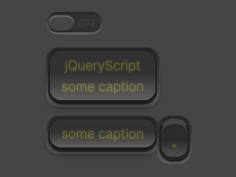
rsCheckboxSwitch is a jQuery plugin to help developers create realistic, animated, and keyboard-accessible slide/toggle/push switches on the webpage.
The plugin supports a diverse set of HTML markups including checkboxes, buttons, and DIV elements. It also includes a number of options to customize the look, feel, and behavior of the switch element.
Table Of Contents:
- Install & Setup
- Options
- API methods
- Setters & Getters
- Custom styles
How to use it:
1. Download and load the rsCheckboxSwitch plugin's files in the HTML document.
<link rel="stylesheet" href="/path/to/rsCheckboxSwitch.css" />
<script src="/path/to/cdn/jquery.slim.min.js"></script>
<script src="/path/to/jquery.rsCheckboxSwitch.js"></script>
2. Convert an element into a switch.
<!-- Checkbox -->
<input class="demo" type="checkbox" />

<!-- Div Button -->
<div class="demo">
  Press me
</div>

<!-- Button -->
<button class="demo">
  Press me
</button>
$('.demo').rsCheckboxSwitch({
  // ...
});
3. Set the switch style. Default: 'sliding'. A sliding switch only shows one half (ON or OFF) while the other half is hidden. This means, that the switch must be longer than the container in order to clip the switch. A toggle or push switch always has the same size. Instead of having a sliding motion, a toggle switch remains in the same location and transitions ON to OFF (or vice-versa) might be animated.
- 'sliding'
- 'toggle'
- 'push'
$('.demo').rsCheckboxSwitch({
  type: "push",
});
4. All possible plugin options to customize the switch.
$('.demo').rsCheckboxSwitch({

  // slidingType is only meaningful if type is 'sliding'
  slidingType: {

    // Classes for the outer container.
    // Add:
    // - corners-rounded for full rounded corners;
    // - corners-halfrounded for 50% rounded corners;
    // - corners-quarterrounded for 25% rounded corners;
    // - corners-sharp for no rounded corners;
    // If none of the above three are specified, corners-rounded is used.
    outerClass: 'checkboxswitch-outer sliding corners-rounded',

    // Classes for the element that slides inside the outer element.
    sliderClass: 'switch',

    // Classes for the handle usually located in the middle of the slider element.
    handleClass: 'handleflat',

    // Classes for the handle when mouse is applied to it. Type: string.
    pushdownClass: 'down',

    // Classes used during the time user is moving the switch with the mouse.
    draggingClass: 'switch-dragging',

    // Classes applied to the topmost element for vertical sliders (when horizontal is false).
    verticalClass: 'vert',

    // Classes applied to the topmost element when the slider is flipped
    flippedClass: 'flipped',

    // Determines the location of the on and off.
    // When flipped is false, the switch is ON--OFF (for horizontal switches) or ON on the top and OFF on the bottom (for vertical switches)
    // When flipped is true, the switch is OFF--ON (for horizontal switches) or OFF on the top and ON on the bottom (for vertical switches)
    flipped: false,

    // Determines the switch orientation, either horizontal or vertical.
    horizontal: true
  },

  // toggleType is only meaningful if type is 'toggle'
  toggleType: {

    // Classes for the container. Type: string.
    // Add:
    // - corners-rounded for full rounded corners;
    // - corners-halfrounded for 50% rounded corners;
    // - corners-quarterrounded for 25% rounded corners;
    // - corners-sharp for no rounded corners;
    // If none of the above four are specified, corners-rounded is used.
    outerClass: 'checkboxswitch-outer toggle corners-rounded',

    // Determines whether a span child is used to display 0 or 1 (you can change CSS to display something else).
    showOnOff: true,

    // Class added to the span created when showOnOff is true.
    onOffClass: 'onoff',

    // Specifies the text caption that appears in toggle switches.
    // If null, then uses the text from the markup.
    // If the plugin is not bounded to an <input type=checkbox> element, this caption is appended to the existing markup text (if any).
    // Type: String.
    caption: null,

    // Each class represents a frame in the animation that runs from OFF to ON position.
    // Type: array of String.
    // The first class is used for the OFF image, the last for the ON image.
    // Optional frames in the middle can be used to create a more realistic animation.
    // For ON to OFF animations, the plug-in simply iterates from the last to the first class.
    frameClasses: ['frm1', 'frm2', 'frm3', 'frm4', 'frm5']
  },

  // pushType is only meaningful if type is 'push'
  pushType: {

    // Classes for the container.
    // Add:
    // - corners-rounded for full rounded corners;
    // - corners-halfrounded for 50% rounded corners;
    // - corners-quarterrounded for 25% rounded corners;
    // - corners-sharp for no rounded corners;
    // If none of the above four are specified, corners-rounded is used.
    outerClass: 'checkboxswitch-outer toggle push corners-rounded',

    // Determines whether a span child is used to display 0 or 1 (you can change CSS to display something else).
    showOnOff: true,

    // Class added to the span created when showOnOff is true.
    onOffClass: 'onoff',

    // Specifies the text caption that appears in toggle switches.
    // If null, then uses the text from the markup.
    // If the plugin is not bounded to an <input type=checkbox> element, this caption is appended to the existing markup text (if any).
    caption: null,

    // Each class represents a frame in the animation that runs from OFF to ON position.
    // Type: array of String.
    // The first class is used for the OFF image, the last for the ON image. Optional frames in the middle can be used to create a more realistic animation.
    // For ON to OFF animations, the plug-in simply iterates from the last to the first class.
    frameClasses: ['frm1', 'frm2', 'frm3', 'frm4']
  },

  keyboard: {

    // Allowed keys on focusable switches.
    // Type: String array.
    // Key events are ignored for non focusable switches.
    // A switch is focusable when the associated markup is an <input type="checkox"> with no disabled attribute, or any HTML element with a tabindex attribute.
    allowed: ['enter', 'esc', 'space'],

    // Determines whether pressing Esc key rollsback to the value the switch had before gaining focus (the committed value).
    // Type: boolean or string.
    // Rolling back has no effect when the current value is the same as the committed value.
    //  true - Pressing Esc on a focusable switch rollsback value. Change events are not fired. Note that 'esc' should be present in the allowed property array (see above).
    // false - Ignores Esc keystrokes.
    // 'trueWithEvents' - Pressing Esc on a focusable switch rollsback value.
    //                    If it rolls back to On, then OnChange and OnChangeOn are fired.
    //                    If it rolls back to Off, then OnChange and OnChangeOff are fired.
    rollbackOnEsc: true,

    // Determines whether the value toggles on Enter or Space.
    //  true - Pressing Enter or Space changes value. Note that 'enter' or 'space' should be present in the allowed property array (see above).
    // false - Ignores Enter or Space keystrokes.
    toggleOnEnter: true,

    // Determines whether the value is saved when switch loses focus. Type: boolean.
    //  true - The current value is commited when switch loses focus.
    // false - Value is not commited.
    commitOnBlur: false
  },

  // Classes set to the outer div when the switch has been changed.
  changedClass: 'changed',

  // Classes set to the outer div when the switch is disabled.
  disabledClass: 'disabled',

  // Determines whether the control is editable.
  // If the plugin is associated with a disabled <input type="checkbox" disabled>, then enabled is set to false.
  enabled: true,

  // Handle animation in milliseconds. Type: positive integer number.
  // For Sliding switches, specifies the time it takes to move from one side to the other.
  // For Toggle or Push switches, specifies the time it takes to change from one position to another.
  speed: 75,

  // Event fired when switch changes to either On or Off.
  // Type: function (event, $elem, value)
  onChange: null,

  // Event fired when switch changes to On position.
  // Type: function (event, $elem)
  // If the markup is an <input type="checkbox"> then an attribute checked="checked" is added.
  // If other markup is used, then an attribute data-checked="checked" is added.
  onChangeOn: null,

  // Event fired when switch changes to OFF position.
  // Type: function (event, $elem)
  // If the markup is an <input type="checkbox"> then the attribute checked="checked" is removed.
  // If other markup is used, then the attribute data-checked="checked" is removed.
  onChangeOff: null

});
5. API methods.
// refresh$e.rsCheckboxSwitch('refresh')
$e.rsCheckboxSwitch('refresh', false)
$e.rsCheckboxSwitch('refresh', true)

// toggle
$e.rsCheckboxSwitch('toggle')

// set on/off states without animations
$e.rsCheckboxSwitch('on')
// OnChange and onChangeOn are never fired
$e.rsCheckboxSwitch('on', false)
OnChange and onChangeOn are always fired
$e.rsCheckboxSwitch('on', true)
$e.rsCheckboxSwitch('off')
$e.rsCheckboxSwitch('off', false)
$e.rsCheckboxSwitch('off', true)

// set on/off states with animations
$e.rsCheckboxSwitch('onAnim')
$e.rsCheckboxSwitch('onAnim', false)
$e.rsCheckboxSwitch('onAnim', true)
$e.rsCheckboxSwitch('offAnim')
$e.rsCheckboxSwitch('offAnim', false)
$e.rsCheckboxSwitch('offAnim', true)

// Rollsback the switch to the original value
$e.rsCheckboxSwitch('rollback')
// Change events are never fired
$e.rsCheckboxSwitch('rollback', false)
// Change events are always fired
$e.rsCheckboxSwitch('rollback', true)

// Notifies the plugin that current value is the "new" original one.
$e.rsCheckboxSwitch('commit')

// Unbinds all events and completely removes the plugin from the page.
$e.rsCheckboxSwitch('destroy')
6. Setters & Getters.
// Returns the current onChange event function handler
var onChangeFunction = $e.rsCheckboxSwitch('option', 'onChange');

// Returns the current onChangeOn event function handler
var onChangeOnFunction = $e.rsCheckboxSwitch('option', 'onChangeOn');

// Returns the current onChangeOff event function handler
var onChangeOffFunction = $e.rsCheckboxSwitch('option', 'onChangeOff');

// Returns true if switched was changed, false otherwise.
// "Changed" means the current value is different from the current commited value.
var changed = $e.rsCheckboxSwitch('option', 'changed');

// Returns switch current value.
var isOn = $e.rsCheckboxSwitch('option', 'value');

// Retuns true if switch can be changed by the user, false otherwise.
var isEnabled = $e.rsCheckboxSwitch('option', 'enabled');

// Sets the onChange event function handler
$e.rsCheckboxSwitch('option', 'onChange', function (event, $elem, value) { alert('value changed to ' + value); } );

// Sets the onChangeOn event function handler
$e.rsCheckboxSwitch('option', 'onChangeOn', function (event, $elem) { alert('value changed to true'); } )

// Sets the onChangeOff event function handler
$e.rsCheckboxSwitch('option', 'onChangeOff', function (event, $elem) { alert('value changed to false'); } )

// Enables or disables the switch control.
$e.rsCheckboxSwitch('option', 'enabled', true);
$e.rsCheckboxSwitch('option', 'enabled', false);
7. Override the default variables in the Less.
// recommended #454545 for dark layout and #f2f2f2 for light layout
@background: #454545;

// recommended 12% for dark layout and 18% for light layout
@deltaContrast: 12%;

@text: #bab026;

// Allowed units are: px, pt (for fixed layout) or em, rem, vw, vh, vmin, vmax (for elastic layout).
// To try other sizes, you only need to change this line. All the rest will resize according to this @refScale
// 1em corresponds to 16px in most browsers, which is the default font size.
// However, some users might define another default font size for accessibility reasons.
// To convert px to em, do em = px/16. Example: 8px = .5em
@refScale: 5vw;

@fromGradientOuter: darken(@background, @deltaContrast);
@toGradientOuter: lighten(@background, @deltaContrast);

@fromGradientInner: darken(@toGradientOuter, 10%);
@toGradientInner: darken(@fromGradientOuter, 2%);

@borderColor: darken(@fromGradientOuter, lightness(@background)/10 + 3%);

@sliderMaxSize: @refScale*6;
@sliderMinSize: @refScale*1.3;
@sliderHandleSize: @refScale*2;

@textoff: @fromGradientOuter;
@texton: desaturate(@text, lightness(@background)/1.8);
This awesome jQuery plugin is developed by ruisoftware. For more Advanced Usages, please check the demo page or visit the official website.