Accessible Form Validation Plugin For jQuery - Aria Form Validation
| File Size: | 5.44 KB |
|---|---|
| Views Total: | 2172 |
| Last Update: | |
| Publish Date: | |
| Official Website: | Go to website |
| License: | MIT |
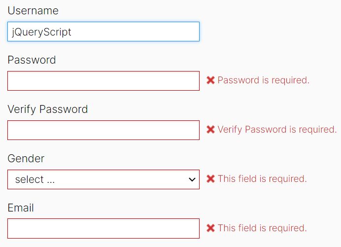
A lightweight and accessible jQuery form validation plugin which has the ability to validate the form fields using aria attributes.
More features:
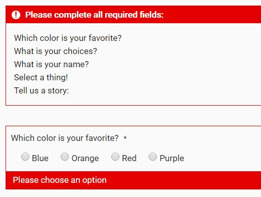
- A summary panel showing all the errors.
- Outlines the invalid form fields with custom error messages.
How to use it:
1. Load jQuery library and the main JavaScript file at the bottom of the webpage.
<script src="/path/to/jquery.min.js"></script>
<script src="/path/to/main.js"></script>
2. Add the aria attributes to the form fields which should be validated before submitting. The aria-required attribute is used to indicate that user input is required on an element before a form can be submitted. Learn more.
<fieldset aria-required="true" aria-invalid="false">
  <legend>Which color is your favorite?</legend>
  <label><input  type="radio" name="color" value="blue"> Blue</label>
  <label><input type="radio" name="color" value="orange"> Orange</label>
  <label><input type="radio" name="color" value="red"> Red</label>
  <label><input type="radio" name="color" value="purple"> Purple</label>
</fieldset>

<input type="text" name="username" id="username" aria-required="true" aria-invalid="false" placeholder="Enter your name">
3. Create a submit button and bind the form validation function as this:
<a href="javascript:void(0);" onclick="validateForm()">Submit</a>
4. Style the summary panel and error messages in the CSS.
#error-summary {
  display: none;
  margin: 40px 0px;
  border: 1px solid #e50000;
}

#error-summary ul {
 padding:.5rem;
 margin:.5rem;
  list-style: none;
  color: #1a1712;
}

#error-summary h3, .error-message {
  background: #e50000;
  color: #fff;
  padding:.2rem .8rem;
  display: block;
  border: 1px solid #e50000;
  margin-top: 0px;
}

.error-message { box-sizing: border-box; }

#error-summary h3 { padding-left: 40px; }

#error-summary h3:before {
  content: '!';
  background: #fff;
  height: 1em;
  width: 1em;
  border-radius: 9px;
  display: inline-block;
  color: #e50000;
  margin-right: 10px;
  margin-top: 2px;
  margin-left: -30px;
  line-height: 1em;
  text-align: center;
}

fieldset[aria-invalid="true"] {
  border: 1px solid #e50000;
  padding: 10px 10px 0px 10px;
}

fieldset[aria-invalid="true"] span.error-message {
  margin-left: -10px;
  margin-right: -10px;
}

select + span.error-message { max-width: 320px; }

textarea[aria-invalid="true"], input[type="text"][aria-invalid="true"], select[aria-invalid="true"] { border: 1px solid #e50000; }

select[aria-invalid="true"] { margin-bottom: 0px; }

textarea[aria-invalid="true"]:focus, input[type="text"][aria-invalid="true"]:focus, select[aria-invalid="true"]:focus {
  outline-offset: -2px;
  outline-style: solid;
  outline-width: 2px;
  outline-color: #e50000;
}
Changelog:
2019-08-16
- revised alert role and error summary to better announce on screen reader
This awesome jQuery plugin is developed by offsetChris. For more Advanced Usages, please check the demo page or visit the official website.