Powerful jQuery Checkbox and Radio Button Enhancing Plugin - rlchecked
| File Size: | 707KB |
|---|---|
| Views Total: | 1857 |
| Last Update: | |
| Publish Date: | |
| Official Website: | Go to website |
| License: | MIT |
rlchecked is a beautiful and easy-to-use jQuery plugin that makes it easy to beautify your checkboxes and radio buttons with keyboard accessibility navigation.
You might also like:
- Default Checkbox Replacement Plugin - jQuery prettyCheckable
- jQuery Plugin For Customizing Checkbox - betterCheckbox
- Sliding Checkbox Actions Menu
- Beautiful and Scalable Checkbox Plugin with jQuery - alt-checkbox
- jQuery Tunable Check/Radio Box Plugin - Tunable Radiobox
How to use it:
1. Include jQuery library and rlchecked.js on your page
<script type="text/javascript" src="jquery.min.js"></script>
<script type="text/javascript" src="js/rlchecked.js"></script>
2. Markup html structure
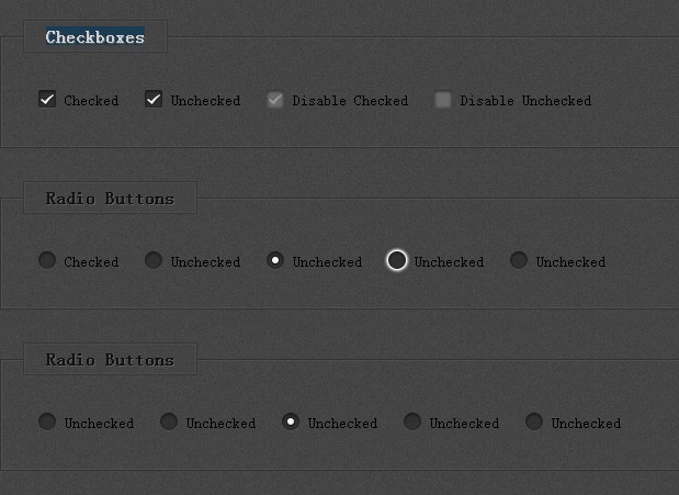
<form>
<fieldset>
<legend>Checkboxes</legend>
<ul>
<li>
<input checked="checked" type="checkbox" name="ckbx" />
<label for="check">Checked</label>
</li>
<li>
<input type="checkbox" name="ckbx" />
<label for="check">Unchecked</label>
</li>
<li>
<input checked="checked" disabled="disabled" type="checkbox" name="ckbx" />
<label for="check">Disable Checked</label>
</li>
<li>
<input disabled="disabled" type="checkbox" name="ckbx" />
<label for="check">Disable Unchecked</label>
</li>
</ul>
</fieldset>
</form>
3. The CSS
@charset "utf-8";
html {
  background: url("../img/bg.png") repeat scroll 0 0 transparent;
}
fieldset {
  border: 1px solid #333;
  box-shadow: 0 0 2px #666 inset;
  margin: 30px 0;
  padding: 20px;
}
legend {
  background: url("../img/bg.png") repeat scroll 0 0 transparent;
  border: 1px solid #333;
  box-shadow: 0 0 2px #666 inset;
  font-weight: bold;
  opacity: 0.75;
  padding: 5px 20px;
  text-shadow: 1px 1px #666;
}
label {
  display: block;
  float: left;
  font-size: 14px;
  line-height: 26px;
  text-indent: 4px;
}
p {
  border: 1px solid #333;
  box-shadow: 0 0 2px #666 inset;
  float: left;
  font-size: 13px;
  font-weight: bold;
  margin: 20px auto;
  padding: 15px 10px;
  text-align: center;
  text-shadow: 1px 1px #666;
}
::-moz-selection {
  background: #00607F;
  color: #ffffff;
}
::selection {
  background: #00607F;
  color: #ffffff;
}

.btn {
  background-color: #007197;
  background-image: -moz-linear-gradient(center bottom, #005d7c 0%, #0088b5 100%);
  background-image: -o-linear-gradient(center bottom, #005d7c 0%, #0088b5 100%);
  background-image: -webkit-linear-gradient(left bottom, left top, color-stop(0, #005d7c), color-stop(1, #0088b5));
  background-image: -ms-linear-gradient(top, #005d7c 0%, #0088b5 100%);
  background-image: linear-gradient(top, #005d7c 0%, #0088b5 100%);
  border: 1px solid #1D4253;
  border-radius: 5px;
  box-shadow: 0 2px 5px rgba(0, 0, 0, 0.55);
  color: #FFFFFF;
  display: block;
  font-size: 1.2em;
  margin: 0 auto;
  text-align: center;
  text-decoration: none;
  text-shadow: 1px 1px 0 #004e68;
}
.btn:hover {
  background-color: #0081ab;
  background-image: -moz-linear-gradient(center bottom, #00749a 0%, #00a5c6 100%);
  background-image: -o-linear-gradient(center bottom, #00749a 0%, #00a5c6 100%);
  background-image: -webkit-linear-gradient(left bottom, left top, color-stop(0, #00749a), color-stop(1, #00a5c6));
  background-image: -ms-linear-gradient(top, #00749a 0%, #00a5c6 100%);
  background-image: linear-gradient(top, #00749a 0%, #00a5c6 100%);
  transition: all 1s ease;
  -webkit-transition: all 1s ease;
}
.btn:active {
  background-color: #006486;
  background-image: -moz-linear-gradient(center bottom, #0085a6 0%, #00537a 100%);
  background-image: -o-linear-gradient(center bottom, #0085a6 0%, #00537a 100%);
  background-image: -webkit-linear-gradient(left bottom, left top, color-stop(0, #0085a6), color-stop(1, #00537a));
  background-image: -ms-linear-gradient(top, #0085a6 0%, #00537a 100%);
  background-image: linear-gradient(top, #0085a6 0%, #00537a 100%);
  box-shadow: 0 0 2px rgba(0, 0, 0, 0.75);
}
.btn span {
  border-radius: 5px;
  border-top: 1px solid #00B8D3;
  display: block;
  font-weight: bold;
  padding: 2% 0;
}
.btn span:active {
  border-top-color: transparent;
}
.checkboxes input,
.radios input {
  border: 0 none;
  float: left;
  height: 24px;
  filter: alpha(opacity=0);
  -ms-filter: "progid:DXImageTransform.Microsoft.Alpha(Opacity=0)";
  opacity: 0;
  position: relative;
  width: 24px;
}
.checkboxes input:focus,
.radios input:focus,
.checkboxes input:active,
.radios input:active {
  border: 0 none;
  outline: 0 none;
}
ul li {
  display: block;
  float: left;
  margin: 10px;
  position: relative;
}
ul li span {
  background: url("../img/checkboxes-and-radio-buttons.png") no-repeat scroll transparent;
  display: block;
  height: 24px;
  position: absolute;
  left: 0;
  top: 0;
  text-indent: -9999px;
  width: 24px;
}
ul li.checkboxes span {
  background-position: 0 0;
}
ul li.checkboxes span.checked {
  background-position: -24px -24px;
}
ul li.checkboxes span.checked.focus,
ul li.checkboxes span.checked.hover {
  background-position: -96px -96px;
}
ul li.checkboxes span.checked.disabled {
  background-position: -48px -48px;
}
ul li.checkboxes span.focus,
ul li.checkboxes span.hover {
  background-position: -120px -120px;
}
ul li.checkboxes span.disabled {
  background-position: -72px -72px;
}
ul li.radios span {
  background-position: 0 -144px;
}
ul li.radios span.radio {
  background-position: -24px -168px;
}
ul li.radios span.radio.focus,
ul li.radios span.radio.hover {
  background-position: -96px -240px;
}
ul li.radios span.radio.disabled {
  background-position: -48px -192px;
}
ul li.radios span.hover {
  background-position: -120px -264px;
}
ul li.radios span.disabled {
  background-position: -72px -216px;
}
4. Call the plugin with options
jQuery(function() {
jQuery("input").rlChecked({
 element: "<span>elements</span>", // html tag created to insert through the DOM
 checkboxes: "checkboxes", // parent class of checkboxes
 radios: "radios", // parent class of radio buttons
 tag: "li", // html tag parent for checkboxes and radio buttons
 bg: "span", // reference a settings.element for make use like a variable
 check: "checked", // sign a class when a checkbox is checked
 radio: "radio", // sign a class when a radio button is checked
 focus: "focus", // sign a class when accessed with keyboard a checkbox or radio button element
 disable: "disabled", // sign a class when a checkbox or radio button element have the disabled attribute
 hover: "hover" // sign a class when hover a checkbox or radio button element
});
});
Change Log:
v0.1.6 (2014-01-20)
- change the logic, add new classes and font-face icons support
v0.1.5 (2013-08-16)
- Updated to the latest version
This awesome jQuery plugin is developed by rludgero. For more Advanced Usages, please check the demo page or visit the official website.