Multi Purpose Range Slider Plugin - jQuery r-slider
| File Size: | 276 KB |
|---|---|
| Views Total: | 4304 |
| Last Update: | |
| Publish Date: | |
| Official Website: | Go to website |
| License: | MIT |
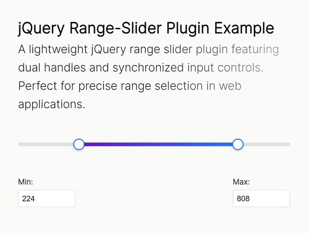
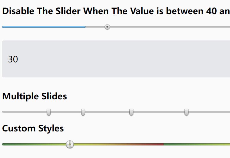
r-slider is a multi-purpose, highly customizable slider control plugin that helps users select a single value or a range of values in an elegant way.
Also can be used to create toggle switch, progress bar, step based form wizard with your own styles. Check out the examples in the zip for more information.
How to use it:
1. To get started, import jQuery library and the r-slider plugin into the document.
<script src="https://code.jquery.com/jquery-3.3.1.min.js"
        integrity="sha384-tsQFqpEReu7ZLhBV2VZlAu7zcOV+rXbYlF2cqB8txI/8aZajjp4Bqd+V6D5IgvKT"
        crossorigin="anonymous">
</script>
<script src="js/r-slider.js"></script>
2. Create a new slider control on the webpage.
<div id="container"></div>
var mySlider = new slider({

    // container element
    container: "#container",

    // start/end values
    start: -100,
    end: 100,

    // custom step
    step: 1,

    // initial value
    value: 0

});
3. Apply your own CSS styles to the slider control.
#container .r-slider-line {
  background: #4b5459;
  border-radius: 4px;
}

#container .r-slider-fill {
  background: #4b5459;
}

#container .r-slider-button {
  box-shadow: inset 0 0 0 4px #c4c8cc;
  border-radius: 100%;
  text-align: center;
}

#container .r-slider-label {
  position: relative;
  top: 13px;
  font-size: 20px;
  color: #c4c8cc;
  z-index: 1000;
}

#container .r-slider-label:before {
  content: "";
  position: absolute;
  top: -13px;
  left: 5px;
  width: 30px;
  height: 30px;
  background: #4b5459;
  border-radius: 100%;
  z-index: -1;
}
4. Advanced usages.
var mySlider = new slider({

    // container element
    container: "#container",

    // start/end values
    start: -100,
    end: 100,

    // min/max values
    min: -50,
    max: 80,

    // custom step
    step: 1,

    // initial value
    value: 0,

    // shows value on drag
    showValue: true,

    // always shows value
    fixValue: true,

    // shows fill line
    showFill: true,

    // shows labels
    pinStep: 10,

    // custom label step
    labelStep: 40,

    // disables drag
    changable: false,

    // custom styles
    style: {
      line_width: 0
    },

    // for toggle switch
    text: ["ON", "OFF"],

    // left, right, up, or down
    direction: 'left'

    // enable on mobile devices
    isMobile: true,

    // callbacks
    ondrag: function(){},

    onchange: function(){},

    onbuttonmousedown: function(){}

});
Changelog:
2019-01-25
- JS Update
2019-01-22
- JS Update
2018-11-18
- added mobile support
2018-11-17
- added more options and callbacks.
2018-11-16
- added direction
2018-11-15
- update getState
2018-10-09
- JS Update
This awesome jQuery plugin is developed by mohammadFeiz. For more Advanced Usages, please check the demo page or visit the official website.