Flexible Multiple Select Widget For jQuery UI - multiSelect.js
| File Size: | 127 KB |
|---|---|
| Views Total: | 61239 |
| Last Update: | |
| Publish Date: | |
| Official Website: | Go to website |
| License: | MIT |
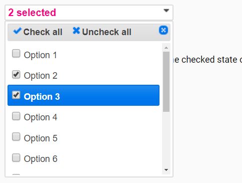
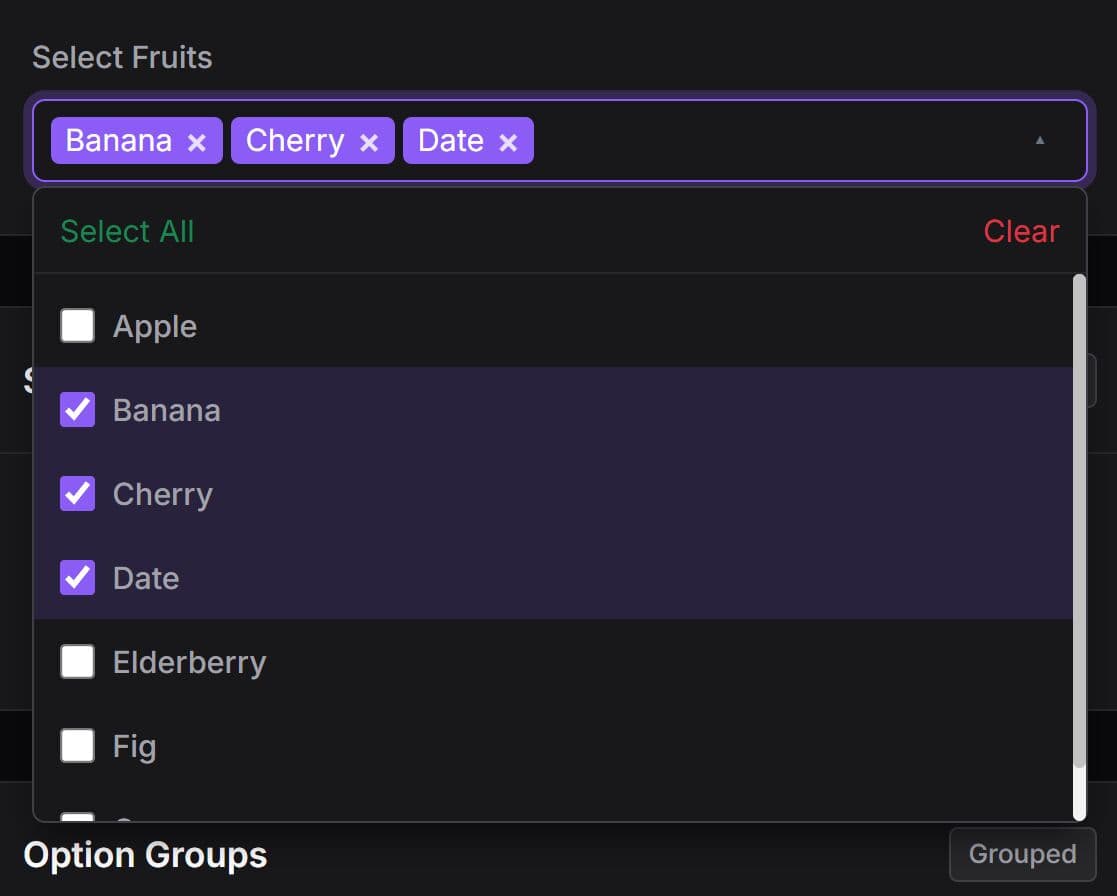
multiSelect.js is a jQuery plugin (jQuery UI) to create a flexible, multi-language, user-friendly multiple select dropdown with support for checkboxes, check/uncheck all, live filtering and on/close animations.
Basic usage:
1. Include the necessary jQuery and jQuery UI libraries on the html page.
<link rel="stylesheet" href="/path/to/jquery-ui.min.css">
<script src="/path/to/jquery.min.js"></script>
<script src="/path/to/jquery-ui.min.js"></script>
2. Include the jQuery multiSelect.js plugin's main files on the page.
<link rel="stylesheet" href="jquery.multiselect.css">
<script src="jquery.multiselect.js"></script>
3. Include the jQuery multiSelect.js plugin's filtering extension when needed.
<link rel="stylesheet" href="jquery.multiselect.filter.css">
<script src="jquery.multiselect.filter.js"></script>
4. Include a language file of choice on the page. Supported languages:
- br
- cs
- de
- es
- fr
- hu
- it
- ja
- pl
- ru
- tr
- zh-cn
- zh-tw
<script src="i18n/jquery.multiselect.de.js"></script>
<script src="i18n/jquery.multiselect.filter.de.js"></script>
5. Call the function on the target multiple select and done (option group is supported as well).
<select name="example" multiple="multiple" size="5">
  <optgroup label="Group One">
    <option value="option1">Option 1</option>
    <option value="option2">Option 2</option>
    <option value="option3">Option 3</option>
  </optgroup>
  <optgroup label="Group Two">
    <option value="option4">Option 4</option>
    <option value="option5">Option 5</option>
    <option value="option6">Option 6</option>
    <option value="option7">Option 7</option>
  </optgroup>
</select>
$(function(){
  $("select").multiselect();
});
6. Full plugin options with default values.
$("select").multiselect({

  // false | string | array False, custom string or array indicating which links to show in the header & in what order.
  header: ['checkAll','uncheckAll'],

  // integer | string | 'auto' | null
  // Sets the min/max/exact width of the button.
  buttonWidth: 225,

  // Enables the use of jQuery UI resizable if it is loaded.
  resizableMenu: false,

  // (integer) Overrides the z-index set for the menu container.
  zIndex: null,

  // integer | null
  // If selected count > maxSelected, then message is displayed, and new selection is undone.
  maxSelected: null,

  // An array containing menu opening effect information.
  openEffect: null,

  // An array containing menu closing effect information.
  closeEffect: null,

  // additional classes
  classes: '',

  // custom text
  noneSelectedText: 'Select options',
  selectedText: '# selected',

  // shows check/uncheck all links
  showCheckAll: true,
  showUncheckAll: true,

  // This allows customization of the list separator.  Use ',<br/>' to make the button grow vertically showing 1 selection per line.
  selectedList: 0,

  // If true, then the menu will be opening immediately after initialization.
  autoOpen: false,

  // List of 'button' &/or 'options' indicating in which parts of the widget to treat text as html.
  htmlText: [],

  // List of 'button', 'header', &/or 'options' indicating in which parts of the widget to wrap text.
  wrapText: ['button','header','options'],

  // Omits the button and instead of a pop-up inserts the open menu directly after the native select as a list box.
  listbox: false,

  // If true, names are created for each option input in the multi-select.
  addInputNames: true,

  // A jQuery UI position object that constrains how the pop-up menu is positioned.
  position: {},

  // jQuery | DOM element | selector string
  // If provided, this specifies what element to append the widget to in the DOM.
  appendTo: null,

  // integer | string | 'auto' | null
  // If a number is provided, sets the exact menu width.
  menuWidth:null,

  // integer | string | 'auto' | 'size'
  // Sets the height of the menu or determines it using native select's size setting.
  menuHeight: 200,

  // list separator
  selectedListSeparator: ', ',

  // disables input on toggle
  disableInputsOnToggle: true,

  // Determines if clicking on an option group heading selects all of its options.
  groupsSelectable: true,

  // Determines if option groups can be collapsed.
  groupsCollapsable: false,

  // Displays groups in a horizonal column layout.
  groupColumns: false,


  /* (object | null) Supply an obect of link information to use alternative icons, icon labels, or icon title text.  See linkDefaults above for object structure.
    'open': {
     'class': 'ui-multiselect-open',
     'icon': '<span class="ui-icon ui-icon-triangle-1-s"></span',
     'title': 'Open'
    },
    'close': {
     'class': 'ui-multiselect-close',
     'icon': '<span class="ui-icon ui-icon-circle-close"></span>',
     'title': 'Close'
    },
    'checkAll': {
     'class': 'ui-multiselect-all',
     'icon': '<span class="ui-icon ui-icon-check"></span>',
     'text': 'Check all',
     'title': 'Check all'
    },
    'uncheckAll': {
     'class': 'ui-multiselect-none',
     'icon': '<span class="ui-icon ui-icon-closethick"></span>',
     'text': 'Uncheck all',
     'title': 'Uncheck all'
    },
    'flipAll': {
     'class': 'ui-multiselect-flip',
     'icon': '<span class="ui-icon ui-icon-arrowrefresh-1-w"></span>',
     'text': 'Flip all',
     'title': 'Flip all'
    },
    'collapse': {
     'icon': '<span class="ui-icon ui-icon-minusthick"></span>',
     'title': 'Collapse'
    },
    'expand': {
     'icon': '<span class="ui-icon ui-icon-plusthick"></span>',
     'title': 'Expand'
    },
    'collapseAll': {
     'class': 'ui-multiselect-collapseall',
     'icon': '<span class="ui-icon ui-icon-minus"></span>',
     'text': 'Collapse all',
     'title': 'Collapse all'
    },
    'expandAll': {
     'class': 'ui-multiselect-expandall',
     'icon': '<span class="ui-icon ui-icon-plus"></span>',
     'text': 'Expand all',
     'title': 'Expand all'
    }
  */
  linkInfo: null,

});
7. Default options for the filtering extension.
$("select").multiselectfilter({

  // The text to appear left of the input.
  label: 'Filter:',

  // The width of the input in pixels.
  width: null,

  // (string) Either a named filter rule from above or a regular expression containing {{term}} as a placeholder
  filterRule: 'contains',

   // If true, search option group labels and show an entire group on a match.
  searchGroups: false,

  // The HTML5 placeholder attribute value of the input.
  placeholder: 'Enter keywords',

  // A boolean value denoting whether or not to reset the search box & any filtered options when the widget closes.
  autoReset: false,

  // Number of milleseconds to wait between running the search handler.
  debounceMS: 250,

  filter: function(event, matches){
    // find the first matching checkbox
    var first_match = $( matches[0] );
  }

});
8. Event handlers.
$("#multiselect").on("beforecheckall", function(){
  // do something
});

$("#multiselect").on("beforeclose", function(){
  // do something
});

$("#multiselect").on("beforecollapseall", function(){
  // do something
});

$("#multiselect").on("beforecollapsetoggle", function(event, ui.label, ui.collapsed){
  // do something
});

$("#multiselect").on("beforeexpandall", function(){
  // do something
});

$("#multiselect").on("beforeflipall", function(){
  // do something
});

$("#multiselect").on("beforeopen", function(){
  // do something
});

$("#multiselect").on("beforecollapsetoggle", function(event, ui.label, ui.collapsed){
  // do something
});

$("#multiselect").on("beforeuncheckall", function(){
  // do something
});

$("#multiselect").on("checkall", function(){
  // do something
});

$("#multiselect").on("click", function(event, ui.value, ui.text, ui.checked){
  // do something
});

$("#multiselect").on("close", function(){
  // do something
});

$("#multiselect").on("collapseall", function(){
  // do something
});

$("#multiselect").on("collapsetoggle", function(event, ui.label, ui.collapsed){
  // do something
});

$("#multiselect").on("create", function(){
  // do something
});

$("#multiselect").on("expandall", function(){
  // do something
});

$("#multiselect").on("flipall", function(){
  // do something
});

$("#multiselect").on("maxselected", function(event, ui.labels, ui.inputs){
  // do something
});

$("#multiselect").on("open", function(){
  // do something
});

$("#multiselect").on("optgrouptoggle", function(event, ui.inputs, ui.label, ui.checked){
  // do something
});

$("#multiselect").on("refresh", function(){
  // do something
});

$("#multiselect").on("resync", function(){
  // do something
});

$("#multiselect").on("uncheckall", function(){
  // do something
});

$("#multiselect").on("resize", function(event, ui){
  // do something
});
9. API methods.
// Adds A New Options
$("#multiselect").multiselect("addOption", attributes, text, groupID);

// Displays a message in the widget button for one second
$("#multiselect").multiselect("buttonMessage", message);

// Checks all checkboxes.
$("#multiselect").multiselect("checkAll", groupID);

// Closes the menu
$("#multiselect").multiselect("close");

// Collapses all option groups.
$("#multiselect").multiselect("collapseAll", groupID);

// Destroy the widget and return to the original select box.
$("#multiselect").multiselect("destroy");

// Enables the entire widget.
$("#multiselect").multiselect("enable", groupID);

// Disables the entire widget.
$("#multiselect").multiselect("disable", groupID);

// Expands all option groups.
$("#multiselect").multiselect("expandAll", groupID);

// Inverts (flip) all checkboxes.
$("#multiselect").multiselect("flipAll", groupID);

// Returns the button element.
$("#multiselect").multiselect("getButton");

// Returns an array of all the checked boxes.
$("#multiselect").multiselect("getChecked");

// Returns an array of the collapsed option groups.
$("#multiselect").multiselect("getCollapsed");

// Returns the labels for the options within the widget, the inputs are children of these labels.
$("#multiselect").multiselect("getLabels");

// Returns the menu element for the widget.
$("#multiselect").multiselect("getMenu");

// Returns the namespace ID of the current widget instance.
$("#multiselect").multiselect("getNamespaceID");

// Returns an array of all the boxes that are not checked.
$("#multiselect").multiselect("getUnchecked");

// Returns a boolean denoting if the widget is currently open or not.
$("#multiselect").multiselect("isOpen");

// Opens the menu. If an open effect was specified as a widget option, then it will be used.
$("#multiselect").multiselect("open");

// Sets or gets one of the options (settings, not menu or select options) after the widget has been initialized. If changing an option, the new option setting will take affect immediately.
$("#multiselect").multiselect("option");

// Resets the positioning of the menu relative to the button.
$("#multiselect").multiselect("position");

// Reloads the checkbox menu. If you're dynamically adding/removing option tags on the original select via AJAX or DOM manipulation methods, call refresh to reflect the changes in the widget.
$("#multiselect").multiselect("refresh", init);

// Removes an option
$("#multiselect").multiselect("removeOption", value);

// Resynchonizes the widget's checkboxes with the selected states of the underlying native select options.
$("#multiselect").multiselect("resync", skipDisabled);

// Unchecks all checkboxes.
$("#multiselect").multiselect("uncheckAll", groupID);

// Updates the button text to reflect the number of current selections or the list of current selections, if the selectedList option is set.
$("#multiselect").multiselect("update", isDefault);

// Returns the value of the native select or sets it and re-synchronizes the widget.
$("#multiselect").multiselect("value", newValue);

// Returns the menu container (all checkboxes inside).
$("#multiselect").multiselect("widget");

// Destroys the filter plugin.
$("#multiselect").multiselectfilter("destroy");

// Reloads the cache of values to search against.
$("#multiselect").multiselectfilter("updateCache");

// Returns the wrapper div with the input and label text inside.
$("#multiselect").multiselectfilter("widget");
Changelog:
v3.0.1 (2021-07-16)
- Add type="button" to option group collapse
v3.0.0 (2019-06-05)
- Added more features and fixed bugs.
- Use inputs instead of menu for checked state
2018-08-28
- Fixes height calculation for optgroups
2018-05-18
- Auto focus first selected item in single mode
2018-03-14
- JS update
This awesome jQuery plugin is developed by ehynds. For more Advanced Usages, please check the demo page or visit the official website.