Advanced Range Slider Control In jQuery - rsSliderLens
| File Size: | 326 KB |
|---|---|
| Views Total: | 4998 |
| Last Update: | |
| Publish Date: | |
| Official Website: | Go to website |
| License: | MIT |
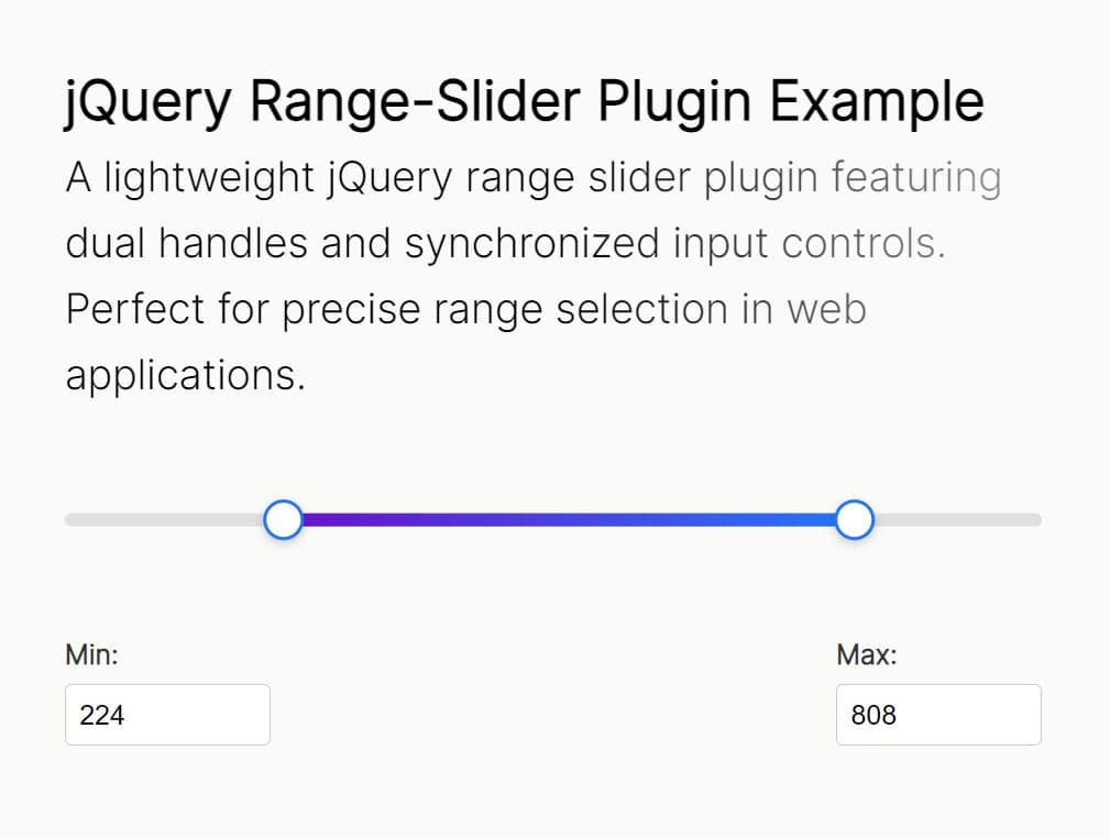
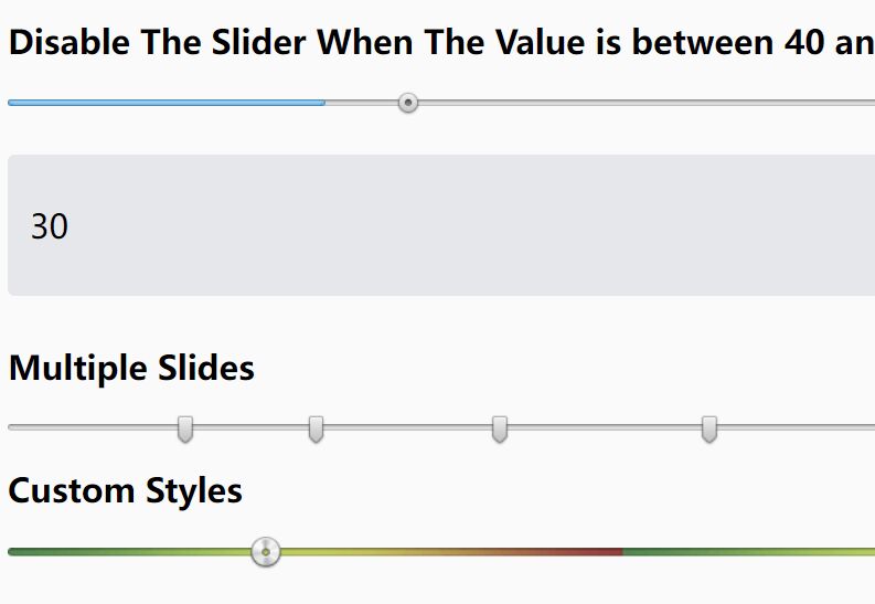
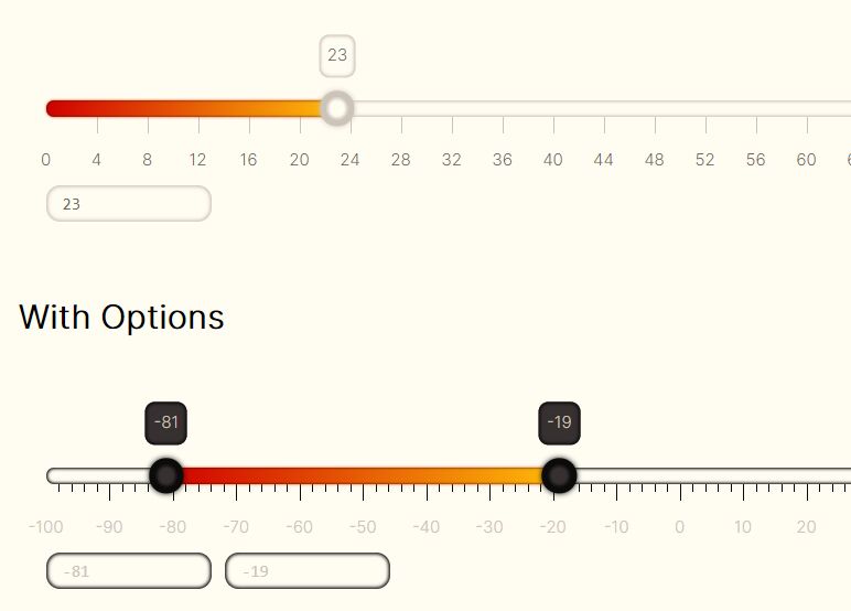
rsSliderLens is a jQuery plugin which transforms the normal range input into an advanced, responsive, customizable, nice-looking range/ruler/content slider control with a magnifying glass effect.
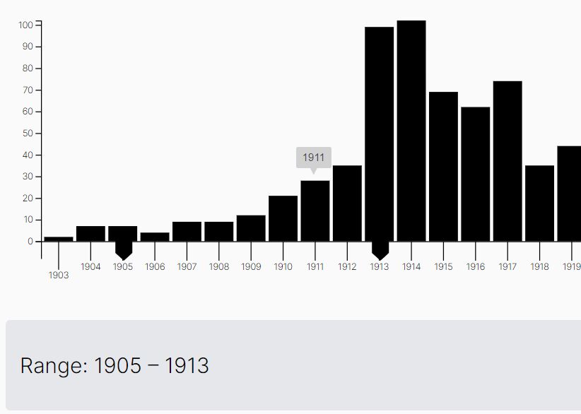
Not only range input, you can also bind the plugin to any element such as text, images, etc.
More features:
- Keyboard friendly.
- Supports both horizontal and vertical sliders.
- Auto snaps to each step on drag.
- Supports mousewheel, mouse drag, and touch events.
- Based on SVG.
- Customizable via JS and LESS.
How to use it:
1. Install & download.
# NPM
$ npm install jquery.rsSliderLens --save
2. Load the rsSliderLens plugin after loading the latest jQuery JavaScript library.
<script src="/path/to/cdn/jquery.min.js"></script>
<script src="/path/to/src/jquery.rsSliderLens.js"></script>
3. Load the compiled stylesheet in the header of the document.
<link rel="stylesheet" href="dist/rsSliderLens.css">
4. Or directly load the LESS file in the document.
<link rel="stylesheet/less" href="/path/to/src/rsSliderLens.less" />
<script src="/path/to/less.min.js"></script>
5. Attach the function rsSliderLens to the range input and done.
<input type="range">
$(function(){
  $("input").rsSliderLens();
});
6. In this example you can see the text slider created out of a <span> markup, so it do not accept keyboard input by default. However, you can add a tabindex attribute to the span, to make it keyboard friendly. A slider made out of a non input element can either display a ruler or the original html content.
<span>Hello world</span>
$(function(){
  $("span").rsSliderLens({
    ruler: {
      visible: false
    }
  });
});
7. Set the slider orientation: auto, horiz, or vert.
$("input").rsSliderLens({
  orientation: 'auto'
});
8. Determines the amount of each interval the slider takes between min and max. Use 0 to disable step. For example, if min = 0, max = 1 and step = 0.25, then the user can only select 0, 0.25, 0.5, 0.75 and 1.
$("input").rsSliderLens({
  step: 0
});
9. Determines whether the handle snaps to each step during mouse dragging. Only meaningful if a non zero step is defined.
$("input").rsSliderLens({
  snapOnDrag: false
});
10. Customize the handle, which is the cursor that the user can drag around to select values.
$("input").rsSliderLens({
  handle: {

    // Relative handle size. Type: Floating number between 0 and 1, inclusive.
    // For horizontal sliders, it is the handle width relative to the slider width, e.g.,
    // if slider width is 500px and handle size is .3, then handle size becomes (500px * 30%) = 150px in width.
    // For vertical sliders, it is the handle height relative to the slider height.
    // If two handles are used, then this is the size of both handles together, which means each handle has a size of size/2.
    size: 0.3,

    // Magnification factor applied inside the handle. Type: positive floating point number.
    // If greater than 1, the content is magnified.
    // If 1, the content remains the same size.
    // If smaller than 1, the content is shrinked.
    zoom: 1.5,

    // Indicates the middle handle relative position (0% - 100%) Type: floating point number >= 0 and <= 1.
    // Not applicable for fixed handled sliders.
    // For horizontal sliders, a value of 0 aligns the middle of the handle to the top of the slider,
    // 1 aligns the middle of the handle to the bottom of the slider.
    // For vertical sliders, a value of 0 aligns the middle of the handle to the left of the slider,
    // 1 aligns the middle of the handle to the right of the slider.
    pos: 0.5,

    // Relative handle height (for horizontal sliders) or relative handle width (for vertical sliders). Type: string or floating point number >= 0.
    // Not applicable for fixed handled sliders.
    // If set to string 'zoom' the otherSize is set according to the handle.zoom value,
    // e.g. if the handle.zoom is 1.25, then the otherSize is also 1.25 (125% of the slider size).
    // If set to a floating point number, it represents a relative size, e.g. if set to 1, then handle size will have
    // the same size (100%) of the slider element.
    otherSize: 'zoom',

    // Duration (ms or jQuery string alias) of animation that happens when handle needs to move to a different location (triggered by a mouse click on the slider).
    // Use 0 to disable animation. Type: positive integer or string.
    animation: 100,

    // Easing function used for the handle animation (@see http://api.jquery.com/animate/#easing). Type: string.
    easing: 'swing',

    // Threshold factor applied to the handle when using the mouse wheel. Type: floating point number.
    // when = 0, mouse wheel cannot be used to move the handle;
    // when > 0 and mouse wheel goes up, then handle moves to the right (for horizontal sliders) or up (for vertical sliders)
    // when > 0 and mouse wheel goes down, then handle moves to the left (for horizontal sliders) or down (for vertical sliders)
    // when < 0 and mouse wheel goes up, then handle moves to the left (for horizontal sliders) or down (for vertical sliders)
    // when < 0 and mouse wheel goes down, then handle moves to the right (for horizontal sliders) or up (for vertical sliders)
    mousewheel: 1
  },
});
11. Customize the ruler.
$("input").rsSliderLens({
  ruler: {

    // Determines whether the SVG ruler is shown. Type: boolean.
    // true - the original markup content is hidden and a SVG ruler is displayed instead.
    // false - the original markup content is displayed.
    // Note: If the plug-in is attached to a DOM element that contains no content at all (no children), then this property is set to true and a ruler is displayed instead (since there is nothing to display from the DOM element).
    // There is more to this, please see onCustom below.
    visible: true,

    // Specifies the relative width (for horizontal sliders) or height (for vertical sliders) of the svg ruler. Type: floating pointer number >= 0.
    // Only applicable to fixed handle sliders with a visible ruler.
    // A value of 1, means that the ruler has the same (100%) width of the parent container (or height for vertical sliders).
    // A value of 1.7, means that the ruler is wider (or taller) 170% than the parent container.
    size: 1.5,

    // Labels on the ruler
    labels: {

      // Determines whether value labels are displayed. Type: boolean.
      visible: true,

      // Determines which values are displayed in the ruler. Type: string, boolean or array of numbers.
      // 'step' - Values are displayed with a step interval (see step). If step is 0, then no labels are displayed.
      // true - Same as 'step'.
      // false - Values are not displayed.
      // number array - Only the numbers in the array are displayed.
      values: 'step',

      // Indicates the label relative (0% - 100%) position. Type: floating point number >= 0 and <= 1.
      // For horizontal sliders, a value of 0 aligns the labels to the top, 1 aligns it to the bottom. Labels are center justified in horizontal sliders.
      // For vertical sliders, a value of 0 aligns the labels to the left, 1 aligns it to the right.
      pos: 0.8,

      // Event called for each label. Type: function (event, value).
      // Use this event to return a string that replaces the default given value.
      onCustomLabel: null,

      // Event called for each label. Type: function (event, value, x, y).
      // This event should return an Javascript object with all the attributes that should be applied to a text label.
      // All three parameters are floating point numbers, and represent the current label value and the X and Y coordinates, respectively.
      /* Example: to rotate labels 45 degrees and left justified, use:
        $('.myElement').rsSliderLens({
          ruler: {
            labels: {
              onCustomAttrs: function (event, value, x, y) {
                return {
                  transform: 'rotate(45 ' + x + ',' + y + ')',
                  'text-anchor': 'start'
                };
              }
            }
          }
        });
      */
      onCustomAttrs: null
    },

    tickMarks: {
      short: {

        // Determines whether short tick marks are visible. Type: boolean.
        visible: true,

        // Interval between each short tick mark. Type: floating number.
        step: 2,

        // Indicates the short tick marks relative position (0% - 100%) Type: floating point number >= 0 and <= 1.
        // For horizontal sliders, 0 means aligned to the top of the slider and 1 to the bottom.
        // For vertical sliders, 0 means aligned to the left of the slider and 1 to the right.
        pos: 0.2,

        // Indicates the short tick marks relative size (0% - 100%) Type: floating point number >= 0 and <= 1.
        // E.g. a value of .5 means the tick mark has a height equivalent to half of the slider height, for horizontal sliders.
        // For vertical sliders, a value of 0.5 means the tick mark has a width equivalent to half of the slider width.
        size: 0.1

      },

      long: {

        // Determines whether long tick marks are visible. Type: boolean.
        visible: true,

        // Interval between each long tick mark. Type: floating number.
        step: 10,

        // Indicates the long tick marks relative position (0% - 100%) Type: floating point number >= 0 and <= 1.
        // For horizontal sliders, 0 means aligned to the top of the slider and 1 to the bottom.
        // For vertical sliders, 0 means aligned to the left of the slider and 1 to the right.
        pos: 0.15,

        // Indicates the long tick marks relative size (0% - 100%) Type: floating point number >= 0 and <= 1.
        // E.g. a value of .5 means the tick mark has a height equivalent to half of the slider height, for horizontal sliders.
        // For vertical sliders, a value of 0.5 means the tick mark has a width equivalent to half of the slider width.
        size: 0.15
      }
    },

    // Event used for customized rulers. Type: function(event, $svg, width, height, zoom, magnifiedRuler, createSvgDomFunc)
    // If onCustom event is undefined and ruler.visible is true, then a custom ruler is generated.
    // If onCustom event is undefined and ruler.visible is false, then no ruler is displayed and the original content is shown.
    // If onCustom event is defined and ruler.visible is true, then onCustom is used to draw on top of the generated ruler.
    // If onCustom event is defined and ruler.visible is false, then use onCustom to create your own custom ruler from scratch.
    // This event is always called twice:
    //   - First time for the regular size ruler.
    //   - Second time for the magnified ruler inside the handle.
    // $svg: <svg> element to be added later to the document. Any extra DOM elements created by your onCustom should be appended as children to this $svg.
    // width: width in pixels of the $svg element.
    // height: height in pixels of the $svg element.
    // zoom: Indicates whether this ruler should be magnified. The first time this event is called, zoom is 1.
    //       The second time this event is called, zoom matches the handle.zoom value.
    // magnifiedRuler: boolean. It is false when onCustom is invoked for the regular size ruler.
    //                          If is true when onCustom is invoked for the magnified ruler inside the handle.
    // createSvgDomFunc: function(tag, attrs), where tag is a String and attrs a JS object.
    //  A function provided to your convenience, that returns a new SVG element (without adding it to the DOM).
    //  The returned element contains the given tag and attributes, if any.
    //  For example, the following code
    //    var $line = createSvgDomFunc('line', {x1: 0, y1: 0, x2: 0.5, y2: 5, 'stroke-width': zoom});
    //  sets $line to the element <line x1="0" y1="0" x2="0.5" y2="5" stroke-width="1"></line>
    onCustom: null
  }
});
12. More customization options.
$("input").rsSliderLens({

  // Slider width: Type: String or positive integer greater than zero.
  // 'auto'  - The plug-in retrieves the width from the element to which the plug-in is bounded.
  //            If retrieving the width is impossible (because the element is hidden), then 150 is used.
  // integer - The plug-in uses this given width instead.
  width: 'auto',

  // Slider height: Type: String or positive integer greater than zero.
  //  'auto'  - The plug-in retrieves the height from the element to which the plug-in is bounded.
  //            If retrieving the height is impossible (because the element is hidden), then 50 is used.
  //  integer - The plug-in uses this given height instead.
  height: 'auto',

  // Determines whether handle is movable. Type: boolean or floating point number between 0 and 1.
  // false - the user can move the handle left/right (horizontal sliders) or move up/down (vertical sliders).
  // true - the handle is in a fixed position (in the middle of the slider) and does not move. Instead, only the ruler moves.
  // 0 <= value <= 1 - the handle is in a fixed position and does not move. Instead, only the ruler moves.
  // The handle is placed in a relative position (0% - 100%). A value of 0 places the handle on the left (horizontal slides) or on top (vertical slides).
  // A value of 0.5 or true places the handle in the middle of the slider.
  fixedHandle: false,

  // Represents the initial value(s). Type: floating point number or array of two floating point numbers.
  // When a single number is used, only one handle is shown. When a two number array is used, e.g. [5, 20], two handles are shown.
  // If value is an array of two numbers and handle is fixed (see fixedHandle), then only the first value (value[0]) is considered.
  value: 0,

  // Minimum allowed value. Type: floating point number.
  min: 0,

  // Maximum allowed value. Type: floating point number.
  max: 100,

  // Determines whether the control is editable. Type: boolean.
  enabled: true,

  // Indicates the direction. Type: boolean.
  //  false - for horizontal sliders, the minimum is located on the left, maximum on the right. For vertical sliders, the minimum on the top, maximum on the bottom.
  //  true - for horizontal sliders, the maximum is located on the left, minimum on the right. For vertical sliders, the maximum on the top, minimum on the bottom.
  flipped: false,

  // Relative position of the content (0% - 100%). Type: Floating number between 0 and 1, inclusive.
  // For horizontal sliders: Relative vertical position of the content.
  // For vertical sliders: Relative horizontal position for content.
  // Only applicable to sliders that show original content. Ignored for sliders with SVG rulers.
  contentOffset: 0.5,

  // Relative start padding (0% - 100%). Type: Floating number between 0 and 1, inclusive.
  paddingStart: 0,

  // Relative end padding (0% - 100%). Type: Floating number between 0 and 1, inclusive.
  // On SVG rulers, if the first or last labels are not displayed at all, or partially displayed, then use this to add some extra padding in order for the labels to be displayed correctly.
  // When displaying the original content (see ruler.visible property)
  paddingEnd: 0,

  // CSS style classes. You can use more than one class, separated by a space. Type: string.
  style: {
    classSlider: 'sliderlens',      // Class added to the wrapper div created at run-time.
    classFixed: 'fixed',            // Class added to the wrapper div created at run-time, when slider has a fixed handle.
    classHoriz: 'horiz',            // Class added to the wrapper div created at run-time, for horizontal sliders.
    classVert: 'vert',              // Class added to the wrapper div created at run-time, for vertical sliders.
    classDisabled: 'disabled',      // Class added to the wrapper div created at run-time, when slider is disabled.
    classHandle: 'handle',          // Class added to the handle div created at run-time, for single handle sliders.
    classHandle1: 'handle1',        // Class added to the first handle div created at run-time (only applicable to double handle sliders).
    classHandle2: 'handle2',        // Class added to the second handle div created at run-time (only applicable to double handle sliders).
    classDragging: 'dragging',      // Class added to the handle currently being dragged by the mouse. Also added to the wrapper div and to the range element.
    classRange: 'range',            // Class added to the range bars.
    classRangeDraggable: 'drag',    // Class added to the range bars the moment the user drags them.
    classFocused: 'focus'           // Class added to the wrapper div created at run-time, when handle receives keyboard focus.
                                    // The keyboard focus is possible only when the plug-in is bounded to a focusable element, that is,
                                    // an <input> element or any other element with a tabindex attribute.
  },

  range: {

    // Specifies a range contained in [min, max]. This range can be used to restrict input even further, or to simply highlight intervals.
    // Type: string or array of two floating point numbers.
    // 'hidden' (or false or undefined) - no range is displayed.
    // 'between' (or true) - range between current handles. Only applicable for double handles (see value).
    // 'min' - range between min and the first handle.
    // 'max' - range between handle and max, or - when two handles are used - between second handle and max.
    // [from, to] - Defines a range that restricts the input to the interval [from, to].
    // For example, if min = 20 and max = 100 and range = [50, 70], then it is not possible to select values smaller than 50 or greater than 70
    // The style of the range area is defined by classRange.
    type: 'hidden',

    // Determines whether the user can drag a range with the mouse. Type: boolean.
    // false - range cannot be dragged.
    //  true - range can be dragged (only if type is 'between', true or [from, to])
    // Not applicable for fixed handle sliders.
    draggable: false,

    // Relative position of the range bar. Type: Floating number between 0 and 1, inclusive.
    // For horizontal sliders, represents the vertical position of the horizontal range, with 0 aligned to the top of the slider, and 1 to the bottom.
    // For vertical sliders, represents the horizontal position of the vertical range, with 0 aligned to the left of the slider, and 1 to the right.
    pos: 0.46,

    // Relative size of the range bar. Type: Floating number between 0 and 1, inclusive.
    // For horizontal sliders, represents the height of the horizontal range.
    // For vertical sliders, represents the width of the vertical range.
    size: 0.1
  },

  keyboard: {

    // Allowed keys. Type: String array.
    allowed: ['left', 'right', 'up', 'down', 'home', 'end', 'pgup', 'pgdown', 'esc'],

    // Easing function used in keyboard animation (@see http://api.jquery.com/animate/#easing). Type: string.
    easing: 'swing',

    // Number of pages in a slider (how many times can you page up/down to go through the whole range). Type: positive integer.
    numPages: 5
  }

});
13. Callback functions.
$("input").rsSliderLens({

  // Event fired when value changes (when handle moves). Type: function (event, value, isFirstHandle).
  onChange: null,

  // Event fired for the final value set after the animation has finished or after a mouse dragging. Type: function (event, value, isFirstHandle).
  onFinalChange: null,

  // Event fired after the plug-in has been initialized. Type: function (event).
  onCreate: null

});
14. Callback functions.
$("input").rsSliderLens({

  // Event fired when value changes (when handle moves). Type: function (event, value, isFirstHandle).
  onChange: null,

  // Event fired for the final value set after the animation has finished or after a mouse dragging. Type: function (event, value, isFirstHandle).
  onFinalChange: null,

  // Event fired after the plug-in has been initialized. Type: function (event).
  onCreate: null

});
15. Update the option.
$("input").rsSliderLens('option', OPTIONNAME, VALUE);
Changelog:
v1.0.6 (2021-02-03)
- reading the value attribute from an input range, not the val()
This awesome jQuery plugin is developed by ruisoftware. For more Advanced Usages, please check the demo page or visit the official website.