Dynamic Cross-platform Grid Gallery Plugin With jQuery - Wall/Grid Gallery
| File Size: | 40.3 MB |
|---|---|
| Views Total: | 4741 |
| Last Update: | |
| Publish Date: | |
| Official Website: | Go to website |
| License: | MIT |
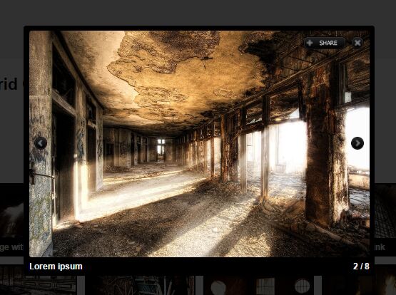
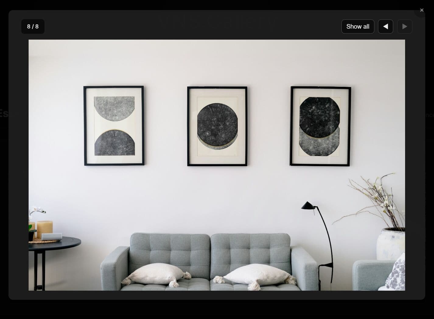
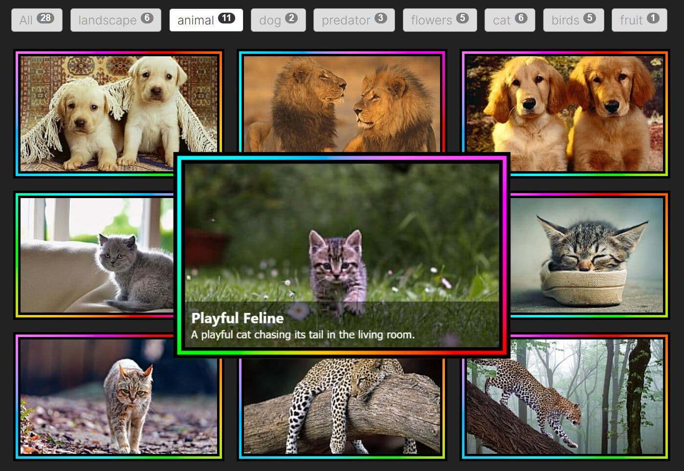
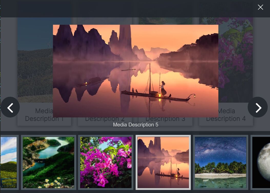
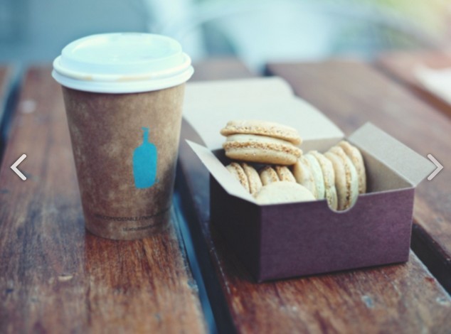
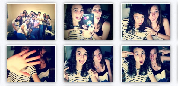
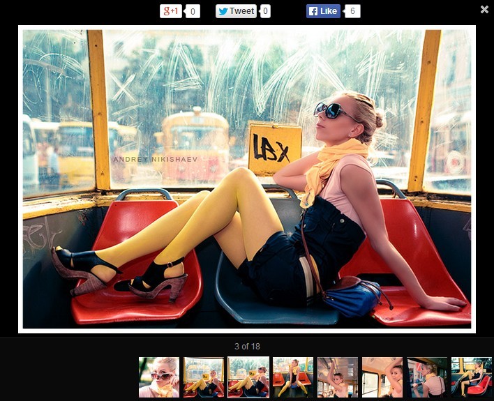
A highly customizable jQuery plugin to create a dynamic, responsive, cross-platform wall/grid photo gallery which can be edited from a HTML, JSON or XML files. The gallery is completely resizable and is compatible with all browsers and devices (compatible with iOS & Android). In the Wall/Grid Gallery you can easily add labels to thumbnails, captions, links, embed videos or add HTML content. With the Wall/Grid Gallery you can easily change thumbnail sizes, colors, navigation, lightbox position … and much more.
How to use it:
1. Load the following JavaScript and CSS files into your html document.
<!-- CSS -->
<link rel="stylesheet" href="jquery.jscrollpane.css">
<link rel="stylesheet" href="jquery.dop.WallGridGallery.css">
<!-- JavaScript -->
<script src="//code.jquery.com/jquery-latest.js"></script>
<script src="jquery.mousewheel.js"></script>
<script src="jquery.jscrollpane.min.js"></script>
<script src="jquery.dop.WallGridGallery.js"></script>
2. Attach the plugin to a gallery container and we're ready to go.
$('#galleryContainer').DOPWallGridGallery();
3. Setup the data source in the JavaScript as these:
$('#galleryContainer').DOPWallGridGallery({
  'SettingsDataType': 'XML',
  'SettingsFilePath': 'settings.xml',
  'ContentDataType': 'XML',
  'ContentFilePath':'content.xml'
});

// or
$('#galleryContainer').DOPWallGridGallery({
  'SettingsFilePath': 'settings.json',
  'ContentFilePath': 'content.json'
});

// or
$('#galleryContainer').DOPWallGridGallery({
  'SettingsDataType': 'HTML',
  'ContentDataType': 'HTML'
});
4. Customize the grid gallery in the settings.xml.
<?xml version="1.0" encoding="UTF-8"?>
<Settings>
  <Width>900</Width> <!-- Width (value in pixels). Default value: 900. Set the width of the gallery. -->
  <Height>0</Height> <!-- Height (value in pixels). Default value: 0. Set the height of the gallery. If you set the value to 0 all thumbnails are going to be displayed. -->
  <BgColor>ffffff</BgColor> <!-- Background Color (color hex code). Default value: f1f1f1. Set gallery background color. -->
  <BgAlpha>100</BgAlpha> <!-- Background Alpha (value from 0 to 100). Default value: 100. Set gallery background alpha. -->
  <NoLines>3</NoLines> <!-- Number of Lines (auto, number). Default value: 3. Set the number of lines for the grid. -->
  <NoColumns>4</NoColumns> <!-- Number of Columns (auto, number). Default value: 4. Set the number of columns for the grid. -->
  <ImagesOrder>normal</ImagesOrder> <!-- Images Order (normal, random). Default value: normal. Set images order. -->
  <ResponsiveEnabled>true</ResponsiveEnabled> <!-- Responsive Enabled (true, false). Default value: true. Enable responsive layout. -->

  <ThumbnailsSpacing>15</ThumbnailsSpacing> <!-- Thumbnails Spacing (value in pixels). Default value: 15. Set the space between thumbnails. -->
  <ThumbnailsPaddingTop>0</ThumbnailsPaddingTop> <!-- Thumbnails Padding Top (value in pixels). Default value: 0. Set the top padding for the thumbnails. -->
  <ThumbnailsPaddingRight>0</ThumbnailsPaddingRight> <!-- Thumbnails Padding Right (value in pixels). Default value: 0. Set the right padding for the thumbnails. -->
  <ThumbnailsPaddingBottom>0</ThumbnailsPaddingBottom> <!-- Thumbnails Padding Bottom (value in pixels). Default value: 0. Set the bottom padding for the thumbnails. -->
  <ThumbnailsPaddingLeft>0</ThumbnailsPaddingLeft> <!-- Thumbnails Padding Left (value in pixels). Default value: 0. Set the left padding for the thumbnails. -->
  <ThumbnailsNavigation>mouse</ThumbnailsNavigation> <!-- Thumbnails Navigation (mouse, scroll). Default value: mouse. Set how you navigate through the thumbnails. -->
  <ThumbnailsScrollScrubColor>777777</ThumbnailsScrollScrubColor> <!-- Thumbnails Scroll Scrub Color (color hex code). Default value: 777777. Set the scroll scrub color. -->
  <ThumbnailsScrollBarColor>e0e0e0</ThumbnailsScrollBarColor> <!-- Thumbnails Scroll Bar Color (color hex code). Default value: e0e0e0. Set the scroll bar color. -->
  <ThumbnailsInfo>tooltip</ThumbnailsInfo> <!-- Info Thumbnails Display (none, tooltip, label). Default value: none. Display a small info text on the thumbnails, a tooltip or a label on bottom. -->

  <ThumbnailLoader>dopwgg/assets/gui/images/ThumbnailLoader.gif</ThumbnailLoader> <!-- Thumbnail Loader (path to image). Set the loader for the thumbnails. -->
  <ThumbnailWidth>200</ThumbnailWidth> <!-- Thumbnail Width (the size in pixels). Default value: 200. Set the width of a thumbnail. -->
  <ThumbnailHeight>100</ThumbnailHeight> <!-- Thumbnail Height (the size in pixels). Default value: 100. Set the height of a thumbnail. -->
  <ThumbnailWidthMobile>100</ThumbnailWidthMobile> <!-- Mobile Thumbnail Width (the size in pixels). Default value: 100. Set the width of a thumbnail on mobile devices. -->
  <ThumbnailHeightMobile>50</ThumbnailHeightMobile> <!-- Mobile Thumbnail Height (the size in pixels). Default value: 50. Set the height of a thumbnail on mobile devices. -->
  <ThumbnailAlpha>80</ThumbnailAlpha> <!-- Thumbnail Alpha (value from 0 to 100). Default value: 80. Set the transparancy of a thumbnail. -->
  <ThumbnailAlphaHover>100</ThumbnailAlphaHover> <!-- Thumbnail Alpha Hover (value from 0 to 100). Default value: 100. Set the transparancy of a thumbnail when hover. -->
  <ThumbnailBgColor>cccccc</ThumbnailBgColor> <!-- Thumbnail Background Color (color hex code). Default value: cccccc. Set the color of a thumbnail's background. -->
  <ThumbnailBgColorHover>000000</ThumbnailBgColorHover> <!-- Thumbnail Background Color Hover (color hex code). Default value: 000000. Set the color of a thumbnail's background when hover. -->
  <ThumbnailBorderSize>0</ThumbnailBorderSize> <!-- Thumbnail Border Size (value in pixels). Default value: 0. Set the size of a thumbnail's border. -->
  <ThumbnailBorderColor>cccccc</ThumbnailBorderColor> <!-- Thumbnail Border Color (color hex code). Default value: cccccc. Set the color of a thumbnail's border. -->
  <ThumbnailBorderColorHover>000000</ThumbnailBorderColorHover> <!-- Thumbnail Border Color Hover (color hex code). Default value: 000000. Set the color of a thumbnail's border when hover. -->
  <ThumbnailPaddingTop>3</ThumbnailPaddingTop> <!-- Thumbnail Padding Top (value in pixels). Default value: 3. Set top padding value of a thumbnail. -->
  <ThumbnailPaddingRight>3</ThumbnailPaddingRight> <!-- Thumbnail Padding Right (value in pixels). Default value: 3. Set right padding value of a thumbnail. -->
  <ThumbnailPaddingBottom>3</ThumbnailPaddingBottom> <!-- Thumbnail Padding Bottom (value in pixels). Default value: 3. Set bottom padding value of a thumbnail. -->
  <ThumbnailPaddingLeft>3</ThumbnailPaddingLeft> <!-- Thumbnail Padding Left (value in pixels). Default value: 3. Set left padding value of a thumbnail. -->

  <LightboxPosition>document</LightboxPosition> <!-- Lightbox Position (document, gallery). Default value: document. If the value is document the lightbox is displayed over the web page fitting in the browser's window, else the lightbox is displayed in the gallery's container. -->
  <LightboxWindowColor>000000</LightboxWindowColor> <!-- Lightbox Window Color (color hex code). Default value: 000000. Set the color for the lightbox window. -->
  <LightboxWindowAlpha>80</LightboxWindowAlpha> <!-- Lightbox Window Alpha (value from 0 to 100). Default value: 80. Set the transparancy for the lightbox window. -->
  <LightboxLoader>dopwgg/assets/gui/images/LightboxLoader.gif</LightboxLoader> <!-- Lightbox Loader (path to image). Set the loader for the lightbox image. -->
  <LightboxBgColor>000000</LightboxBgColor> <!-- Lightbox Background Color (color hex code). Default value: 000000. Set the color for the lightbox background. -->
  <LightboxBgAlpha>100</LightboxBgAlpha> <!-- Lightbox Background Alpha (value from 0 to 100). Default value: 100. Set the transparancy for the lightbox background. -->
  <LightboxMarginTop>70</LightboxMarginTop> <!-- Lightbox Margin Top (value in pixels). Default value: 70. Set top margin value for the lightbox. -->
  <LightboxMarginRight>70</LightboxMarginRight> <!-- Lightbox Margin Right (value in pixels). Default value: 70. Set right margin value for the lightbox. -->
  <LightboxMarginBottom>70</LightboxMarginBottom> <!-- Lightbox Margin Bottom (value in pixels). Default value: 70. Set bottom margin value for the lightbox. -->
  <LightboxMarginLeft>70</LightboxMarginLeft> <!-- Lightbox Margin Left (value in pixels). Default value: 70. Set top left value for the lightbox. -->
  <LightboxPaddingTop>10</LightboxPaddingTop> <!-- Lightbox Padding Top (value in pixels). Default value: 10. Set top padding value for the lightbox. -->
  <LightboxPaddingRight>10</LightboxPaddingRight> <!-- Lightbox Padding Right (value in pixels). Default value: 10. Set right padding value for the lightbox. -->
  <LightboxPaddingBottom>10</LightboxPaddingBottom> <!-- Lightbox Padding Bottom (value in pixels). Default value: 10. Set bottom padding value for the lightbox. -->
  <LightboxPaddingLeft>10</LightboxPaddingLeft> <!-- Lightbox Padding Left (value in pixels). Default value: 10. Set left padding value for the lightbox. -->

  <LightboxNavigationPrev>dopwgg/assets/gui/images/LightboxPrev.png</LightboxNavigationPrev> <!-- Lightbox Navigation Previous Button Image (path to image). Upload the image for lightbox navigation's previous button. -->
  <LightboxNavigationPrevHover>dopwgg/assets/gui/images/LightboxPrevHover.png</LightboxNavigationPrevHover> <!-- Lightbox Navigation Previous Button Hover Image (path to image). Upload the image for lightbox navigation's previous hover button. -->
  <LightboxNavigationNext>dopwgg/assets/gui/images/LightboxNext.png</LightboxNavigationNext> <!-- Lightbox Navigation Next Button Image (path to image). Upload the image for lightbox navigation's next button. -->
  <LightboxNavigationNextHover>dopwgg/assets/gui/images/LightboxNextHover.png</LightboxNavigationNextHover> <!-- Lightbox Navigation Next Button Hover Image (path to image). Upload the image for lightbox navigation's next hover button. -->
  <LightboxNavigationClose>dopwgg/assets/gui/images/LightboxClose.png</LightboxNavigationClose> <!-- Lightbox Navigation Close Button Image (path to image). Upload the image for lightbox navigation's close button. -->
  <LightboxNavigationCloseHover>dopwgg/assets/gui/images/LightboxCloseHover.png</LightboxNavigationCloseHover> <!-- Lightbox Navigation Close Button Hover Image (path to image). Upload the image for lightbox navigation's close hover button. -->

  <CaptionHeight>75</CaptionHeight> <!-- Caption Height (value in pixels). Default value: 75. Set caption height. -->
  <CaptionTitleColor>eeeeee</CaptionTitleColor> <!-- Caption Title Color (color hex code). Default value: eeeeee. Set caption title color. -->
  <CaptionTextColor>dddddd</CaptionTextColor> <!-- Caption Text Color (color hex code). Default value: dddddd. Set caption text color. -->
  <CaptionScrollScrubColor>777777</CaptionScrollScrubColor> <!-- Caption Scroll Scrub Color (color hex code). Default value: 777777. Set scroll scrub color. -->
  <CaptionScrollBgColor>e0e0e0</CaptionScrollBgColor> <!-- Caption Scroll Background Color (color hex code). Default value: e0e0e0. Set scroll background color. -->

  <SocialShareEnabled>true</SocialShareEnabled> <!-- Social Share Enabled (true, false). Default value: true. Enable AddThis Social Share. -->
  <SocialShareLightbox>dopwgg/assets/gui/images/SocialShareLightbox.png</SocialShareLightbox> <!-- Lightbox Social Share Button Image (path to image). Upload the image for lightbox social share button. -->

  <TooltipBgColor>ffffff</TooltipBgColor> <!-- Tooltip Background Color (color hex code). Default value: ffffff. Set tooltip background color. -->
  <TooltipStrokeColor>000000</TooltipStrokeColor> <!-- Tooltip Stroke Color (color hex code). Default value: 000000. Set tooltip stroke color. -->
  <TooltipTextColor>000000</TooltipTextColor> <!-- Tooltip Text Color (color hex code). Default value: 000000. Set tooltip text color. -->

  <LabelPosition>bottom</LabelPosition> <!-- Label Position (bottom, top). Default value: bottom. Set label position. -->
  <LabelTextColor>000000</LabelTextColor> <!-- Label Text Color (color hex code). Default value: 000000. Set label text color. -->
  <LabelTextColorHover>ffffff</LabelTextColorHover> <!-- Label Text Color Hover (color hex code). Default value: ffffff. Set label text hover color. -->
</Settings>
5. Customize the grid gallery in the settings.json.
{
  "Width": 900,
  "Height": 0,
  "BgColor": "ffffff",
  "BgAlpha": 100,
  "NoLines": 3,
  "NoColumns": 4,
  "ImagesOrder": "normal",
  "ResponsiveEnabled": "true",

  "ThumbnailsSpacing": 15,
  "ThumbnailsPaddingTop": 0,
  "ThumbnailsPaddingRight": 0,
  "ThumbnailsPaddingBottom": 0,
  "ThumbnailsPaddingLeft": 0,
  "ThumbnailsNavigation": "mouse",
  "ThumbnailsScrollScrubColor": "777777",
  "ThumbnailsScrollBarColor": "e0e0e0",
  "ThumbnailsInfo": "tooltip",

  "ThumbnailLoader": "dopwgg/assets/gui/images/ThumbnailLoader.gif",
  "ThumbnailWidth": 200,
  "ThumbnailHeight": 100,
  "ThumbnailWidthMobile": 100,
  "ThumbnailHeightMobile": 50,
  "ThumbnailAlpha": 80,
  "ThumbnailAlphaHover": 100,
  "ThumbnailBgColor": "cccccc",
  "ThumbnailBgColorHover": "000000",
  "ThumbnailBorderSize": 0,
  "ThumbnailBorderColor": "cccccc",
  "ThumbnailBorderColorHover": "000000",
  "ThumbnailPaddingTop": 3,
  "ThumbnailPaddingRight": 3,
  "ThumbnailPaddingBottom": 3,
  "ThumbnailPaddingLeft": 3,

  "LightboxPosition": "document",
  "LightboxWindowColor": "000000",
  "LightboxWindowAlpha": 80,
  "LightboxLoader": "dopwgg/assets/gui/images/LightboxLoader.gif",
  "LightboxBgColor": "000000",
  "LightboxBgAlpha": 100,
  "LightboxMarginTop": 70,
  "LightboxMarginRight": 70,
  "LightboxMarginBottom": 70,
  "LightboxMarginLeft": 70,
  "LightboxPaddingTop": 10,
  "LightboxPaddingRight": 10,
  "LightboxPaddingBottom": 10,
  "LightboxPaddingLeft": 10,

  "LightboxNavigationPrev": "dopwgg/assets/gui/images/LightboxPrev.png",
  "LightboxNavigationPrevHover": "dopwgg/assets/gui/images/LightboxPrevHover.png",
  "LightboxNavigationNext": "dopwgg/assets/gui/images/LightboxNext.png",
  "LightboxNavigationNextHover": "dopwgg/assets/gui/images/LightboxNextHover.png",
  "LightboxNavigationClose": "dopwgg/assets/gui/images/LightboxClose.png",
  "LightboxNavigationCloseHover": "dopwgg/assets/gui/images/LightboxCloseHover.png",

  "CaptionHeight": 75,
  "CaptionTitleColor": "eeeeee",
  "CaptionTextColor": "dddddd",
  "CaptionScrollScrubColor": "777777",
  "CaptionScrollBgColor": "e0e0e0",

  "SocialShareEnabled": "true",
  "SocialShareLightbox": "dopwgg/assets/gui/images/SocialShareLightbox.png",

  "TooltipBgColor": "ffffff",
  "TooltipStrokeColor": "000000",
  "TooltipTextColor": "000000",

  "LabelPosition": "bottom",
  "LabelTextColor": "000000",
  "LabelTextColorHover": "ffffff"
}
6. For HTML you need to add in the container a list with class Settings:
<ul class=”Settings”></ul>
7. All possible plugin options:
- Width(value in pixels): Default value: 900. Sets the width of the gallery.
- Height(value in pixels): Default value: 0. Sets the height of the gallery. If you set the value to 0 all thumbnails are going to be displayed.
- BgColor(color hex code): Default value: f1f1f1. Sets gallery’s background color.
- BgAlpha(value from 0 to 100): Default value: 100. Sets gallery’s background alpha.
- NoLines(auto, number): Default value: 3. Sets the number of lines for the grid.
- NoColumns(auto, number): Default value: 4. Sets the number of columns for the grid.
- ImagesOrder(normal, random): Default value: normal. Sets images’ order.
- ResponsiveEnabled(true, false): Default value: true. Enables responsive layout.
- ThumbnailsSpacing(value in pixels): Default value: 15. Sets the space between thumbnails.
- ThumbnailsPaddingTop(value in pixels): Default value: 0. Sets the top padding for the thumbnails.
- ThumbnailsPaddingRight(value in pixels): Default value: 0. Sets the right padding for the thumbnails.
- ThumbnailsPaddingBottom(value in pixels): Default value: 0. Sets the bottom padding for the thumbnails.
- ThumbnailsPaddingLeft(value in pixels): Default value: 0. Sets the left padding for the thumbnails.
- ThumbnailsNavigation(mouse, scroll): Default value: mouse. Sets how you navigate through the thumbnails.
- ThumbnailsScrollScrubColor(color hex code): Default value: 777777. Sets the scroll scrub color.
- ThumbnailsScrollBarColor(color hex code): Default value: e0e0e0. Sets the scroll bar color.
- ThumbnailsInfo(none, tooltip, label): Default value: none. Displays a small info text on the thumbnails, a tooltip or a label on bottom.
- ThumbnailLoader(path to image): Sets the loader for the thumbnails.
- ThumbnailWidth(the size in pixels): Default value: 200. Sets the width of a thumbnail.
- ThumbnailHeight(the size in pixels): Default value: 100. Sets the height of a thumbnail.
- ThumbnailWidthMobile(the size in pixels): Default value: 100. Sets the width of a thumbnail on mobile devices.
- ThumbnailHeightMobile(the size in pixels): Default value: 50. Sets the height of a thumbnail on mobile devices.
- ThumbnailAlpha(value from 0 to 100): Default value: 80. Sets the transparency of a thumbnail.
- ThumbnailAlphaHover(value from 0 to 100): Default value: 100. Sets the transparency of a thumbnail when hover.
- ThumbnailBgColor(color hex code): Default value: cccccc. Sets the color of a thumbnail's background.
- ThumbnailBgColorHover(color hex code): Default value: 000000. Sets the color of a thumbnail's background when hover.
- ThumbnailBorderSize(value in pixels): Default value: 0. Sets the size of a thumbnail's border.
- ThumbnailBorderColor(color hex code): Default value: cccccc. Sets the color of a thumbnail's border.
- ThumbnailBorderColorHover(color hex code): Default value: 000000. Sets the color of a thumbnail's border when hover.
- ThumbnailPaddingTop(value in pixels): Default value: 3. Sets the top padding value of a thumbnail.
- ThumbnailPaddingRight(value in pixels): Default value: 3. Sets the right padding value of a thumbnail.
- ThumbnailPaddingBottom(value in pixels): Default value: 3. Sets the bottom padding value of a thumbnail.
- ThumbnailPaddingLeft(value in pixels): Default value: 3. Sets the left padding value of a thumbnail.
- LightboxPosition(document, gallery): Default value: document. If the value is document the lightbox is displayed over the web page, fitting in the browser's window, else the lightbox is displayed in the gallery's container.
- LightboxWindowColor(color hex code): Default value: 000000. Sets the color for the lightbox window.
- LightboxWindowAlpha(value from 0 to 100): Default value: 80. Sets the transparency for the lightbox window.
- LightboxLoader(path to image): Sets the loader for the lightbox image.
- LightboxBgColor(color hex code): Default value: 000000. Sets the color for the lightbox background.
- LightboxBgAlpha(value from 0 to 100): Default value: 100. Sets the transparency for the lightbox background.
- LightboxMarginTop(value in pixels): Default value: 70. Sets the top margin value for the lightbox.
- LightboxMarginRight(value in pixels): Default value: 70. Sets the right margin value for the lightbox.
- LightboxMarginBottom(value in pixels): Default value: 70. Sets the bottom margin value for the lightbox.
- LightboxMarginLeft(value in pixels): Default value: 70. Sets the top left value for the lightbox.
- LightboxPaddingTop(value in pixels): Default value: 10. Sets the top padding value for the lightbox.
- LightboxPaddingRight(value in pixels): Default value: 10. Sets the right padding value for the lightbox.
- LightboxPaddingBottom(value in pixels): Default value: 10. Sets the bottom padding value for the lightbox.
- LightboxPaddingLeft(value in pixels): Default value: 10. Sets the left padding value for the lightbox.
- LightboxNavigationPrev(path to image): Uploads the image for lightbox navigation's previous button.
- LightboxNavigationPrevHover(path to image): Uploads the image for lightbox navigation's previous hover button.
- LightboxNavigationNext(path to image): Uploads the image for lightbox navigation's next button.
- LightboxNavigationNextHover(path to image): Uploads the image for lightbox navigation's next hover button.
- LightboxNavigationClose(path to image): Uploads the image for lightbox navigation's close button.
- LightboxNavigationCloseHover(path to image): Uploads the image for lightbox navigation's close hover button.
- CaptionHeight(value in pixels): Default value: 75. Sets caption’s height.
- CaptionTitleColo(color hex code): Default value: eeeeee. Sets caption’s title color.
- CaptionTextColor(color hex code): Default value: dddddd. Sets caption’s text color.
- CaptionScrollScrubColor(color hex code): Default value: 777777. Sets scroll scrub color.
- CaptionScrollBgColor(color hex code): Default value: e0e0e0. Sets scroll background color.
- SocialShareEnabled(true, false): Default value: true. Enables AddThis Social Share.
- SocialShareLightbox(path to image): Uploads the image for lightbox social share button.
- TooltipBgColor(color hex code): Default value: ffffff. Sets tooltip background color.
- TooltipStrokeColor(color hex code): Default value: 000000. Sets tooltip stroke color.
- TooltipTextColor(color hex code): Default value: 000000. Sets tooltip text color.
- LabelPosition(bottom, top): Default value: bottom. Sets label’s position.
- LabelTextColor(color hex code): Default value: 000000. Sets label’s text color.
- LabelTextColorHover(color hex code): Default value: ffffff. Sets label’s text hover color.
This awesome jQuery plugin is developed by dotonpaper. For more Advanced Usages, please check the demo page or visit the official website.