3D Off-canvas Skew Menu with jQuery and CSS3
| File Size: | 3.26 KB |
|---|---|
| Views Total: | 3788 |
| Last Update: | |
| Publish Date: | |
| Official Website: | Go to website |
| License: | MIT |
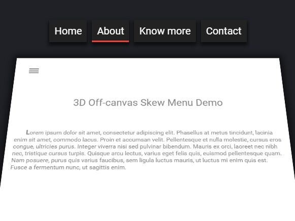
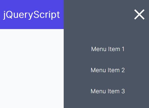
A cool 3D navigation that uses jQuery and several CSS3 properties to reveal a horizontal off-canvas menu while 'skewing' the main content section.
See also:
- 3D Skew Side Menu with jQuery and CSS3 Transforms
- Easy jQuery 3D Side Menu Plugin with CSS3 - Box Lid
How to use it:
1. Add the navigation menu, toggle button and main content into a container following the html structure like this:
<main>

  <div class="content">

    <button class="toggle">
      <div class="bar"></div>
      <div class="bar"></div>
      <div class="bar"></div>
    </button>

    <section id="home" class="section__open">
      Home Section
    </section>
    <section id="about">
      About Section
    </section>
    <section id="blog">
      Blog Section
    </section>
    <section id="contact">
      Contact Section
    </section>

  </div>

  <nav>
    <ul>
      <li>
        <button class="home">Home</button>
      </li>
      <li>
        <button class="about">About</button>
      </li>
      <li>
        <button class="blog">Blog</button>
      </li>
      <li>
        <button class="contact">Contact</button>
      </li>
    </ul>
  </nav>

</main>
2. The primary CSS rules for the off-canvas menu & hamburger toggle button.
.toggle {
  border: none;
  outline: none;
  background-color: transparent;
  cursor: pointer;
  margin: 30px;
}

.toggle .bar {
  width: 27px;
  margin: 3px;
  height: 3px;
  background-color: #888;
}

nav {
  position: absolute;
  top: 100px;
  left: 0;
  width: 100%;
  z-index: -1;
  transition: all 0.5s ease-in-out;
  -webkit-transition: all 0.5s ease-in-out;
  -moz-transition: all 0.5s ease-in-out;
  -o-transition: all 0.5s ease-in-out;
  -ms-transition: all 0.5s ease-in-out;
}

nav ul {
  list-style-type: none;
  margin: 0;
  padding: 0;
  text-align: center;
}

nav ul li { display: inline-block; }

nav ul li:nth-child(1) > button {
  transition: all 0.2s cubic-bezier(0.5, 1, 0.5, 1.5) 0.1s;
  -webkit-transition: all 0.2s cubic-bezier(0.5, 1, 0.5, 1.5) 0.1s;
  -moz-transition: all 0.2s cubic-bezier(0.5, 1, 0.5, 1.5) 0.1s;
  -o-transition: all 0.2s cubic-bezier(0.5, 1, 0.5, 1.5) 0.1s;
  -ms-transition: all 0.2s cubic-bezier(0.5, 1, 0.5, 1.5) 0.1s;
}

nav ul li:nth-child(2) > button {
  transition: all 0.2s cubic-bezier(0.5, 1, 0.5, 1.5) 0.2s;
  -webkit-transition: all 0.2s cubic-bezier(0.5, 1, 0.5, 1.5) 0.2s;
  -moz-transition: all 0.2s cubic-bezier(0.5, 1, 0.5, 1.5) 0.2s;
  -o-transition: all 0.2s cubic-bezier(0.5, 1, 0.5, 1.5) 0.2s;
  -ms-transition: all 0.2s cubic-bezier(0.5, 1, 0.5, 1.5) 0.2s;
}

nav ul li:nth-child(3) > button {
  transition: all 0.2s cubic-bezier(0.5, 1, 0.5, 1.5) 0.3s;
  -webkit-transition: all 0.2s cubic-bezier(0.5, 1, 0.5, 1.5) 0.3s;
  -moz-transition: all 0.2s cubic-bezier(0.5, 1, 0.5, 1.5) 0.3s;
  -o-transition: all 0.2s cubic-bezier(0.5, 1, 0.5, 1.5) 0.3s;
  -ms-transition: all 0.2s cubic-bezier(0.5, 1, 0.5, 1.5) 0.3s;
}

nav ul li:nth-child(4) > button {
  transition: all 0.2s cubic-bezier(0.5, 1, 0.5, 1.5) 0.4s;
  -webkit-transition: all 0.2s cubic-bezier(0.5, 1, 0.5, 1.5) 0.4s;
  -moz-transition: all 0.2s cubic-bezier(0.5, 1, 0.5, 1.5) 0.4s;
  -o-transition: all 0.2s cubic-bezier(0.5, 1, 0.5, 1.5) 0.4s;
  -ms-transition: all 0.2s cubic-bezier(0.5, 1, 0.5, 1.5) 0.4s;
}

nav ul button {
  padding: 10px;
  font-size: 20px;
  outline: none;
  border: none;
  background-color: transparent;
  color: #fff;
  cursor: pointer;
  position: relative;
  background-color: #222;
  margin: 3px;
  transform: translateY(-150px);
  -webkit-transform: translateY(-150px);
  -moz-transform: translateY(-150px);
  -o-transform: translateY(-150px);
  -ms-transform: translateY(-150px);
  box-shadow: 0 5px 10px 2px rgba(0, 0, 0, 0.6);
  -webkit-box-shadow: 0 5px 10px 2px rgba(0, 0, 0, 0.6);
  -moz-box-shadow: 0 5px 10px 2px rgba(0, 0, 0, 0.6);
  -o-box-shadow: 0 5px 10px 2px rgba(0, 0, 0, 0.6);
  -ms-box-shadow: 0 5px 10px 2px rgba(0, 0, 0, 0.6);
}

nav ul button::after {
  position: absolute;
  content: " ";
  bottom: 0;
  left: 50%;
  width: 0;
  height: 3px;
  background-color: #F44336;
  transition: all 0.2s ease-in-out;
  -webkit-transition: all 0.2s ease-in-out;
  -moz-transition: all 0.2s ease-in-out;
  -o-transition: all 0.2s ease-in-out;
  -ms-transition: all 0.2s ease-in-out;
}

nav ul button:hover::after {
  width: 100%;
  left: 0;
}

.nav__move { z-index: 10; }

.nav__move button {
  transform: translateY(0px);
  -webkit-transform: translateY(0px);
  -moz-transform: translateY(0px);
  -o-transform: translateY(0px);
  -ms-transform: translateY(0px);
}
3. The primary CSS rules for the main content.
main {
  position: absolute;
  width: 100%;
  height: 100%;
  transform-style: preserve-3d;
  -webkit-transform-style: preserve-3d;
  -moz-transform-style: preserve-3d;
  -o-transform-style: preserve-3d;
  -ms-transform-style: preserve-3d;
  perspective: 500px;
  -webkit-perspective: 500px;
  -moz-perspective: 500px;
  -o-perspective: 500px;
  -ms-perspective: 500px;
  perspective-origin: 50% 50%;
  -webkit-perspective-origin: 50% 50%;
  -moz-perspective-origin: 50% 50%;
  -o-perspective-origin: 50% 50%;
  -ms-perspective-origin: 50% 50%;
}

.content {
  position: absolute;
  width: 100%;
  height: 100%;
  overflow: auto;
  background-color: #fff;
  transform-origin: 50% 50%;
  -webkit-transform-origin: 50% 50%;
  -moz-transform-origin: 50% 50%;
  -o-transform-origin: 50% 50%;
  -ms-transform-origin: 50% 50%;
  transition: all 0.8s ease-in-out;
  -webkit-transition: all 0.8s ease-in-out;
  -moz-transition: all 0.8s ease-in-out;
  -o-transition: all 0.8s ease-in-out;
  -ms-transition: all 0.8s ease-in-out;
  box-shadow: 0 0 30px 10px rgba(0, 0, 0, 0.5);
  -webkit-box-shadow: 0 0 30px 10px rgba(0, 0, 0, 0.5);
  -moz-box-shadow: 0 0 30px 10px rgba(0, 0, 0, 0.5);
  -o-box-shadow: 0 0 30px 10px rgba(0, 0, 0, 0.5);
  -ms-box-shadow: 0 0 30px 10px rgba(0, 0, 0, 0.5);
}

.content__move {
  transform: scale(0.8) translateY(50px) rotateX(10deg);
  -webkit-transform: scale(0.8) translateY(50px) rotateX(10deg);
  -moz-transform: scale(0.8) translateY(50px) rotateX(10deg);
  -o-transform: scale(0.8) translateY(50px) rotateX(10deg);
  -ms-transform: scale(0.8) translateY(50px) rotateX(10deg);
}

section {
  visibility: hidden;
  position: absolute;
  opacity: 0;
  width: 100%;
  transition: all 0.3s ease-in-out 0.3s;
  -webkit-transition: all 0.3s ease-in-out 0.3s;
  -moz-transition: all 0.3s ease-in-out 0.3s;
  -o-transition: all 0.3s ease-in-out 0.3s;
  -ms-transition: all 0.3s ease-in-out 0.3s;
  transform: translateY(100px);
  -webkit-transform: translateY(100px);
  -moz-transform: translateY(100px);
  -o-transform: translateY(100px);
  -ms-transform: translateY(100px);
}

.section__open {
  visibility: visible;
  opacity: 1;
  transform: translateY(0px);
  -webkit-transform: translateY(0px);
  -moz-transform: translateY(0px);
  -o-transform: translateY(0px);
  -ms-transform: translateY(0px);
}

.section--title {
  font-size: 28px;
  margin: 40px;
  text-align: center;
}

.section--text {
  min-width: 200px;
  max-width: 800px;
  padding: 20px;
  font-size: 16px;
  margin: auto;
}

.section--text:first-letter {
  font-weight: bold;
  font-size: 18px;
  display: inline-block;
  padding-left: 30px;
}
4. Load the latest version of jQuery JavaScript library in the document.
<script src="//code.jquery.com/jquery-2.1.4.min.js"></script>
5. Active the 3D off-canvas menu by toggling the CSS classes.
var bring_nav= function() {
    $('.content').toggleClass('content__move');
    $('nav').toggleClass('nav__move');
  };

$(document).ready(function() {
  $('.toggle').on('click',bring_nav);
  $('nav').find('button').on('click',go_to_section);
});
6. The jQuery script to switch content when you click on the navigation.
var go_to_section= function() {
    var id= $(this).attr('class');
    $('section').removeClass('section__open');
    $('section#'+id).addClass('section__open');
    bring_nav();
};
This awesome jQuery plugin is developed by phenax. For more Advanced Usages, please check the demo page or visit the official website.