3D Skew Side Menu with jQuery and CSS3 Transforms
| File Size: | 1.71 KB |
|---|---|
| Views Total: | 23169 |
| Last Update: | |
| Publish Date: | |
| Official Website: | Go to website |
| License: | MIT |
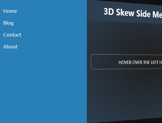
A cool side navigation which allows you to reveal an off-canvas menu with an impressive 3D skew effect based on CSS3 transitions, 3D transforms and perspective. jQuery is required to toggle the active CSS class as you hover over the left hand side of the web page.
See also:
- Three-Dimensional and Space Efficient menu - Meny
- Easy jQuery 3d Side menu Plugin with CSS3 - Box Lid
- Airbnb iOS 7 App Style Side menu with jQuery and CSS3 - Fly Side menu
How to use it:
1. Add the CSS class 'set3d' to your body tag.
<body class="set3d">
  ...
</body>
2. The required CSS3 rules to define how many pixels the 3D skew menu is placed from the view.
.set3d {
  margin: 0;
  -moz-perspective: 800px;
  -webkit-perspective: 800px;
  perspective: 800px;
  -moz-perspective-origin: 0% 50%;
  -webkit-perspective-origin: 0% 50%;
  perspective-origin: 0% 50%;
  height: 100%;
  width: 100%;
}
3. Create a menu list containing a trigger to toggle the menu.
<div id="menu">
  <ul>
    <li>Home</li>
    <li>Blog</li>
    <li>Contact</li>
    <li>About</li>
  </ul>
  <div id="trigger"></div>
</div>
4. The required CSS/CSS3 styles for the menu & trigger.
#trigger {
  position: absolute;
  width: 50px;
  height: 100%;
  display: block;
  right: -50px;
  background: transparent;
  top: 0;
}

#menu {
  display: block;
  position: fixed;
  background: #333;
  color: #eee;
  height: 100%;
  width: 320px;
  top: 0;
  left: 0px;
  z-index: 2;
  margin: 0px;
  padding: 20px;
  -webkit-transform: rotateY(-30deg) translateX(-100%);
  -moz-transform: rotateY(-30deg) translateX(-100%);
  -ms-transform: rotateY(-30deg) translateX(-100%);
  -o-transform: rotateY(-30deg) translateX(-100%);
  transform: rotateY(-30deg) translateX(-100%);
  -webkit-box-sizing: border-box;
  -moz-box-sizing: border-box;
  box-sizing: border-box;
  -webkit-transition: -webkit-transform .4s ease;
  -moz-transition: -moz-transform .4s ease;
  -ms-transition: -ms-transform .4s ease;
  -o-transition: -o-transform .4s ease;
  transition: transform .4s ease;
  -webkit-transform-origin: 0% 50%;
  -moz-transform-origin: 0% 50%;
  -ms-transform-origin: 0% 50%;
  -o-transform-origin: 0% 50%;
  transform-origin: 0% 50%;
}

#menu:hover {
  -webkit-transform: rotateY(0deg);
  -moz-transform: rotateY(0deg);
  -ms-transform: rotateY(0deg);
  -o-transform: rotateY(0deg);
  transform: rotateY(0deg);
}
5. Wrap the main content in a container with an unique ID 'content'.
<div id="content">
  <h1> 3D Skew Menu on Hover </h1>
  <div id="instructions">
    <p>Go hover over on the left hand side. I dare you!</p>
  </div>
</div>
6. The CSS/CSS3 styles for the content wrapper.
#content {
  background: #000;
  width: 100%;
  height: 100%;
  background-color: #1f1f1f;
 *zoom: 1;
 filter: progid:DXImageTransform.Microsoft.gradient(gradientType=1, startColorstr='#FF1F1F1F', endColorstr='#FF000000');
  background-image: -moz-radial-gradient(center, ellipse cover, #1f1f1f 0%, #000000 100%);
  background-image: -webkit-radial-gradient(center, ellipse cover, #1f1f1f 0%, #000000 100%);
  background-image: radial-gradient(center, ellipse cover, #1f1f1f 0%, #000000 100%);
}

#content {
  -webkit-box-sizing: border-box;
  -moz-box-sizing: border-box;
  box-sizing: border-box;
  -webkit-transition: -webkit-transform .4s ease;
  -moz-transition: -moz-transform .4s ease;
  -ms-transition: -ms-transform .4s ease;
  -o-transition: -o-transform .4s ease;
  transition: transform .4s ease;
  -webkit-transform-origin: 0% 50%;
  -moz-transform-origin: 0% 50%;
  -ms-transform-origin: 0% 50%;
  -o-transform-origin: 0% 50%;
  transform-origin: 0% 50%;
  width: 100%;
  height: 100%;
  overflow-y: auto;
}

.active #content {
  -webkit-transform: translateX(300px) rotateY(15deg);
  -moz-transform: translateX(300px) rotateY(15deg);
  -ms-transform: translateX(300px) rotateY(15deg);
  -o-transform: translateX(300px) rotateY(15deg);
  transform: translateX(300px) rotateY(15deg);
}
7. Include the latest version of jQuery library at the end of the document.
<script src="http://code.jquery.com/jquery-2.1.1.min.js"></script>
8. The jQuery script to toggle the 3D skew menu on hover.
$("#menu").hover(function () {
  $('body').toggleClass("active");
});
This awesome jQuery plugin is developed by sirnightowl. For more Advanced Usages, please check the demo page or visit the official website.


