Three-Dimensional and Space Efficient Menu - Meny
| File Size: | 13.8 KB |
|---|---|
| Views Total: | 20394 |
| Last Update: | |
| Publish Date: | |
| Official Website: | Go to website |
| License: | MIT |
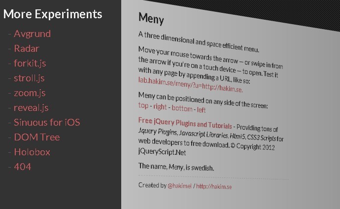
Meny is a javascript library for helping create a Three-Dimensional and Space Efficient Menu using CSS3 3D transforms, which can be positioned on any side of the screen. It is compatible with all modern browsers which support CSS3 3D transforms. For old browsers, it will only fall back on 2D animation.
How to use it:
1. Download and inlcude Meny.js on your webpage
<script src="js/meny.min.js"></script>
2. CSS For 3D Menu
.meny {
display: none;
padding: 20px;
overflow: auto;
background: #333;
color: #eee;
-webkit-box-sizing: border-box;
-moz-box-sizing: border-box;
box-sizing: border-box;
}
.meny ul {
margin-top: 10px;
}
.meny ul li {
display: inline-block;
width: 200px;
list-style: none;
font-size: 20px;
padding: 3px 10px;
}
.meny ul li:before {
content: '-';
margin-right: 5px;
color: rgba( 255, 255, 255, 0.2 );
}
/**
 * Hint graphic that appears while menu is inactive
 */
.meny-arrow {
position: absolute;
z-index: 10;
border: 10px solid transparent;
-webkit-transition: opacity 0.4s ease 0.4s;
-moz-transition: opacity 0.4s ease 0.4s;
-ms-transition: opacity 0.4s ease 0.4s;
-o-transition: opacity 0.4s ease 0.4s;
transition: opacity 0.4s ease 0.4s;
}
.meny-left .meny-arrow {
left: 14px;
top: 50%;
margin-top: -16px;
border-left: 16px solid #333;
}
.meny-right .meny-arrow {
right: 14px;
top: 50%;
margin-top: -16px;
border-right: 16px solid #333;
}
.meny-top .meny-arrow {
left: 50%;
top: 14px;
margin-left: -16px;
border-top: 16px solid #333;
}
.meny-bottom .meny-arrow {
left: 50%;
bottom: 14px;
margin-left: -16px;
border-bottom: 16px solid #333;
}
.meny-active .meny-arrow {
opacity: 0;
-webkit-transition: opacity 0.2s ease;
-moz-transition: opacity 0.2s ease;
-ms-transition: opacity 0.2s ease;
-o-transition: opacity 0.2s ease;
transition: opacity 0.2s ease;
}
3. Markup
<div class="meny">
<h2>...</h2>
<ul>
<li>...</li>
...
</ul>
</div>
<div class="meny-arrow"></div>
4. Add a toggle button
<div class="meny-arrow"></div>
5. Call the plugin
<script>
// Create an instance of Meny
var meny = Meny.create({
	// The element that will be animated in from off screen
	menuElement: document.querySelector( '.meny' ),

	// The contents that gets pushed aside while Meny is active
	contentsElement: document.querySelector( '.contents' ),

	// [optional] The alignment of the menu (top/right/bottom/left)
	position: Meny.getQuery().p || 'left',

	// [optional] The height of the menu (when using top/bottom position)
	height: 200,

	// [optional] The width of the menu (when using left/right position)
	width: 260,

	// [optional] Distance from mouse (in pixels) when menu should open
	threshold: 40
});

// API Methods:
// meny.open();
// meny.close();
// meny.isOpen();

// Events:
// meny.addEventListener( 'open', function(){ console.log( 'open' ); } );
// meny.addEventListener( 'close', function(){ console.log( 'close' ); } );

// Embed an iframe if a URL is passed in
if( Meny.getQuery().u && Meny.getQuery().u.match( /^http/gi ) ) {
	var contents = document.querySelector( '.contents' );
	contents.style.padding = '0px';
	contents.innerHTML = '<div class="cover"></div><iframe src="'+ Meny.getQuery().u +'" style="width: 100%; height: 100%; border: 0; position: absolute;"></iframe>';
}
		</script>
This awesome jQuery plugin is developed by hakimel. For more Advanced Usages, please check the demo page or visit the official website.