Basic Hamburger Navigation Menu With jQuery And CSS/CSS3
| File Size: | 5.35 KB |
|---|---|
| Views Total: | 26977 |
| Last Update: | |
| Publish Date: | |
| Official Website: | Go to website |
| License: | MIT |
A simple, lightweight, responsive, jQuery/CSS based Hamburger Navigation system that automatically converts the normal site menu into a toggleable, mobile-friendly dropdown menu on small screens. Powered by CSS3 flexbox model and several animation properties (transition, transform).
How to use it:
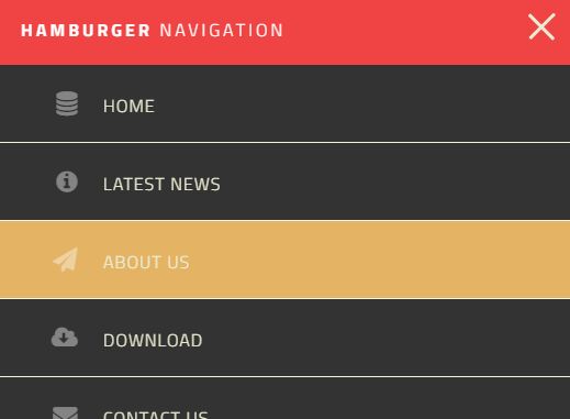
1. Create the navigation menu with a hamburger toggle for your website.
<nav class="site-nav">

  <div class="menu-toggle">
    <div class="hamburger"></div>
  </div>

  <ul class="open desktop">
    <li><a href="#!">Home</a></li>
    <li><a href="#!">Latest News</a></li>
    <li><a href="#!">About us</a></li>
    <li><a href="#!">Download Plugin</a></li>
    <li><a href="#!">Contact us</a></li>

  </ul>
</nav>
2. The basic CSS styles for the hamburger navigation.
nav {
  margin: 0;
  padding: 0;
}

nav ul {
  display: flex;
  flex-direction: column;
  list-style-type: none;
  padding: 0;
  margin: 0;
  display: none;
}

nav ul.opening {
  display: block;
  height: 30px;
}

nav li { border-bottom: 1px solid #f6f4e2; }

nav li:last-child { border-bottom: none; }

nav a {
  color: #EBEBD3;
  background: #e7a119;
  display: block;
  padding: 1.5em 4em 1.5em 3em;
  text-transform: uppercase;
  text-decoration: none;
}

nav a:hover, nav a:focus { background: #E4B363; }

.site-nav--icon {
  font-size: 1.4em;
  margin-right: 1em;
  width: 1.1em;
  text-align: right;
  color: rgba(255,255,255,.4);
}
3. The CSS styles for menu toggle
.menu-toggle {
  position: absolute;
  padding: 0.8em;
  top: 1em;
  right: .5em;
  cursor: pointer;
}

.hamburger, .hamburger::before, .hamburger::after {
  content: '';
  display: block;
  background: #EBEBD3;
  height: 3px;
  width: 2em;
  border-radius: 3px;
  -webkit-transition: all ease-in-out 350ms;
  transition: all ease-in-out 350ms;
}

.hamburger::before {
  -webkit-transform: translateY(-7px);
  transform: translateY(-7px);
}

.hamburger::after {
  -webkit-transform: translateY(4px);
  transform: translateY(4px);
}

.open .hamburger {
  -webkit-transform: rotate(45deg);
  transform: rotate(45deg);
}

.open .hamburger::before { display: none; }

.open .hamburger::after {
  -webkit-transform: translateY(-1px) rotate(-90deg);
  transform: translateY(-1px) rotate(-90deg);
}
4. The CSS styles for the hamburger navigation on desktop (screen width > 780px).
@media (min-width: 780px) {

.menu-toggle { display: none; }

nav ul {
  display: flex;
  flex-direction: row;
  justify-content: flex-end;
}

nav li {
  flex: 1 1 auto;
  border: none;
}

nav li a {
  padding: 1.5em 1.3em 1.5em 1.3em;
  margin: 0;
  border: none;
  background-color: #f04343;
}

nav a:hover,  nav a:focus { background-color: rgba(255,255,255,.10); }

.logo {
  flex: 0 0 200px;
  margin: 0;
  padding-left: 20px;
}

nav {
  display: flex;
  flex-direction: row;
  justify-content: space-between;
  text-align: center;
  background-color: #f04343;
}

}
5. The jQuery script to active the Hamburger Navigation. Copy and insert the script after you load the latest version of jQuery library.
<script src="//code.jquery.com/jquery.min.js"></script>
$('.menu-toggle').click(function() {

  $('ul').toggleClass('opening');
  $(this).toggleClass('open');

})
This awesome jQuery plugin is developed by sprintify. For more Advanced Usages, please check the demo page or visit the official website.


