Minimalist Sidebar Navigation With jQuery And CSS3
| File Size: | 2.36 KB |
|---|---|
| Views Total: | 9607 |
| Last Update: | |
| Publish Date: | |
| Official Website: | Go to website |
| License: | MIT |
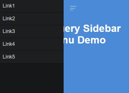
A simplest sidebar navigation that uses jQuery and CSS3 transitions to slide out an off-canvas menu overlaying the main content. Great for mobile webpage or web application to preserve the screen space.
How to use it:
1. Create the sidebar navigation with a hamburger toggle button on the webpage.
<div id="sidebar">
  <ul>
    <li><a href="#">Link1</a></li>
    <li><a href="#">Link2</a></li>
    <li><a href="#">Link3</a></li>
    <li><a href="#">Link4</a></li>
    <li><a href="#">Link5</a></li>
  </ul>
  <div id="sidebar-btn">
    <span></span>
    <span></span>
    <span></span>
  </div>
</div>
2. Style the hamburger toggle button.
#sidebar-btn {
  display: inline-block;
  vertical-align: middle;
  width: 20px;
  height: 15px;
  cursor: pointer;
  margin: 20px;
  position: absolute;
  top: 0;
  right: -60px;
}

#sidebar-btn span {
  height: 1px;
  background: #111;
  margin-bottom: 5px;
  display: block;
}

#sidebar-btn span:nth-child(2) { width: 75%; }

#sidebar-btn span:nth-child(3) { width: 50%; }
2. Style the sidebar navigation and hide in on page load.
#sidebar {
  background: #151718;
  width: 200px;
  height: 100%;
  display: block;
  position: absolute;
  left: -200px;
  top: 0;
  transition: left 0.3s linear;
}
3. The required CSS for the active navigation when toggled.
#sidebar.visible {
  left: 0;
  transition: left 0.3s linear;
}
4. Place the needed jQuery library at the bottom of the webpage.
<script src="//code.jquery.com/jquery-2.2.0.min.js"></script>
5. The JavaScript to toggle the CSS class when you click on the hamburger button.
$('#sidebar-btn').click(function() {
  $('#sidebar').toggleClass('visible');
});
This awesome jQuery plugin is developed by polodev. For more Advanced Usages, please check the demo page or visit the official website.


