Minimal Mobile Off-canvas Menu With jQuery And CSS3
| File Size: | 3.86 KB |
|---|---|
| Views Total: | 2316 |
| Last Update: | |
| Publish Date: | |
| Official Website: | Go to website |
| License: | MIT |
This is a small, handy jQuery navigation plugin for creating a mobile-friendly off-canvas side menu on your responsive, cross-platform web page. Smooth menu slide in and slide out animations based on CSS3 transitions and transforms.
How to use it:
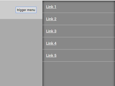
1. Create the off-canvas side menu as these:
<section id="offcanvas">
  <nav>
    <ul>
      <li><a href="#">Link 1</a></li>
      <li><a href="#">Link 2</a></li>
      <li><a href="#">Link 3</a></li>
      <li><a href="#">Link 4</a></li>
      <li><a href="#">Link 5</a></li>
    </ul>
  </nav>
</section>
2. Style the off-canvas menu and make it hidden on page load.
#offcanvas {
  display: none;
  position: fixed;
  top: 0;
  height: 100vh;
  background: #888;
  box-shadow: 0 0 15px #000 inset;
}

#offcanvas a {
  color: #FFF;
  display: block;
  border-bottom: 1px solid rgba(255,255,255,0.5);
  padding: 15px;
}
3. Create a trigger element to toggle the off-canvas menu when needed.
<button id="trigger">trigger menu</button>
4. Import the latest version of jQuery library and the Mobile Offcanvas Menu's main script into the document.
<script src="https://code.jquery.com/jquery-3.3.1.min.js"
        integrity="sha384-tsQFqpEReu7ZLhBV2VZlAu7zcOV+rXbYlF2cqB8txI/8aZajjp4Bqd+V6D5IgvKT"
        crossorigin="anonymous">
</script>
<script src="jquery.mobile-offcanvas-menu.js"></script>
5. Activate the off-canvas menu with default settings.
$("#offcanvas").offcanvasmenu();
6. Default settings which can be used to customize the off-canvas menu.
$("#offcanvas").offcanvasmenu({

  // trigger element
  menuTrigger: "trigger",

  // or 'left'
  position: "right",

  // animation speed
  speed: "0.3",

  // menu width
  width: "220px"

});
Change log:
2018-05-03
- fixed container can now be specified and animated
This awesome jQuery plugin is developed by jaynoe. For more Advanced Usages, please check the demo page or visit the official website.


