Mobile-first Offcavas Side Menu With jQuery - gab-mobilemenu
| File Size: | 11.9 KB |
|---|---|
| Views Total: | 5385 |
| Last Update: | |
| Publish Date: | |
| Official Website: | Go to website |
| License: | MIT |
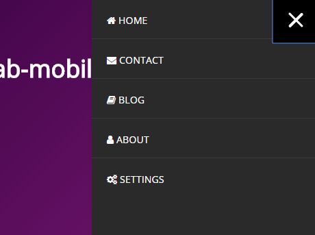
gab-mobilemenu is a jQuery plugin used to create an offcanvas sidebar navigation for mobile and small screen devices (screen size < 1024px).
View more:
How to use it:
1. Load the required style sheet jquery.mobilemenu.css in the header of the webpage.
<link rel="stylesheet" href="jquery.mobilemenu.css">
2. Create the mobile offcanvas menu with a hamburger toggle on the webpage.
<div id="mobilemenu">
  <div class="mobilemenu-wrapper">
    <div class="mobilemenu-trigger">
      <button class="trigger">
        <span class="box">
          <span class="bar top"></span>
          <span class="bar middle"></span>
          <span class="bar bottom"></span>
        </span>
      </button>
    </div>
    <div class="mobilemenu-view">
      <div class="menu">
        <ul class="navaccordion">
          <li><a href="#">Home</a></li>
          <li> <a href="#">Contact</a></li>
          <li><a href="#">Blog</a></li>
          <li><a href="#">About</a></li>
          <li><a href="#">Settings</a></li>
        </ul>
      </div>
    </div>
  </div>
</div>
3. Load jQuery library and the JavaScript file jquery.mobilemenu.js at the bottom of the webpage.
<script src="//code.jquery.com/jquery-3.1.1.slim.min.js"></script>
<script src="jquery.mobilemenu.js"></script>
4. Active the mobile offcanvas menu and we're done.
$.mobilemenu()
This awesome jQuery plugin is developed by gburgose. For more Advanced Usages, please check the demo page or visit the official website.


