Mobile-friendly Fullscreen Drill Down Menu With jQuery - mobileMenu.js
| File Size: | 110 KB |
|---|---|
| Views Total: | 5509 |
| Last Update: | |
| Publish Date: | |
| Official Website: | Go to website |
| License: | MIT |

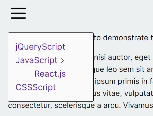
mobileMenu.js is a jQuery plugin which takes an array of menu objects and converts them into a fullscreen, mobile-friendly, multi-level drilldown menu for your large, complicated site/app navigation.
How to use it:
1. Create the html for the drilldown menu.
<div id="mobileMenuWrapper">
  <div id="mobileMenu"></div>
</div>
2. Place jQuery library and the mobileMenu.js script at the end of the html document.
<script src="//code.jquery.com/jquery.min.js"></script>
<script src="js/mobileMenu.js"></script>
3. Load the jQuery easing plugin if you want more easing effects.
<script src="/path/to/jquery.easing.1.3.js"></script>
4. Create menu items to be presented in the drilldown menu.
var home = {
  name: 'Home',
  url: '#'
};

var myWork = {
   name: 'MyWork',
   section: {
     title: 'My Work',
     items: [{
         name: 'My Work submenu',
         section:{
           title: 'My Work submenu',
           items:[
             { name: 'subsub 1'}
           ]
         }
     }]
   }
 };
5. Initialize the drilldown menu with some options.
$('#mobileMenu').mobileMenu({
  section: {
    title: 'My Menu',
    items: [
      home,
      myWork
    ]
}
});
6. The pre-defined CSS styles for the drilldown menu.
#mobileMenu {
  display: none;
  position: absolute;
  left: 0;
  top: 0;
  width: 100%;
  height: 200px;
  overflow: hidden;
}

#mobileMenuButton {
  display: block;
  background: blue;
  font-size: 14px;
  color: white;
  padding: 20px;
}

.title {
  margin: 40px 0 5px 15%;
  font-size: 22px;
  color: #696969;
}

.item {
  display: block;
  position: relative;
  color: #0397f9;
  font-size: 18px;
  padding-top: 25px;
  width: 70%;
  margin-left: 15%;
}

.item.more:after {
  content: "";
  width: 16px;
  height: 17px;
  background-image: url("../images/icons.png");
  background-position: right;
  position: relative;
  ;
  display: inline-block;
  float: right;
}

.button.back {
  display: block;
  color: #0397f9;
  font-size: 14px;
  position: absolute;
  top: 20px;
  right: 20px;
  padding: 10px 20px;
  border: 2px solid #0397f9;
  border-radius: 30px;
  font-size: 20px;
}

.button.close {
  background-image: url("../images/icons.png");
  background-position: left;
  background-repeat: no-repeat;
  margin: 20px 20px 0 20px;
  width: 24px;
  height: 30px;
}

.button.close.static {
  display: none;
  opacity: 0;
  position: absolute;
  top: 0;
  left: 0;
}

.mobileMenuOpener {
  position: absolute;
  top: 20px;
  left: 20px;
  width: 20px;
}

.line {
  width: inherit;
  border-top: 4px solid orange;
  margin-bottom: 4px;
}
7. All default options to customize the drilldown menu.
$('#mobileMenu').mobileMenu({

  // animation options
  animation: {
    speed: 200,
    easing: 'easeOutSine'
  },

  // close all the submenus when close
  closeAll: true,

  // or right
  mainOpenFrom: 'left',

  // display page shadow
  shadow: true,

  // menu opener
  opener: '.mobileMenuOpener',

  // true or false
  closeStatic: true,

  // choose from where id going to open the subMenu
  subOpenFrom: 'left'

});
Change log:
2017-01-13
- Change openFrom to mainOpenFrom => choose from where is going to open the menu
- Added subOpenFrom => choose from where id going to open the subMenu
- Added Web stylsheet
- Added function to change stylesheet on demand
This awesome jQuery plugin is developed by nwyler-modusagency. For more Advanced Usages, please check the demo page or visit the official website.