jQuery/CSS Sticky Header Navigation With Scrollspy Functionality
| File Size: | 2.57 KB |
|---|---|
| Views Total: | 6904 |
| Last Update: | |
| Publish Date: | |
| Official Website: | Go to website |
| License: | MIT |
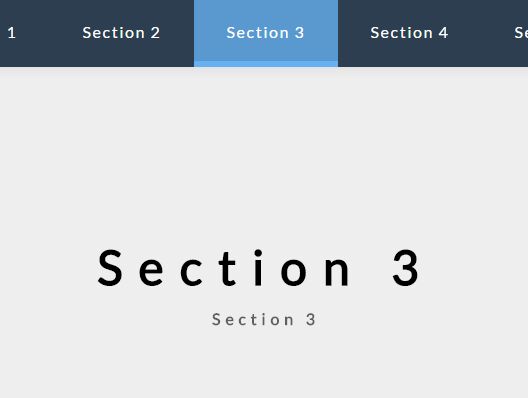
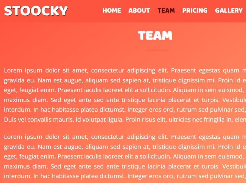
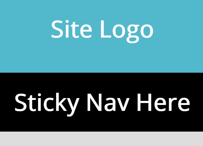
This is a jQuery and CSS/CSS3 based header navigation that will be fixed on the top of the page and auto highlight the current menu item when you scroll past its content section. Also provides a functionality to smoothly scroll the webpage to target content sections by clicking on the navigation menu. Fully responsive powered by CSS3 flexbox model.
How to use it:
1. Create the header navigation as this:
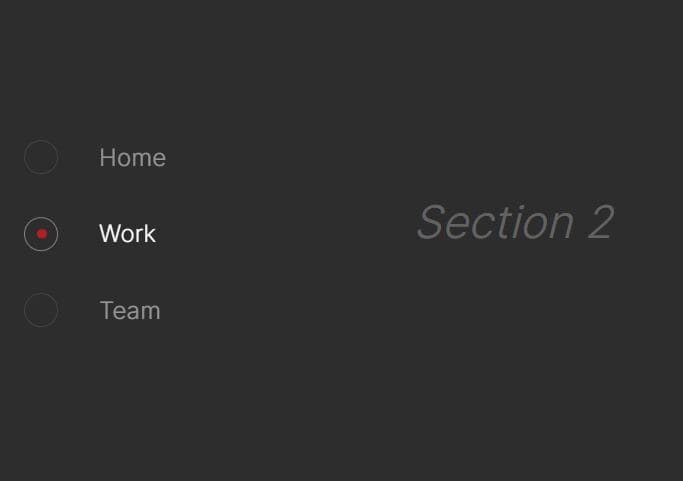
<section class="stickyhero-tabs">
<div class="stickyhero-tabs-container">
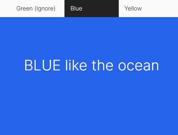
<a class="stickyhero-tab" href="#tab-section1">Section 1</a>
<a class="stickyhero-tab" href="#tab-section2">Section 2</a>
<a class="stickyhero-tab" href="#tab-section3">Section 3</a>
<a class="stickyhero-tab" href="#tab-section4">Section 4</a>
<a class="stickyhero-tab" href="#tab-section5">Section 5</a>
<span class="stickyhero-tab-slider"></span>
</div>
</section>
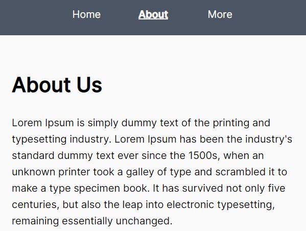
2. Create the corresponding content sections. Note that the section's ID must match the href attribute as shown below.
<main class="stickymain">
  <section class="stickyslide" id="tab-section1">
    <h1>Section 1</h1>
    <h3>something about Section 1</h3>
  </section>
  <section class="stickyslide" id="tab-section2">
    <h1>Section 2</h1>
    <h3>something about Section 2</h3>
  </section>
  <section class="stickyslide" id="tab-section3">
    <h1>Section 3</h1>
    <h3>Section 3</h3>
  </section>
  <section class="stickyslide" id="tab-section4">
    <h1>Section 4</h1>
    <h3>Section 4</h3>
  </section>
  <section class="stickyslide" id="tab-section5">
    <h1>Section 5</h1>
    <h3>Section 5</h3>
  </section>
</main>
3. Style the header navigation in the CSS.
.stickyhero-tabs, .stickyslide {
  display: -webkit-box;
  display: -ms-flexbox;
  display: flex;
  -webkit-box-orient: vertical;
  -webkit-box-direction: normal;
  -ms-flex-direction: column;
  flex-direction: column;
  -webkit-box-pack: center;
  -ms-flex-pack: center;
  justify-content: center;
  -webkit-box-align: center;
  -ms-flex-align: center;
  align-items: center;
  height: 100vh;
  position: relative;
  background: #eee;
}

.stickyhero-tabs-container {
  display: -webkit-box;
  display: -ms-flexbox;
  display: flex;
  -webkit-box-orient: horizontal;
  -webkit-box-direction: normal;
  -ms-flex-direction: row;
  flex-direction: row;
  position: absolute;
  bottom: 0;
  width: 100%;
  height: 70px;
  box-shadow: 0 0 20px rgba(0, 0, 0, 0.1);
  background: #fff;
  z-index: 10;
}

.stickyhero-tabs-container--top {
  position: fixed;
  top: 0;
}

.stickyhero-tab {
  display: -webkit-box;
  display: -ms-flexbox;
  display: flex;
  -webkit-box-pack: center;
  -ms-flex-pack: center;
  justify-content: center;
  -webkit-box-align: center;
  -ms-flex-align: center;
  align-items: center;
  -webkit-box-flex: 1;
  -ms-flex: 1;
  flex: 1;
  color: #000;
  letter-spacing: 0.1rem;
  -webkit-transition: all 0.5s ease;
  transition: all 0.5s ease;
}

.stickyhero-tab:hover {
  color: white;
  background: rgba(102, 177, 241, 0.8);
  -webkit-transition: all 0.5s ease;
  transition: all 0.5s ease;
}

.stickyhero-tab-slider {
  position: absolute;
  bottom: 0;
  width: 0;
  height: 6px;
  background: #66B1F1;
  -webkit-transition: left 0.3s ease;
  transition: left 0.3s ease;
}
4. Don't forget to load the latest version of jQuery library in the document.
<script src="//code.jquery.com/jquery-3.1.1.slim.min.js"></script>
5. The main JavaScript to achieve the sticky, smooth scroll and scrollspy functionalities.
class StickyNavigation {

  constructor() {
    this.currentId = null;
    this.currentTab = null;
    this.tabContainerHeight = 70;
    let self = this;
    $('.et-hero-tab').click(function() {
      self.onTabClick(event, $(this));
    });
    $(window).scroll(() => { this.onScroll(); });
    $(window).resize(() => { this.onResize(); });
  }

  onTabClick(event, element) {
    event.preventDefault();
    let scrollTop = $(element.attr('href')).offset().top - this.tabContainerHeight + 1;
    $('html, body').animate({ scrollTop: scrollTop }, 600);
  }

  onScroll() {
    this.checkTabContainerPosition();
    this.findCurrentTabSelector();
  }

  onResize() {
    if(this.currentId) {
      this.setSliderCss();
    }
  }

  checkTabContainerPosition() {
    let offset = $('.et-hero-tabs').offset().top + $('.et-hero-tabs').height() - this.tabContainerHeight;
    if($(window).scrollTop() > offset) {
      $('.et-hero-tabs-container').addClass('et-hero-tabs-container--top');
    }
    else {
      $('.et-hero-tabs-container').removeClass('et-hero-tabs-container--top');
    }
  }

  findCurrentTabSelector(element) {
    let newCurrentId;
    let newCurrentTab;
    let self = this;
    $('.et-hero-tab').each(function() {
      let id = $(this).attr('href');
      let offsetTop = $(id).offset().top - self.tabContainerHeight;
      let offsetBottom = $(id).offset().top + $(id).height() - self.tabContainerHeight;
      if($(window).scrollTop() > offsetTop && $(window).scrollTop() < offsetBottom) {
        newCurrentId = id;
        newCurrentTab = $(this);
      }
    });
    if(this.currentId != newCurrentId || this.currentId === null) {
      this.currentId = newCurrentId;
      this.currentTab = newCurrentTab;
      this.setSliderCss();
    }
  }

  setSliderCss() {
    let width = 0;
    let left = 0;
    if(this.currentTab) {
      width = this.currentTab.css('width');
      left = this.currentTab.offset().left;
    }
    $('.et-hero-tab-slider').css('width', width);
    $('.et-hero-tab-slider').css('left', left);
  }

}

new StickyNavigation();
This awesome jQuery plugin is developed by ettrics. For more Advanced Usages, please check the demo page or visit the official website.