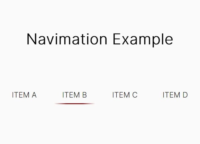
Responsive Lava Lamp Style Navigation Plugin With jQuery
| File Size: | 2.02 KB |
|---|---|
| Views Total: | 2551 |
| Last Update: | |
| Publish Date: | |
| Official Website: | Go to website |
| License: | MIT |

A really simple jQuery script that makes use of pseudo element to create an animated,interactive magic line under the menu items just like the Lava Lamp navigation.
See also:
- Pure CSS3 Animated Sliding Menu
- jQuery Plugin for Creating a Navigation Menu with Sliding Lines
- jQuery Plugin For LavaLamp-Like Menu Hover Effect - Lavazi
- jQuery Animated Navigation with Sliding Background - Lava Lamp
How to use it:
1. Create a site navigation using the regular html list as this:
<ul class="menu">
  <li class="menu-item active">
    <a href="home.html">Home</a>
  </li>
  <li class="menu-item">
    <a href="category.html">Category</a>
  </li>
  <li class="menu-item">
    <a href="about.html">About</a>
  </li>
  <li class="menu-item">
    <a href="blog.html">Blog</a>
  </li>
  <li class="menu-item">
    <a href="contact.html">Contact</a>
  </li>
</ul>
2. Style and make the navigation menu responsive using CSS3 flexbox model
.menu {
  margin: 40vh auto 0;
  padding: 0;
  list-style-type: none;
  width: 75%;
  max-width: 960px;
  min-width: 320px;
  position: relative;
  display: -webkit-box;
  display: -ms-flexbox;
  display: flex;
  -webkit-box-flex: 0;
  -ms-flex: 0 1 auto;
  flex: 0 1 auto;
  -webkit-box-pack: justify;
  -ms-flex-pack: justify;
  justify-content: space-between;
  font-size: calc(.25em + 1.25vw);
}

.menu a {
  display: block;
  color: inherit;
  text-decoration: none;
  text-align: center;
  white-space: nowrap;
  position: relative;
}

.menu a:before { visibility: hidden; }

.menu .magic-line:before, .menu a:before {
  content: "";
  position: absolute;
  top: 0;
  bottom: -0.25em;
  width: 100%;
  border-bottom: 0.125em solid white;
}

.menu .menu-item.active a:before, .menu .menu-item a:hover:before { visibility: visible; }
3. Animate the magic line using CSS3 transitions and transforms.
.magic-line {
  position: absolute;
  top: 0;
  bottom: 0;
  left: 0;
  width: 1px !important;
  -webkit-transform: translateX(0);
  transform: translateX(0);
  -webkit-transform-origin: left;
  transform-origin: left;
  -webkit-transition: -webkit-transform 0.4s;
  transition: -webkit-transform 0.4s;
  transition: transform 0.4s;
  transition: transform 0.4s, -webkit-transform 0.4s;
  -webkit-backface-visibility: hidden;
  backface-visibility: hidden;
  -webkit-transform-style: preserve-3d;
  transform-style: preserve-3d;
  will-change: transform;
}
4. Link to the latest version of jQuery library.
<script src="//code.jquery.com/jquery-3.1.1.slim.min.js"></script>
5. The core jQuery script to active the magic line.
var magicLine, bind = function (fn, me) {
      return function () {
          return fn.apply(me, arguments);
      };
};

magicLine = function () {
  function magicLine(menu) {
      this.menu = menu;
      this.update = bind(this.update, this);
      if (!this.menu.length) {
          return;
      }
      $('<li>', { 'class': 'magic-line' }).appendTo(this.menu.addClass('has-magic-line'));
      this.update();
      $(window).resize(this.update);
  }
  magicLine.prototype.update = function () {
      var el, ref;
      el = this.menu.find('.active');
      return this.menu.find('.magic-line').css({ transform: 'translateX( ' + (((ref = el.position()) != null ? ref.left : void 0) || 0) + 'px ) scaleX( ' + (el.width() || 0) + ' )' });
  };
  return magicLine;
}();

window.magicLine = new magicLine($('.menu'));

$('.menu-item').on('click', function (e) {
  e.preventDefault();
  $(this).addClass('active').siblings().removeClass('active');
  return window.magicLine.update();
});
This awesome jQuery plugin is developed by mican. For more Advanced Usages, please check the demo page or visit the official website.