Responsive Flat Dropdown Menu with jQuery and CSS3
| File Size: | 5.25 KB |
|---|---|
| Views Total: | 58186 |
| Last Update: | |
| Publish Date: | |
| Official Website: | Go to website |
| License: | MIT |
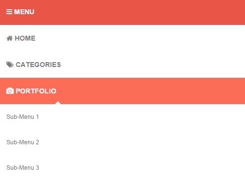
A responsive, mobile-friendly, flat style, animated, multilevel navigation menu built on top of jQuery and CSS/CSS3. It uses jQuery window resize method to detect the screen size and automatically converts the horizontal menu into a mobile-friendly dropdown menu with a toggle button in case the screen size is smaller than a specific breakpoint.
How to use it:
1. Load the Font Awesome 4 in the header (Optional, just for navigation icons).
<link rel="stylesheet" href="//netdna.bootstrapcdn.com/font-awesome/4.3.0/css/font-awesome.min.css">
2. Create the Html for a responsive menu that wraps nested list items with a toggle button.
<nav>
  <a id="resp-menu" class="responsive-menu" href="#">
   <i class="fa fa-reorder"></i> Menu
  </a>
  <ul class="menu">
    <li><a class="homer" href="#"><i class="fa fa-home"></i> HOME</a>
      <ul class="sub-menu">
        <li><a href="#">Sub-Menu 1</a></li>
        <li><a href="#">Sub-Menu 2</a></li>
        <li><a href="#">Sub-Menu 3</a></li>
        <li><a href="#">Sub-Menu 4</a></li>
        <li><a href="#">Sub-Menu 5</a></li>
      </ul>
    </li>
    <li><a href="#"><i class="fa fa-tags"></i> CATEGORIES</a>
      <ul class="sub-menu">
        <li><a href="#">Sub-Menu 1</a></li>
        <li><a href="#">Sub-Menu 2</a></li>
        <li><a href="#">Sub-Menu 3</a></li>
        <li><a href="#">Sub-Menu 4</a></li>
        <li><a href="#">Sub-Menu 5</a></li>
      </ul>
    </li>
    ...
  </ul>
</nav>
3. The primary CSS/CSS3 styles for the responsive menu.
nav {
  display: block;
  background: #E95546;
}

.menu { display: block; }

.menu li {
  display: inline-block;
  position: relative;
  z-index: 100;
}

.menu li:first-child { margin-left: 0; }

.menu li a {
  font-weight: 600;
  text-decoration: none;
  padding: 20px 15px;
  display: block;
  color: #fff;
  transition: all 0.2s ease-in-out 0s;
}

.menu li a:hover,
.menu li:hover>a {
  color: #fff;
  background: #FC6D58;
}

.menu ul {
  visibility: hidden;
  opacity: 0;
  margin: 0;
  padding: 0;
  width: 170px;
  position: absolute;
  left: 0px;
  background: #fff;
  z-index: 99;
  transform: translate(0, 20px);
  transition: all 0.2s ease-out;
}

.menu ul:after {
  bottom: 100%;
  left: 20%;
  border: solid transparent;
  content: " ";
  height: 0;
  width: 0;
  position: absolute;
  pointer-events: none;
  border-color: rgba(255, 255, 255, 0);
  border-bottom-color: #fff;
  border-width: 6px;
  margin-left: -6px;
}

.menu ul li {
  display: block;
  float: none;
  background: none;
  margin: 0;
  padding: 0;
}

.menu ul li a {
  font-size: 12px;
  font-weight: normal;
  display: block;
  color: #797979;
  background: #fff;
}

.menu ul li a:hover,
.menu ul li:hover>a {
  background: #FC6D58;
  color: #fff;
}

.menu li:hover>ul {
  visibility: visible;
  opacity: 1;
  transform: translate(0, 0);
}

.menu ul ul {
  left: 169px;
  top: 0px;
  visibility: hidden;
  opacity: 0;
  transform: translate(20px, 20px);
  transition: all 0.2s ease-out;
}

.menu ul ul:after {
  left: -6px;
  top: 10%;
  border: solid transparent;
  content: " ";
  height: 0;
  width: 0;
  position: absolute;
  pointer-events: none;
  border-color: rgba(255, 255, 255, 0);
  border-right-color: #fff;
  border-width: 6px;
  margin-top: -6px;
}

.menu li>ul ul:hover {
  visibility: visible;
  opacity: 1;
  transform: translate(0, 0);
}

.responsive-menu {
  display: none;
  width: 100%;
  padding: 20px 15px;
  background: #E95546;
  color: #fff;
  text-transform: uppercase;
  font-weight: 600;
}

.responsive-menu:hover {
  background: #E95546;
  color: #fff;
  text-decoration: none;
}

a.homer { background: #FC6D58; }
4. Use CSS3 media queries to specify the menu styles on small screen devices.
@media (min-width: 768px) and (max-width: 979px) {

.mainWrap { width: 768px; }

.menu ul { top: 37px; }

.menu li a { font-size: 12px; }

a.homer { background: #E95546; }

}

@media (max-width: 767px) {

.mainWrap {
  width: auto;
  padding: 50px 20px;
}

.menu { display: none; }

.responsive-menu { display: block; }

nav {
  margin: 0;
  background: none;
}

.menu li {
  display: block;
  margin: 0;
}

.menu li a {
  background: #fff;
  color: #797979;
}

.menu li a:hover,
.menu li:hover>a {
  background: #FC6D58;
  color: #fff;
}

.menu ul {
  visibility: hidden;
  opacity: 0;
  top: 0;
  left: 0;
  width: 100%;
  transform: initial;
}

.menu li:hover>ul {
  visibility: visible;
  opacity: 1;
  position: relative;
  transform: initial;
}

.menu ul ul {
  left: 0;
  transform: initial;
}

.menu li>ul ul:hover { transform: initial; }

}
5. Load the latest version of jQuery library at the bottom of your web page.
<script src="//code.jquery.com/jquery-2.1.3.min.js"></script>
6. The core JavaScript to active the responsive menu.
$(document).ready(function(){
  var touch   = $('#resp-menu');
  var menu  = $('.menu');

  $(touch).on('click', function(e) {
    e.preventDefault();
    menu.slideToggle();
  });

  $(window).resize(function(){
    var w = $(window).width();

    // breakpoint
    if(w > 767 && menu.is(':hidden')) {
      menu.removeAttr('style');
    }
  });

});
This awesome jQuery plugin is developed by arlinadesign. For more Advanced Usages, please check the demo page or visit the official website.


