Responsive Sidebar Push Menu with jQuery and CSS3
| File Size: | 28.5 KB |
|---|---|
| Views Total: | 31999 |
| Last Update: | |
| Publish Date: | |
| Official Website: | Go to website |
| License: | MIT |
Yet another responsive off-canvas navigation system that uses CSS3 transition to smoothly slide out a sidebar push menu from the right hand side of the web page. Built with jQuery, CSS3, Bootstrap 3 and Font Awesome4. jQuery is used only to make the menu open / close on click by toggling CSS classes.
How to use it:
1. Include the required Bootstrap 3 core CSS and Font Awesome 4 icon font in the header.
<link rel="stylesheet" href="//maxcdn.bootstrapcdn.com/bootstrap/3.3.2/css/bootstrap.min.css">
<link rel='stylesheet' href="//maxcdn.bootstrapcdn.com/font-awesome/4.3.0/css/font-awesome.min.css">
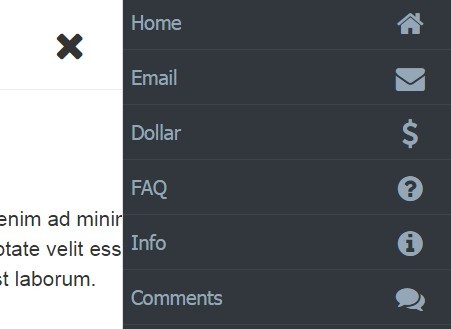
2. Create the Html for the push menu.
<div id="push_sidebar">
  <ul class="list-unstyled">
    <li><a href="#"><i class="fa fa-home"></i> Home</a></li>
    <li><a href="#"><i class="fa fa-envelope"></i> Email</a></li>
    <li><a href="#"><i class="fa fa-dollar"></i> Dollar</a></li>
    <li><a href="#"><i class="fa fa-question-circle"></i> FAQ</a></li>
    <li><a href="#"><i class="fa fa-info-circle"></i> Info</a></li>
    <li><a href="#"><i class="fa fa-comments"></i> Comments</a></li>
  </ul>
</div>
3. Create a trigger element to toggle the push menu.
<span class="nav_trigger">
  <i class="fa fa-navicon"></i>
</span>
4. Wrap your main content into the 'wrapper' container.
<div id="wrapper">
  ...
</div>
5. Load the jQuery JavaScript library at the bottom of the web page.
<script src="//ajax.googleapis.com/ajax/libs/jquery/2.1.3/jquery.min.js"></script>
6. The JavaScript to toggle CSS classes when you open / close the push menu.
$(".nav_trigger").click(function() {
  $("body").toggleClass("show_sidebar");
  $(".nav_trigger .fa").toggleClass("fa-navicon fa-times");
});
7. The core CSS/CSS3 styles for the push menu.
.nav_trigger {
  cursor: pointer;
  display: inline-block;
  font-size: 26px;
  margin: 5px 20px 0 50px;
  float: right;
}

body.show_sidebar .nav_trigger { margin-right: 5px; }

#push_sidebar {
  background: #31373d;
  border-left: 1px solid #ddd;
  bottom: 0;
  color: #95A7B7;
  left: 100%;
  overflow: auto;
  position: fixed;
  top: 0;
  width: 25%;
  -webkit-transition: all .5s ease;
  -moz-transition: all .5s ease;
  -ms-transition: all .5s ease;
  -o-transition: all .5s ease;
  transition: all .5s ease;
}

body.show_sidebar #push_sidebar { left: 75%; }

#wrapper {
  margin-right: 0;
  min-height: 1000px;
  overflow: hidden;
  width: 100%;
  -webkit-transition: all .5s ease;
  -moz-transition: all .5s ease;
  -ms-transition: all .5s ease;
  -o-transition: all .5s ease;
  transition: all .5s ease;
}

body.show_sidebar #wrapper {
  margin-right: 25%;
  width: 75%;
}

@media (max-width: 767px) {

.nav_trigger {
  font-size: 19px;
  margin: 5px 5px 0 20px;
}

#push_sidebar { width: 80%; }

body.show_sidebar #push_sidebar { left: 20%; }

body.show_sidebar #wrapper {
  margin-right: 80%;
  width: 20%;
}
}

@media (min-width: 992px) {

#push_sidebar { width: 20%; }

body.show_sidebar #push_sidebar { left: 80%; }

body.show_sidebar #wrapper {
  margin-right: 20%;
  width: 80%;
}
}

#push_sidebar li a {
  padding: 10px 15px 10px 5px;
  display: block;
  font: 13px Tahoma, Arial, serif;
  background: #31373d;
  color: #95A7B7;
  text-decoration: none;
  border-bottom: 1px solid #3D454C;
}

#push_sidebar li a:hover {
  background-color: #272c30;
  color: #95a7b7
}

#push_sidebar li a .fa {
  font-size: 19px;
  float: right;
  width: 30px;
  text-align: center;
  margin-left: 5px;
}
This awesome jQuery plugin is developed by AmrMekkawy. For more Advanced Usages, please check the demo page or visit the official website.


