Responsive Sliding Side Navigation with jQuery and CSS3
| File Size: | 4.88 KB |
|---|---|
| Views Total: | 10983 |
| Last Update: | |
| Publish Date: | |
| Official Website: | Go to website |
| License: | MIT |
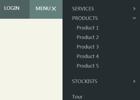
Yet another jQuery plugin to create a fully responsive & animated sliding side navigation with sub-navigation using jQuery and CSS3. Useful for creating a mobile app-like vertical navigation menu sliding out from the edge of your page and push the main content area to the left.
How to use it:
1. Create the Html for a main content area with a toggle link to open a sliding menu.
<main class="cd-main-content">
  <header>
    <nav id="cd-top-nav">
      <ul>
        <li><a href="#0">Tour</a></li>
        <li><a href="#0">Login</a></li>
      </ul>
    </nav>
    <a id="cd-menu-trigger" href="#0"><span class="cd-menu-text">Menu</span><span class="cd-menu-icon"></span></a>
  </header>
</main>
2. Create the Html for a sliding navigation.
<nav id="cd-lateral-nav">
<ul class="cd-navigation">
<li class="item-has-children"> <a href="#0">Services</a>
<ul class="sub-menu">
<li><a href="#0">Brand</a></li>
<li><a href="#0">Web Apps</a></li>
<li><a href="#0">Mobile Apps</a></li>
</ul>
</li>
<!-- item-has-children -->
<li class="item-has-children"> <a href="#0">Products</a>
<ul class="sub-menu">
<li><a href="#0">Product 1</a></li>
<li><a href="#0">Product 2</a></li>
<li><a href="#0">Product 3</a></li>
<li><a href="#0">Product 4</a></li>
<li><a href="#0">Product 5</a></li>
</ul>
</li>
<!-- item-has-children -->
<li class="item-has-children"> <a href="#0">Stockists</a>
<ul class="sub-menu">
<li><a href="#0">London</a></li>
<li><a href="#0">New York</a></li>
<li><a href="#0">Milan</a></li>
<li><a href="#0">Paris</a></li>
</ul>
</li>
<!-- item-has-children -->
</ul>
<!-- cd-navigation -->
<ul class="cd-navigation cd-single-item-wrapper">
<li><a href="#0">Tour</a></li>
<li><a href="#0">Login</a></li>
<li><a href="#0">Register</a></li>
<li><a href="#0">Pricing</a></li>
<li><a href="#0">Support</a></li>
</ul>
<!-- cd-single-item-wrapper -->
<ul class="cd-navigation cd-single-item-wrapper">
<li><a class="current" href="#0">Journal</a></li>
<li><a href="#0">FAQ</a></li>
<li><a href="#0">Terms & Conditions</a></li>
<li><a href="#0">Careers</a></li>
<li><a href="#0">Students</a></li>
</ul>
<!-- cd-single-item-wrapper -->
</nav>
3. The required CSS/CSS3 styles.
.cd-img-replace {
 /* replace text with a background-image */
 display: inline-block;
 overflow: hidden;
 text-indent: 100%;
 white-space: nowrap;
}

.overflow-hidden {
 overflow: hidden;
}

/* --------------------------------

Main components

-------------------------------- */


.cd-main-content {
 /* set a min-height and a z-index to be sure that the main element completely covers the lateral menu */
 min-height: 100%;
 position: relative;
 background-color: #f5f4e9;
 z-index: 2;
 /* Force Hardware Acceleration in WebKit */
 -webkit-transform: translateZ(0);
 -webkit-backface-visibility: hidden;
 -webkit-transition-property: -webkit-transform;
 -moz-transition-property: -moz-transform;
 transition-property: transform;
 -webkit-transition-duration: 0.4s;
 -moz-transition-duration: 0.4s;
 transition-duration: 0.4s;
}

.cd-main-content.lateral-menu-is-open {
 /* translate to show the lateral menu - all content needs to be put in the .cd-main-content to translate*/
 -webkit-transform: translateX(-260px);
 -moz-transform: translateX(-260px);
 -ms-transform: translateX(-260px);
 -o-transform: translateX(-260px);
 transform: translateX(-260px);
}

header {
 position: relative;
 height: 50px;
 width: 100%;
 background: #4e6361;
}
@media only screen and (min-width: 768px) {

header {
 height: 70px;
}
}

#cd-logo {
 display: block;
 float: left;
 margin: 12px 0 0 20px;
}

#cd-logo img {
 display: block;
}
@media only screen and (min-width: 768px) {

#cd-logo {
 margin: 22px 0 0 30px;
}
}

#cd-top-nav {
 position: absolute;
 top: 0;
 right: 120px;
 height: 100%;
 display: none;
}

#cd-top-nav ul {
 height: 100%;
 padding-top: 18px;
}

#cd-top-nav li {
 display: inline-block;
 margin-right: 1em;
}

#cd-top-nav a {
 display: inline-block;
 padding: .5em;
 color: #FFF;
 text-transform: uppercase;
 font-weight: 600;
}

#cd-top-nav a.current {
 background-color: #242e30;
}

.no-touch #cd-top-nav a:hover {
 color: rgba(255, 255, 255, 0.7);
}
@media only screen and (min-width: 768px) {

#cd-top-nav {
 display: block;
}
}

#cd-menu-trigger {
 position: absolute;
 right: 0;
 top: 0;
 height: 100%;
 width: 50px;
 background-color: #64807d;
}

#cd-menu-trigger .cd-menu-text {
 height: 100%;
 text-transform: uppercase;
 color: #FFF;
 font-weight: 600;
 display: none;
}

#cd-menu-trigger .cd-menu-icon {
 /* this span is the central line in the menu menu */
 display: inline-block;
 position: absolute;
 left: 50%;
 top: 50%;
 bottom: auto;
 right: auto;
 -webkit-transform: translateX(-50%) translateY(-50%);
 -moz-transform: translateX(-50%) translateY(-50%);
 -ms-transform: translateX(-50%) translateY(-50%);
 -o-transform: translateX(-50%) translateY(-50%);
 transform: translateX(-50%) translateY(-50%);
 width: 18px;
 height: 2px;
 background-color: #FFF;/* these are the upper and lower lines in the menu menu */
}

#cd-menu-trigger .cd-menu-icon::before,
#cd-menu-trigger .cd-menu-icon:after {
 content: '';
 width: 100%;
 height: 100%;
 position: absolute;
 background-color: inherit;
 left: 0;
 /* Force Hardware Acceleration in WebKit */
 -webkit-transform: translateZ(0);
 -webkit-backface-visibility: hidden;
}

#cd-menu-trigger .cd-menu-icon::before {
 bottom: 5px;
}

#cd-menu-trigger .cd-menu-icon::after {
 top: 5px;
}

#cd-menu-trigger.is-clicked .cd-menu-icon {
 background-color: rgba(255, 255, 255, 0);
}

#cd-menu-trigger.is-clicked .cd-menu-icon::before,
#cd-menu-trigger.is-clicked .cd-menu-icon::after {
 background-color: white;
}

#cd-menu-trigger.is-clicked .cd-menu-icon::before {
 bottom: 0;
 -webkit-transform: rotate(45deg);
 -moz-transform: rotate(45deg);
 -ms-transform: rotate(45deg);
 -o-transform: rotate(45deg);
 transform: rotate(45deg);
}

#cd-menu-trigger.is-clicked .cd-menu-icon::after {
 top: 0;
 -webkit-transform: rotate(-45deg);
 -moz-transform: rotate(-45deg);
 -ms-transform: rotate(-45deg);
 -o-transform: rotate(-45deg);
 transform: rotate(-45deg);
}
@media only screen and (min-width: 768px) {

#cd-menu-trigger {
 width: 110px;
 padding-left: 1.25em;
}

#cd-menu-trigger .cd-menu-text {
 display: inline-block;
 line-height: 70px;
}

#cd-menu-trigger .cd-menu-icon {
 left: auto;
 right: 1.25em;
 -webkit-transform: translateX(0);
 -moz-transform: translateX(0);
 -ms-transform: translateX(0);
 -o-transform: translateX(0);
 transform: translateX(0);
}
}

#cd-lateral-nav {
 position: fixed;
 height: 100%;
 right: 0;
 top: 0;
 /* the secondary navigation is covered by the main element */
 z-index: 1;
 width: 260px;
 background-color: #242e30;
 overflow-y: auto;
 /* smooth the scrolling on touch devices - webkit browsers */
 -webkit-overflow-scrolling: touch;
 /* Force Hardware Acceleration in WebKit */
 -webkit-transform: translateZ(0);
 -webkit-backface-visibility: hidden;
 -webkit-transition-property: -webkit-transform;
 -moz-transition-property: -moz-transform;
 transition-property: transform;
 -webkit-transition-duration: 0.4s;
 -moz-transition-duration: 0.4s;
 transition-duration: 0.4s;
 /* this creates the subtle slide in animation of the navigation */
 -webkit-transform: translateX(80px);
 -moz-transform: translateX(80px);
 -ms-transform: translateX(80px);
 -o-transform: translateX(80px);
 transform: translateX(80px);
}

#cd-lateral-nav .cd-navigation {
 margin: 10px 0 16px;
}

#cd-lateral-nav .sub-menu {
 padding: 0 10px 20px 15px;
 display: none;
}

#cd-lateral-nav a {
 display: block;
 line-height: 2em;
 padding: 0 16px 0 32px;
 color: #aab5b7;
}

#cd-lateral-nav a.current {
 background-color: #3a4a4d;
 color: #FFF;
}

.no-touch #cd-lateral-nav a:hover {
 color: #FFF;
}
@media only screen and (min-width: 768px) {

#cd-lateral-nav .cd-navigation {
 margin: 20px 0;
}
}

#cd-lateral-nav.lateral-menu-is-open {
 -webkit-transform: translateX(0);
 -moz-transform: translateX(0);
 -ms-transform: translateX(0);
 -o-transform: translateX(0);
 transform: translateX(0);
}

/* style menu items which have a submenu  */


#cd-lateral-nav .item-has-children > a {
 position: relative;
 text-transform: uppercase;
 font-weight: 600;/* this is the right arrow to show that the item has a submenu  */
}

#cd-lateral-nav .item-has-children > a::after {
 content: '';
 display: block;
 height: 11px;
 width: 8px;
 position: absolute;
 top: 50%;
 bottom: auto;
 -webkit-transform: translateY(-50%);
 -moz-transform: translateY(-50%);
 -ms-transform: translateY(-50%);
 -o-transform: translateY(-50%);
 transform: translateY(-50%);
 right: 1em;
 background: url("https://s3-us-west-2.amazonaws.com/s.cdpn.io/148866/cd-arrow-sec-exp-nav.svg") no-repeat center center;
 background-size: 8px 11px;
 -webkit-transition-property: -webkit-transform;
 -moz-transition-property: -moz-transform;
 transition-property: transform;
 -webkit-transition-duration: 0.2s;
 -moz-transition-duration: 0.2s;
 transition-duration: 0.2s;
}

#cd-lateral-nav .item-has-children > a.submenu-open::after {
 -webkit-transform: translateY(-50%) rotate(90deg);
 -moz-transform: translateY(-50%) rotate(90deg);
 -ms-transform: translateY(-50%) rotate(90deg);
 -o-transform: translateY(-50%) rotate(90deg);
 transform: translateY(-50%) rotate(90deg);
}

#cd-lateral-nav .socials {
 *zoom: 1;
 padding: 0 32px;
}

#cd-lateral-nav .socials:before,
#cd-lateral-nav .socials:after {
 content: " ";
 display: table;
}

#cd-lateral-nav .socials:after {
 clear: both;
}

#cd-lateral-nav .socials a {
 height: 32px;
 width: 32px;
 float: left;
 padding: 0;
 background-image: url("https://s3-us-west-2.amazonaws.com/s.cdpn.io/148866/cd-socials.svg");
 background-repeat: no-repeat;
 background-size: 128px 64px;
 background-color: #FFF;
 margin-right: .5em;
 border-radius: 0.25em;
}

#cd-lateral-nav .socials a.cd-twitter {
 background-position: 0 0;
}

#cd-lateral-nav .socials a.cd-github {
 background-position: -32px 0;
}

#cd-lateral-nav .socials a.cd-facebook {
 background-position: -64px 0;
}

#cd-lateral-nav .socials a.cd-google {
 background-position: -96px 0;
}

.no-touch #cd-lateral-nav .socials a:hover {
 background-color: #4e6361;
}

.no-touch #cd-lateral-nav .socials a:hover.cd-twitter {
 background-position: 0 -32px;
}

.no-touch #cd-lateral-nav .socials a:hover.cd-github {
 background-position: -32px -32px;
}

.no-touch #cd-lateral-nav .socials a:hover.cd-facebook {
 background-position: -64px -32px;
}

.no-touch #cd-lateral-nav .socials a:hover.cd-google {
 background-position: -96px -32px;
}
4. Include the latest version of jQuery library at the end of your page.
<script src='http://ajax.googleapis.com/ajax/libs/jquery/1.11.1/jquery.min.js'></script>
5. Add the following Javascript snippets after jQuery library.
<script>jQuery(document).ready(function($){
var $lateral_menu_trigger = $('#cd-menu-trigger'),
$content_wrapper = $('.cd-main-content');

// fallback added for IE9 - transition not supported
var is_explorer_9 = navigator.userAgent.indexOf('MSIE 9') > -1;

//open-close lateral menu clicking on the menu icon
$lateral_menu_trigger.on('click', function(event){
event.preventDefault();
$lateral_menu_trigger.toggleClass('is-clicked');
$content_wrapper.toggleClass('lateral-menu-is-open').one('webkitTransitionEnd otransitionend oTransitionEnd msTransitionEnd transitionend', function(){
// firefox transitions break when parent overflow is changed, so we need to wait for the end of the trasition to give the body an overflow hidden
$('body').toggleClass('overflow-hidden');
});
$('#cd-lateral-nav').toggleClass('lateral-menu-is-open');
if(is_explorer_9) {
$('body').toggleClass('overflow-hidden');
}
});

//close lateral menu clicking outside the menu itself
$content_wrapper.on('click', function(event){
if( !$(event.target).is('#cd-menu-trigger, #cd-menu-trigger span') ) {
$lateral_menu_trigger.removeClass('is-clicked');
$content_wrapper.removeClass('lateral-menu-is-open').one('webkitTransitionEnd otransitionend oTransitionEnd msTransitionEnd transitionend', function(){
$('body').removeClass('overflow-hidden');
});
$('#cd-lateral-nav').removeClass('lateral-menu-is-open');
if(is_explorer_9) {
$('body').removeClass('overflow-hidden');
}

}
});

//open (or close) submenu items in the lateral menu. Close all the other open submenu items.
$('.item-has-children').children('a').on('click', function(event){
event.preventDefault();
$(this).toggleClass('submenu-open').next('.sub-menu').slideToggle(200).end().parent('.item-has-children').siblings('.item-has-children').children('a').removeClass('submenu-open').next('.sub-menu').slideUp(200);
});
});
</script>
This awesome jQuery plugin is developed by codyhouse. For more Advanced Usages, please check the demo page or visit the official website.


