jQuery Plugin For Responsive Sticky Header Navigation
| File Size: | 3.42 KB |
|---|---|
| Views Total: | 11276 |
| Last Update: | |
| Publish Date: | |
| Official Website: | Go to website |
| License: | MIT |
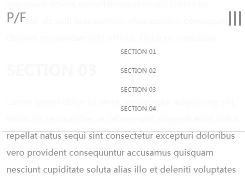
A super tiny jQuery plugin for creating a responsive sticky header navigation on-demand for your website. The sticky header will appear automatically when your users scroll down the web page, and it will be turned into a drop down toggle menu on small screen devices.
Basic Usage:
1. Include the necessary jQuery javascript library at the bottom of the web page.
<script src="http://ajax.googleapis.com/ajax/libs/jquery/1.11.1/jquery.min.js"></script>
2. Create the Html for a header navigation.
<header class="main_h">
  <div class="row">
    <div class="mobile-toggle"> <span></span> <span></span> <span></span> </div>
    <nav>
      <ul>
        <li><a href="#">Section 01</a></li>
        <li><a href="#">Section 02</a></li>
        <li><a href="#">Section 03</a></li>
        <li><a href="#">Section 04</a></li>
      </ul>
    </nav>
  </div>
</header>
3. The required CSS to style the header navigation and make it sticky and responsive.
.main_h {
 position: fixed;
 top: 0px;
 max-height: 70px;
 z-index: 999;
 width: 100%;
 padding-top: 17px;
 background: none;
 overflow: hidden;
 -webkit-transition: all 0.3s;
 transition: all 0.3s;
 opacity: 0;
 top: -100px;
 padding-bottom: 6px;
 font-family: "Montserrat", sans-serif;
}
@media only screen and (max-width: 766px) {

.main_h {
 padding-top: 25px;
}
}

.open-nav {
 max-height: 400px !important;
}

.open-nav .mobile-toggle {
 transform: rotate(-90deg);
 -webkit-transform: rotate(-90deg);
}

.sticky {
 background-color: rgba(255, 255, 255, 0.93);
 opacity: 1;
 top: 0px;
 border-bottom: 1px solid gainsboro;
}

nav {
 float: right;
 width: 60%;
}
@media only screen and (max-width: 766px) {

nav {
 width: 100%;
}
}

nav ul {
 list-style: none;
 overflow: hidden;
 text-align: right;
 float: right;
}
@media only screen and (max-width: 766px) {

nav ul {
 padding-top: 10px;
 margin-bottom: 22px;
 float: left;
 text-align: center;
 width: 100%;
}
}

nav ul li {
 display: inline-block;
 margin-left: 35px;
 line-height: 1.5;
}
@media only screen and (max-width: 766px) {

nav ul li {
 width: 100%;
 padding: 7px 0;
 margin: 0;
}
}

nav ul a {
 color: #888888;
 text-transform: uppercase;
 font-size: 12px;
}

.mobile-toggle {
 display: none;
 cursor: pointer;
 font-size: 20px;
 position: absolute;
 right: 22px;
 top: 0;
 width: 30px;
 -webkit-transition: all 200ms ease-in;
 -moz-transition: all 200ms ease-in;
 transition: all 200ms ease-in;
}
@media only screen and (max-width: 766px) {

.mobile-toggle {
 display: block;
}
}

.mobile-toggle span {
 width: 30px;
 height: 4px;
 margin-bottom: 6px;
 border-radius: 1000px;
 background: #8f8f8f;
 display: block;
}
4. The Javascript to enable the plugin.
$(window).scroll(function() {

    if ($(window).scrollTop() > 100) {
        $('.main_h').addClass('sticky');
    } else {
        $('.main_h').removeClass('sticky');
    }
});

// Mobile Navigation
$('.mobile-toggle').click(function() {
    if ($('.main_h').hasClass('open-nav')) {
        $('.main_h').removeClass('open-nav');
    } else {
        $('.main_h').addClass('open-nav');
    }
});

$('.main_h li a').click(function() {
    if ($('.main_h').hasClass('open-nav')) {
        $('.navigation').removeClass('open-nav');
        $('.main_h').removeClass('open-nav');
    }
});
This awesome jQuery plugin is developed by MarcRay. For more Advanced Usages, please check the demo page or visit the official website.


