Responsive jQuery Mobile Off-Canvas Menu Plugin - Responsive Nav
| File Size: | 4.9 KB |
|---|---|
| Views Total: | 9577 |
| Last Update: | |
| Publish Date: | |
| Official Website: | Go to website |
| License: | MIT |
Responsive Nav is jQuery toggle menu plugin that converts a multi-level dropdown navigation into a nested off-canvas menu on small screen devices.
When you click the toggle button, a sidebar navigation panel will slide out from the left side of the web page and push the main content section to the right.
How to use it:
1. Include the jQuery javascript library together with jQuery responsive nav plugin's javascript and CSS files in your Html page.
<script src="jquery.min.js"></script>
<script src="jquery.responsive-nav.js"></script>
<link rel="stylesheet" href="jquery.responsive-nav.css">
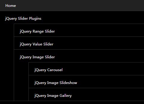
2. Create a multi-level dropdown navigation with Html unordered lists.
<div id="global-nav">
  <ul>
    <li><a href="">Home</a></li>
    <li><a href="">jQuery Slider Plugins</a>
      <ul>
        <li><a href="">jQuery Range Slider</a></li>
        <li><a href="">jQuery Value Slider</a>
        <li><a href="">jQuery Image Slider</a>
          <ul>
            <li><a href="">jQuery Carousel</a></li>
            <li><a href="">jQuery Image Slideshow</a></li>
            <li><a href="">jQuery Image Gallery</a></li>
          </ul>
        </li>
      </ul>
    </li>
    <li><a href="">Contact us</a></li>
    <li><a href="">Blog</a></li>
  </ul>
</div>
3. Create a menu toggle button that will become visible when the window's size reaches the break point defined in the CSS media queries.
<div id="responsive-btn"></div>
4. The CSS to style the original dropdown menu and custom the break point to determine in which screen size will display the off-canvas menu.
#global-nav { background-color: #3886FC; }

#global-nav ul li a {
  color: #fff;
  background-color: #3886FC;
  font-size: 12px;
  padding: 5px 20px;
  text-decoration: none;
}

#global-nav ul li a:hover { background-color: #5093F8; }

#global-nav ul li ul { display: none; }

@media screen and ( max-width: 939px ) {

#responsive-btn {
  display: block;
  position: absolute;
  right: 20px;
  top: 10px;
}
}
5. Call the plugin on document ready.
jQuery( function( $ ) {
  $('#global-nav').responsive_nav();
});
Changelog:
2018-07-26
- Some fixes
2015-01-19
- fixed bugs.
2015-01-09
- improvement.
2014-08-12
- update.
2014-07-31
- Set the max-width width of the off-canvas-nav is not too widely
- Fix bug that off-canvas-nav disappears when open the Developer Tools
2014-07-25
- Fix CSS again.
2014-07-10
- Fix CSS
2014-06-24
- Fix display bug in Chrome.
2014-04-18
- Fix CSS
This awesome jQuery plugin is developed by inc2734. For more Advanced Usages, please check the demo page or visit the official website.


