Collapsible Sidebar Navigation Using Bootstrap 4
| File Size: | 3.84 KB |
|---|---|
| Views Total: | 25153 |
| Last Update: | |
| Publish Date: | |
| Official Website: | Go to website |
| License: | MIT |
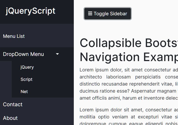
A mobile-friendly collapsible sidebar navigation system (off-canvas navigation) built on top of Bootstrap 4, jQuery, and CSS/CSS3.
Feel free to download and use it in your dashboard app or documentation website to provide a better navigation experience.
How to use it:
1. Include jQuery library and Bootstrap 4 framework on the page.
<link rel="stylesheet" href="/path/to/cdn/bootstrap.min.css" />
<script src="/path/to/cdn/jquery.slim.min.js"></script>
<script src="/path/to/cdn/bootstrap.min.js"></script>
2. Create a collapsible sidebar from Bootstrap 4 nav component.
<div class="wrapper">
  <nav id="sidebar">
    <div class="sidebar-header">
      <h3>jQueryScript</h3>
    </div>
    <ul class="lisst-unstyled components">
      <p>My Nav</p>
      <li class="active">
        <a href="#foodSubmenu" data-toggle="collapse" aria-expanded="false" class="dropdown-toggle">DropDown MENU</a>
        <ul class="collapse lisst-unstyled" id="foodSubmenu">
          <li><a href="#">jQuery</a></li>
          <li><a href="#">Script</a></li>
          <li><a href="#">Net</a></li>
        </ul>
      </li>
      <li>
        <a href="#">Contact</a>
      </li>
      <li>
        <a href="#">About</a>
      </li>
    </ul>
  </nav>
  <div id="content">
    <!-- Navigation Toggler -->
    <nav class="navbar navbar-expand-lg">
      <div class="container-fluid">
        <button type="button" id="sidebarCollapse" class="btn btn-dark">
          <i class="fas fa-bars"></i><span> Toggle Sidebar</span>
        </button>
      </div>
    </nav>
    <!-- Main Content Here -->
  </div>
</div>
3. The main CSS styles for the sidebar navigation.
.wrapper {
  display: flex;
  text-decoration: none;
  transition: all 0.4s;
}

#sidebar {
  min-width: 250px;
  max-width: 250px;
  background: #262933;
  color: #fff;
  transition: all 0.4s;
  height: 100vh;
}

#sidebar.active {
  margin-left: -250px;
}

#sidebar .sidebar-header {
  padding: 20px;
  background: #1b1d24;
}

#sidebar ul.components {
  padding: 20px 0;
  /* border-bottom: 1px solid #47748b; */
}

#sidebar ul p {
  color: #fff;
  padding: 10px;
}

#sidebar ul li a {
  padding: 10px;
  font-size: 1.1em;
  display: block;
}

#sidebar ul li a:hover {
  color: #262933;
  background: #fff;
}

#sidebar ul li.active>a,
a[aria-expanded="true"] {
  color: #fff;
  background: #1b1d24;
}

a[data-toggle="collapse"] {
  position: relative;
}

.dropdown-toggle::after {
  display: block;
  position: absolute;
  top: 50%;
  right: 20%;
  transform: translateY(-50%);
}

ul ul a {
  font-size: 0.9em !important;
  padding-left: 30px !important;
  background: #1b1d24;
}
4. Hide the sidebar navigation on mobile devices.
@media (max-width: 768px) {
  #sidebar {
    margin-left: -250px;
  }

  #sidebar.active {
    margin-left: 0;
  }

  #sidebarCollapse span {
    display: none;
  }
}
This awesome jQuery plugin is developed by tomimandalap. For more Advanced Usages, please check the demo page or visit the official website.