jQuery & CSS3 Off-canvas Push Menu For Bootstrap 3
| File Size: | 4.33 KB |
|---|---|
| Views Total: | 38749 |
| Last Update: | |
| Publish Date: | |
| Official Website: | Go to website |
| License: | MIT |
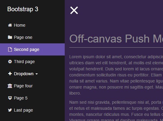
A jQuery & CSS3 based sidebar navigation for Bootstrap 3 that slides out an off-canvas push menu from the edge of the browser window.
How to use it:
1. Create an overlay element for the sidebar navigation.
<div class="overlay"></div>
2. Create a sidebar navigation for your Bootstrap project as follow.
<nav class="navbar navbar-inverse navbar-fixed-top" id="sidebar-wrapper" role="navigation">
  <ul class="nav sidebar-nav">
    <li>
      <a href="#">Home</a>
    </li>
    <li>
      <a href="#">Contact</a>
    </li>
    <li>
      <a href="#">Blog</a>
    </li>
  </ul>
</nav>
3. Create a hamburger button inside the main content to toggle the sidebar navigation.
<div id="page-content-wrapper">
  <button type="button" class="hamburger is-closed animated fadeInLeft" data-toggle="offcanvas">
    <span class="hamb-top"></span>
    <span class="hamb-middle"></span>
    <span class="hamb-bottom"></span>
  </button>
  <div class="container">
    Main content goes here
  </div>
</div>
4. Wrap them into a container. The entire markup structure should be like this:
<div id="wrapper">
  <div class="overlay"></div>
  <nav class="navbar navbar-inverse navbar-fixed-top" id="sidebar-wrapper" role="navigation">
    ...
  </nav>
  <div id="page-content-wrapper">
    ...
  </div>
</div>
5. The CSS styles for the main wrapper.
#wrapper {
  -moz-transition: all 0.5s ease;
  -o-transition: all 0.5s ease;
  -webkit-transition: all 0.5s ease;
  padding-left: 0;
  -webkit-transition: all 0.5s ease;
  transition: all 0.5s ease;
}

#wrapper.toggled { padding-left: 220px; }

#wrapper.toggled #sidebar-wrapper { width: 220px; }

#wrapper.toggled #page-content-wrapper {
  margin-right: -220px;
  position: absolute;
}

#sidebar-wrapper {
  -moz-transition: all 0.5s ease;
  -o-transition: all 0.5s ease;
  -webkit-transition: all 0.5s ease;
  background: #1a1a1a;
  height: 100%;
  left: 220px;
  margin-left: -220px;
  overflow-x: hidden;
  overflow-y: auto;
  -webkit-transition: all 0.5s ease;
  transition: all 0.5s ease;
  width: 0;
  z-index: 1000;
}

#sidebar-wrapper::-webkit-scrollbar {
 display: none;
}

#page-content-wrapper {
  padding-top: 70px;
  width: 100%;
}
6. The primary CSS styles for the sidebar navigation.
.sidebar-nav {
  list-style: none;
  margin: 0;
  padding: 0;
  position: absolute;
  top: 0;
  width: 220px;
}

.sidebar-nav li {
  display: inline-block;
  line-height: 20px;
  position: relative;
  width: 100%;
}

.sidebar-nav li:before {
  -moz-transition: width 0.2s ease-in;
  -ms-transition: width 0.2s ease-in;
  -webkit-transition: width 0.2s ease-in;
  background-color: #1c1c1c;
  content: '';
  height: 100%;
  left: 0;
  position: absolute;
  top: 0;
  -webkit-transition: width 0.2s ease-in;
  transition: width 0.2s ease-in;
  width: 3px;
  z-index: -1;
}

.sidebar-nav li:first-child a {
  background-color: #1a1a1a;
  color: #ffffff;
}

.sidebar-nav li:nth-child(2):before { background-color: #52418a; }

.sidebar-nav li:nth-child(3):before { background-color: #5c499c; }

.sidebar-nav li:nth-child(4):before { background-color: #6651ad; }

.sidebar-nav li:nth-child(5):before { background-color: #7562b5; }

.sidebar-nav li:nth-child(6):before { background-color: #8473be; }

.sidebar-nav li:nth-child(7):before { background-color: #9485c6; }

.sidebar-nav li:nth-child(8):before { background-color: #a396ce; }

.sidebar-nav li:nth-child(9):before { background-color: #b2a7d6; }

.sidebar-nav li:hover:before {
  -webkit-transition: width 0.2s ease-in;
  transition: width 0.2s ease-in;
  width: 100%;
}

.sidebar-nav li a {
  color: #dddddd;
  display: block;
  padding: 10px 15px 10px 30px;
  text-decoration: none;
}

.sidebar-nav li.open:hover before {
  -webkit-transition: width 0.2s ease-in;
  transition: width 0.2s ease-in;
  width: 100%;
}

.sidebar-nav .dropdown-menu {
  background-color: #222222;
  border-radius: 0;
  border: none;
  box-shadow: none;
  margin: 0;
  padding: 0;
  position: relative;
  width: 100%;
}

.sidebar-nav li a:hover, .sidebar-nav li a:active, .sidebar-nav li a:focus, .sidebar-nav li.open a:hover, .sidebar-nav li.open a:active, .sidebar-nav li.open a:focus {
  background-color: transparent;
  color: #ffffff;
  text-decoration: none;
}

.sidebar-nav > .sidebar-brand {
  font-size: 20px;
  height: 65px;
  line-height: 44px;
}
7. Style & animate the hamburger toggle button.
.hamburger {
  background: transparent;
  border: none;
  display: block;
  height: 32px;
  margin-left: 15px;
  position: fixed;
  top: 20px;
  width: 32px;
  z-index: 999;
}

.hamburger:hover { outline: none; }

.hamburger:focus { outline: none; }

.hamburger:active { outline: none; }

.hamburger.is-closed:before {
  -webkit-transform: translate3d(0, 0, 0);
  -webkit-transition: all 0.35s ease-in-out;
  color: #ffffff;
  content: '';
  display: block;
  font-size: 14px;
  line-height: 32px;
  opacity: 0;
  text-align: center;
  width: 100px;
}

.hamburger.is-closed:hover before {
  -webkit-transform: translate3d(-100px, 0, 0);
  -webkit-transition: all 0.35s ease-in-out;
  display: block;
  opacity: 1;
}

.hamburger.is-closed:hover .hamb-top {
  -webkit-transition: all 0.35s ease-in-out;
  top: 0;
}

.hamburger.is-closed:hover .hamb-bottom {
  -webkit-transition: all 0.35s ease-in-out;
  bottom: 0;
}

.hamburger.is-closed .hamb-top {
  -webkit-transition: all 0.35s ease-in-out;
  background-color: rgba(255, 255, 255, 0.7);
  top: 5px;
}

.hamburger.is-closed .hamb-middle {
  background-color: rgba(255, 255, 255, 0.7);
  margin-top: -2px;
  top: 50%;
}

.hamburger.is-closed .hamb-bottom {
  -webkit-transition: all 0.35s ease-in-out;
  background-color: rgba(255, 255, 255, 0.7);
  bottom: 5px;
}

.hamburger.is-closed .hamb-top, .hamburger.is-closed .hamb-middle, .hamburger.is-closed .hamb-bottom, .hamburger.is-open .hamb-top, .hamburger.is-open .hamb-middle, .hamburger.is-open .hamb-bottom {
  height: 4px;
  left: 0;
  position: absolute;
  width: 100%;
}

.hamburger.is-open .hamb-top {
  -webkit-transform: rotate(45deg);
  -webkit-transition: -webkit-transform 0.2s cubic-bezier(0.73, 1, 0.28, 0.08);
  background-color: #ffffff;
  margin-top: -2px;
  top: 50%;
}

.hamburger.is-open .hamb-middle {
  background-color: #ffffff;
  display: none;
}

.hamburger.is-open .hamb-bottom {
  -webkit-transform: rotate(-45deg);
  -webkit-transition: -webkit-transform 0.2s cubic-bezier(0.73, 1, 0.28, 0.08);
  background-color: #ffffff;
  margin-top: -2px;
  top: 50%;
}

.hamburger.is-open:before {
  -webkit-transform: translate3d(0, 0, 0);
  -webkit-transition: all 0.35s ease-in-out;
  color: #ffffff;
  content: '';
  display: block;
  font-size: 14px;
  line-height: 32px;
  opacity: 0;
  text-align: center;
  width: 100px;
}

.hamburger.is-open:hover before {
  -webkit-transform: translate3d(-100px, 0, 0);
  -webkit-transition: all 0.35s ease-in-out;
  display: block;
  opacity: 1;
}
8. Customize the styles of the overlay.
.overlay {
  position: fixed;
  display: none;
  width: 100%;
  height: 100%;
  top: 0;
  left: 0;
  right: 0;
  bottom: 0;
  background-color: rgba(0, 0, 0, 0.4);
  z-index: 1;
}
9. The jQuery script to enable the sidebar navigation for your Bootstrap project.
$(document).ready(function () {
  var trigger = $('.hamburger'),
      overlay = $('.overlay'),
     isClosed = false;

    trigger.click(function () {
      hamburger_cross();
    });

    function hamburger_cross() {

      if (isClosed == true) {
        overlay.hide();
        trigger.removeClass('is-open');
        trigger.addClass('is-closed');
        isClosed = false;
      } else {
        overlay.show();
        trigger.removeClass('is-closed');
        trigger.addClass('is-open');
        isClosed = true;
      }
  }

  $('[data-toggle="offcanvas"]').click(function () {
        $('#wrapper').toggleClass('toggled');
  });
});
This awesome jQuery plugin is developed by j_holtslander. For more Advanced Usages, please check the demo page or visit the official website.


