jQuery Arbitrarily-prioritized Responsive Navigation - Priority Navigation
| File Size: | 42.7 KB |
|---|---|
| Views Total: | 1092 |
| Last Update: | |
| Publish Date: | |
| Official Website: | Go to website |
| License: | MIT |
A responsive & space-saving jQuery navigation menu plugin that allows for prioritization ordering independent from menu ordering. The goal is to hide the less important items behind a “more” link if there's no enough space to hold the whole navigation menu. The less important items are revealed when the user clicks the “more” link.
How to use it:
1. Create a list of menu items for the navigation and use the data-priority attribute to specify the priority for each item.
<nav>
<ul>
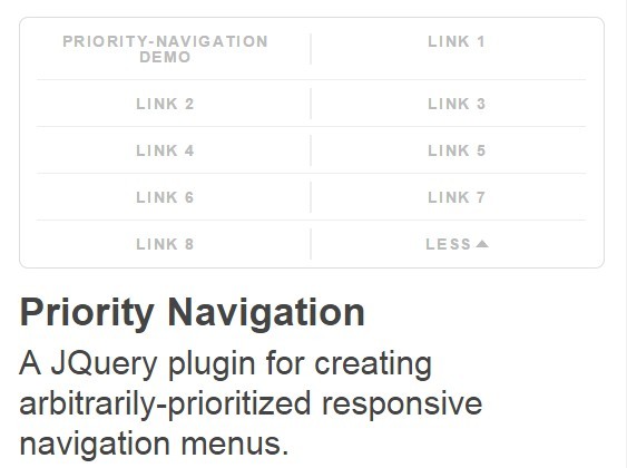
<li data-priority="0"> <a href="#">Priority-Navigation Demo</a> </li>
<li data-priority="8"> <a href="#">Link 1</a> </li>
<li data-priority="1"> <a href="#">Link 2</a> </li>
<li data-priority="4"> <a href="#">Link 3</a> </li>
<li data-priority="2"> <a href="#">Link 4</a> </li>
<li data-priority="3"> <a href="#">Link 5</a> </li>
<li data-priority="5"> <a href="#">Link 6</a> </li>
<li data-priority="7"> <a href="#">Link 7</a> </li>
<li data-priority="6"> <a href="#">Link 8</a> </li>
</ul>
</nav>
2. Include jQuery library and the jQuery Priority Navigation plugin at the bottom of the webpage.
<script src="jquery.min.js"></script>
<script src="src/priority-navigation.js"></script>
3. Initialize the plugin by calling the function on the menu list.
$("nav ul").prioritize({

  // Shown in the last position when the menu has been truncated
  more: "More",

  // Shown in the last position when the menu has been opened
  less: "Less",

  // Shown when the menu has been truncated to a single item
  menu: "Menu"

});
4. The sample CSS to style the navigation menu.
body > nav { width: 100%; }

body > nav ul {
  font-size: 0;
  padding: 0;
  white-space: nowrap;
  list-style-type: none;
}

body > nav ul > li {
  font-size: 1rem;
  display: inline-block;
  white-space: nowrap;
  text-align: center;
  list-style-type: none;
  vertical-align: middle;
}

body > nav ul > li a {
  display: block;
  text-decoration: none;
  padding: .75em;
  position: relative;
  line-height: 1em;
}

body > nav ul > li a:focus, body > nav ul > li a:hover { text-decoration: underline; }

html body > nav ul.prioritized li[data-priority="more"], html body > nav ul.prioritized.opened li[data-priority="more"], html body > nav ul.prioritized:not(.opened) > li[data-priority="less"] { display: none; }

html body > nav ul.prioritized.truncated > li[data-priority="more"] { display: inline-block; }

html body > nav ul:not(.opened) > li[data-priority="0"], html body > nav ul.prioritized:not(.opened) > li.demoted, html body > nav ul.prioritized:not(.opened) > li[data-priority="less"] {
  position: absolute;
  overflow: hidden;
  clip: rect(0 0 0 0);
  height: 1px;
  width: 1px;
  margin: -1px;
  padding: 0;
  border: 0;
}

body > nav ul.prioritized.opened, body > nav ul:not(.prioritized) { white-space: normal; }

body > nav ul.prioritized.opened li, body > nav ul:not(.prioritized) li { white-space: normal; }

body > nav ul.prioritized.opened > li, body > nav ul.prioritized.opened > li.demoted, body > nav ul:not(.prioritized) > li {
  width: 50%;
  height: auto;
  position: static;
}

body > nav ul.prioritized.opened > li[data-priority="more"] {
  position: absolute;
  display: none !important;
}

body > nav {
  margin-top: 1.75rem;
  overflow: hidden;
 border-radius: .4rem;
  border: solid 1px #dddddd;
  width: calc(100% - 2px);
}

body > nav ul { overflow: hidden; }

body > nav ul.prioritized:not(.opened) {
  width: 100%;
  display: table;
  padding: 0;
  margin-left: -2px;
  height: 2.5rem;
  height: calc(2.5rem - 2px);
}

body > nav > ul > li {
  font-family: sans-serif;
  text-transform: uppercase;
 font-size: .7rem;
  font-weight: bold;
  letter-spacing: .1em;
  overflow: visible;
}

body > nav ul.prioritized:not(.opened) li, html body > nav ul.prioritized.truncated > li[data-priority="more"] {
  display: table-cell;
  position: relative;
  vertical-align: middle;
}

body > nav ul.prioritized:not(.opened) li:not(.menu) a:before {
  content: "";
  position: absolute;
  height: 2em;
  margin-top: -1em;
  top: 50%;
  width: 1px;
  background: #eeeeee;
  left: 0;
}

body > nav ul.prioritized.opened, body > nav ul.prioritized.opened li, body > nav ul:not(.prioritized), body > nav ul:not(.prioritized) li { margin: 0; }

body > nav ul.prioritized.opened, body > nav ul:not(.prioritized) { position: relative }

body > nav ul.prioritized.opened li, body > nav ul:not(.prioritized) li {
  vertical-align: top;
  margin-top: -1px;
}

body > nav ul.prioritized.opened li:before, body > nav ul:not(.prioritized) li:before {
  content: "";
  position: absolute;
  height: 1px;
  width: 94%;
  background: #eeeeee;
  left: 3%;
}

body > nav ul.prioritized.opened li:nth-child(odd):not([data-priority="more"]):not([data-priority="less"]) a:before, body > nav ul:not(.prioritized) li:nth-child(odd):not([data-priority="more"]):not([data-priority="less"]) a:before {
  content: "";
  position: absolute;
  height: 2em;
  width: 1px;
  background: #eeeeee;
  right: 0;
  top: 50%;
  margin-top: -1em;
}

body > nav ul > li a {
 padding: .75rem 1.25rem;
  color: #bbbbbb;
  transition: color.33s;
  overflow: visible;
  overflow: visible;
}

body > nav ul.prioritized> li[data-priority="more"] a:after, body > nav ul.prioritized> li[data-priority="less"] a:after {
  content: "";
  display: inline-block;
  width: 0;
  height: 0;
  border-left: .9ex solid transparent;
  border-right: .9ex solid transparent;
  vertical-align: middle;
  margin: 0 0 .2em .25em;
  transition: border-color.33s
}

body > nav ul.prioritized> li[data-priority="more"] a::after { border-top: 1ex solid #bbbbbb; }

body > nav ul.prioritized> li[data-priority="less"] a::after { border-bottom: 1ex solid #bbbbbb; }

body > nav ul > li a:hover, body > nav ul > li a:focus {
  text-decoration: none;
  color: #666666;
}

body > nav ul.prioritized> li[data-priority="more"] a:hover::after, body > nav ul.prioritized> li[data-priority="more"] a:focus::after, body > nav ul.prioritized> li[data-priority="less"] a:hover::after, body > nav ul.prioritized> li[data-priority="less"] a:focus::after {
  border-top-color: #666666;
  border-bottom-color: #666666;
}

@media only screen and (max-width: 40em) {

body > header > nav { margin-top: 0 }

}

@media only screen and (max-width: 30em) {

body > nav ul.prioritized.opened > li, body > nav ul.prioritized.opened > li.demoted, body > nav ul:not(.prioritized) > li { width: 100%; }

body > nav ul.opened li:nth-child(odd) a:before { display: none; }

}
Change log:
2015-06-25
- fixed firefox with outerWidth() and removed the redundant
This awesome jQuery plugin is developed by matthornsby. For more Advanced Usages, please check the demo page or visit the official website.


