Mobile-friendly Navigation Drawer For Bootstrap 4
| File Size: | 4.87 KB |
|---|---|
| Views Total: | 6494 |
| Last Update: | |
| Publish Date: | |
| Official Website: | Go to website |
| License: | MIT |
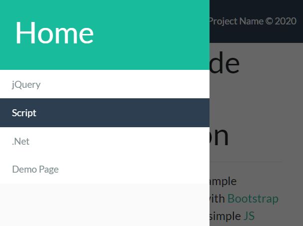
A side drawer component for Bootstrap 4 to create a mobile-friendly off-canvas navigation drawer that can be toggled by a hamburger button.
Inspired by Android (Material Design) navigation drawer concept. Works as an extension to the Bootstrap 4 JavaScript. jQuery is OPTIONAL.
How to use it:
1. The required HTML structure for the navigation drawer.
<div id="side-drawer" class="position-fixed">
  <div class="h-100 bg-white">
    <!-- Side Drawer Title -->
    <div class="p-4 bg-dark">
      <a href="#">
        <h1 class="text-white">Home</h1>
      </a>
    </div>
    <!-- Side Drawer Links -->
    <ul id="links" class="list-group" onclick="closeSideDrawer()">
      <a id="link-structure" href="#" class="list-group-item list-group-item-action border-0 rounded-0 active">
        Works
      </a>
      <a id="link-css" href="#" class="list-group-item list-group-item-action border-0 rounded-0">
        About
      </a>
      <a id="link-javascript" href="#" class="list-group-item list-group-item-action border-0 rounded-0">
        Contact
      </a>
      <a id="link-customization" href="#customization" class="list-group-item list-group-item-action border-0 rounded-0">
        Blog
      </a>
    </ul>
  </div>
</div>
<div id="side-drawer-void" class="position-fixed d-none" onclick="closeSideDrawer()"></div>
2. Create a hamburger button to toggle the navigation drawer.
<button class="navbar-toggler" type="button" onclick="openSideDrawer()">
  <span class="navbar-toggler-icon"></span>
</button>
3. The necessary CSS styles for the navigation drawer.
#side-drawer {
  height: 100vh;
  width: 336px;  /*Ideal width for sidebar accdg to https://forums.envato.com/t/standard-sidebar-width/75633*/
  top: 0;
  left: -336px;
  z-index: 1032;  /*z-index of standard bootstrap navbar is 1030 + 1 offset due to side-drawer-void*/
  transition: left 0.25s ease;
}

#side-drawer-void {
  height: 100%;
  width: 100%;
  top: 0;
  z-index: 1031;  /*z-index of standard bootstrap navbar is 1030*/
  background: rgba(0,0,0,.6);
}
4. The main JavaScript to enable the navigation drawer. Copy the following snippets and insert them after Bootstrap's JavaScript. Done.
<link rel="stylesheet" href="/path/to/cdn/bootstrap.min.css" />
<script src="/path/to/cdn/jquery.slim.min.js"></script>
<script src="/path/to/cdn/bootstrap.min.js"></script>
function openSideDrawer() {
  document.getElementById("side-drawer").style.left = "0";
  document.getElementById("side-drawer-void").classList.add("d-block");
  document.getElementById("side-drawer-void").classList.remove("d-none");
}

function closeSideDrawer() {
  document.getElementById("side-drawer").style.left = "-336px";
  document.getElementById("side-drawer-void").classList.add("d-none");
  document.getElementById("side-drawer-void").classList.remove("d-block");
}
This awesome jQuery plugin is developed by danielflachica. For more Advanced Usages, please check the demo page or visit the official website.


